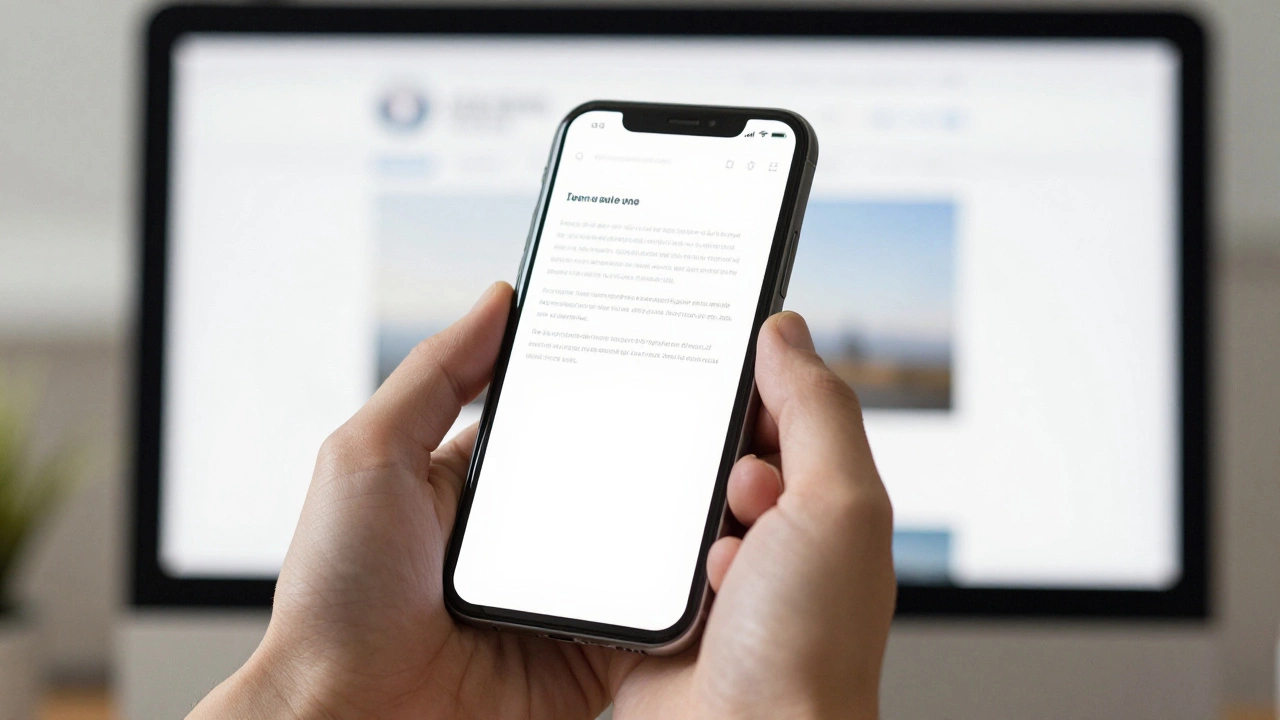
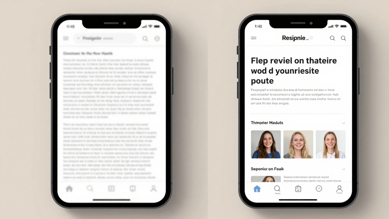
How to Convert a Normal Website to Responsive Web Design
14 Apr 2026Learn how to convert a static website into a responsive one using viewport tags, fluid grids, and CSS media queries for a better mobile experience.
Learn how to convert a static website into a responsive one using viewport tags, fluid grids, and CSS media queries for a better mobile experience.
Fix your old website for mobile users quickly. Learn how to update layouts, handle images, and test responsiveness without rewriting everything from scratch.
Learn how to build a responsive UI design that works on phones, tablets, and desktops. Start with the viewport tag, use fluid layouts, test on real devices, and avoid common mistakes that break mobile experiences.
Responsive design isn't about fitting your site to screens-it's about adapting the experience to the user. Learn the three core principles that make responsive design actually work across devices and networks.