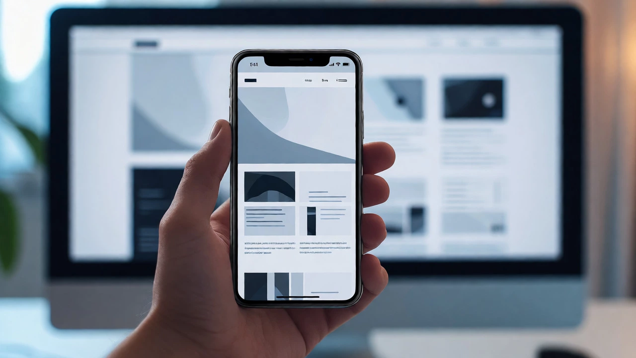
Responsive Design Visualizer
Adjust the viewport width below to see how a standard webpage layout adapts using responsive principles. Notice how columns stack on smaller screens and navigation simplifies.
Simulate Viewport
Quick Presets:
Current State Analysis
@media (min-width: 1024px) { ... }
Live Layout Preview
Viewport: 1200pxYou have probably experienced it: you click a link on your phone, and the site looks like a tiny, unreadable postage stamp. Or worse, you have to pinch and zoom just to read a paragraph. That is not just annoying; it drives people away. But what actually stops that from happening? What makes your website responsive?
It isn't magic, and it isn't just about having a "mobile version" of your site hidden somewhere in the code. True responsiveness is a set of technical strategies that allow one single website to adapt its layout and content to fit any screen size, from a massive desktop monitor down to a smartwatch. If you are building or maintaining a site today, understanding these core mechanisms is non-negotiable. Google prioritizes them, users expect them, and your bounce rate depends on them.
The Viewport Meta Tag: The First Line of Defense
Before any styling kicks in, the browser needs to know how wide the screen is. This is where the viewport meta tag comes into play. It is a simple line of HTML placed in the <head> section of your document. Without it, mobile browsers assume they are viewing a desktop-sized page (usually around 980px wide) and then shrink everything down to fit the small screen. Text becomes microscopic, and buttons become impossible to tap.
By adding this tag, you tell the browser: "Hey, match the width of the layout to the device's actual screen width." It sounds trivial, but missing this single line breaks responsiveness for many developers who jump straight into CSS. It is the handshake between your HTML and the user's device.
Fluid Grids: Ditching Fixed Pixels
Traditional web design relied heavily on fixed pixels. You would say, "Make this sidebar 300px wide." On a 1920px monitor, that works fine. On a 375px iPhone, that sidebar eats up almost the entire screen, pushing the main content off the edge. A responsive approach uses relative units instead of absolute ones.
A fluid grid uses percentages rather than pixels for widths. Instead of defining a column as 300px, you define it as 25% of the container. Now, if the container shrinks because the window is smaller, the column shrinks proportionally. This ensures that the relationship between elements remains consistent regardless of screen size. It requires a shift in thinking: you are no longer designing for a static canvas; you are designing for a flexible container.
Media Queries: The Brains of the Operation
If fluid grids provide the structure, media queries provide the logic. They are CSS rules that apply only when specific conditions are met-most commonly, when the viewport width crosses a certain threshold.
Think of media queries as switches. At 1024px, you might want a three-column layout. Below 768px, you switch to two columns. Below 480px, you stack everything vertically. Media queries let you change font sizes, hide complex navigation menus, or rearrange images based on the available space. They don't change the HTML structure; they just change how that structure is presented visually. This separation of content and presentation is crucial for maintainability.
| Device Type | Typical Width (px) | Layout Strategy |
|---|---|---|
| Small Phones | < 480 | Single column, large touch targets |
| Tablets / Large Phones | 480 - 768 | Two columns, simplified nav |
| Laptops / Desktops | 768 - 1024+ | Multi-column, full navigation |

Flexible Images and Media
Even with a perfect grid, a single oversized image can break your layout. If an image has a fixed width of 1000px and sits inside a container that is only 400px wide, it will either overflow the container or force horizontal scrolling. The fix is surprisingly simple: use max-width.
Setting img { max-width: 100%; height: auto; } ensures that images never exceed the width of their parent container. They scale down smoothly as the screen gets smaller, maintaining their aspect ratio so they don't look squashed. This rule applies to videos and embedded maps too. It is a one-line safety net that prevents 90% of visual glitches on mobile devices.
Mobile-First vs. Desktop-First
There are two ways to write your CSS for responsiveness: starting big or starting small. Historically, developers designed for desktop first, then used media queries to strip things away for mobile. This is called desktop-first. Today, the industry standard has shifted to mobile-first design.
In a mobile-first approach, your base CSS styles are written for the smallest screens. You then use media queries to add complexity as the screen gets larger. Why is this better? It forces you to prioritize essential content. You cannot clutter a small screen with unnecessary widgets. It also results in cleaner CSS because you are overriding fewer styles. Starting with the constraints of a smartphone keeps your design lean and focused.

Touch Targets and Usability
Responsiveness isn't just about layout; it's about interaction. A button that looks great on a mouse cursor might be a nightmare for a finger. Apple’s Human Interface Guidelines recommend a minimum touch target size of 44x44 points. Microsoft suggests 40x40 pixels. If your links are crammed together, users will accidentally click the wrong thing.
This means increasing padding around buttons and spacing out menu items on smaller screens. It also means avoiding hover-only interactions. On a touchscreen, there is no "hover" state until you tap. If you rely on hovering to reveal submenus, those menus will be inaccessible on mobile. You need to redesign navigation patterns, such as using hamburger menus or accordion-style dropdowns, to ensure usability across all input methods.
Performance Matters Too
A responsive site that loads slowly is still a bad experience. Mobile networks are often slower and less reliable than wired connections. Sending a 2MB hero image optimized for a 4K TV to a smartphone wastes bandwidth and battery life.
Modern responsive design includes performance optimizations like lazy loading (loading images only when they scroll into view) and serving different image resolutions based on the device pixel ratio. Tools like srcset allow you to specify multiple versions of an image, letting the browser choose the best one for the current screen. Responsiveness is not just about fitting the screen; it's about respecting the user's data plan and patience.
Is responsive design the same as adaptive design?
No. Adaptive design uses predefined layouts for specific screen sizes (e.g., distinct templates for mobile, tablet, and desktop). Responsive design uses fluid grids and flexible components to adjust continuously to any screen size. Responsive is generally preferred now because it handles new device sizes automatically without needing new templates.
Do I need separate CSS files for mobile?
Not necessarily. With modern CSS frameworks like Bootstrap or Tailwind, you can handle all breakpoints within a single stylesheet using utility classes or media queries. Separate files can make management harder unless your project is extremely large. Keeping it in one file reduces HTTP requests and simplifies debugging.
How do I test if my website is truly responsive?
Don't just resize your browser window. Use browser developer tools to simulate various devices (iPhone, iPad, Android tablets). Check for horizontal scrollbars, overlapping text, and broken images. Also, test on real physical devices if possible, as emulators don't perfectly replicate touch interactions and network speeds.
Does responsive design affect SEO?
Yes, significantly. Google uses mobile-first indexing, meaning it primarily uses the mobile version of content for ranking. A non-responsive site may rank lower because it provides a poor user experience on mobile. Fast-loading, well-structured responsive sites tend to perform better in search results.
Can I make an existing WordPress theme responsive?
If the theme was built before 2015, it might not be responsive. You can try adding custom CSS media queries, but this is often messy. For older themes, it is usually more efficient to migrate to a modern, block-based theme or rebuild the template parts using a framework like GeneratePress or Astra, which are responsive by default.