
Responsive Design Readiness Checker
Evaluate your project against the three pillars of fully responsive design and critical modern standards.
Pillar 1: Fluid Layouts & Structure
Pillar 2: Flexible Media
Pillar 3: Logic & Strategy
Detailed Analysis:
You’ve probably heard the term "responsive" thrown around in every tech meeting or client pitch. But what does it actually mean when someone says they built a fully responsive website? It’s not just about making sure your site doesn’t break on an iPhone. That’s the bare minimum. A truly responsive experience is seamless, adaptive, and intelligent. It adjusts layout, typography, images, and even functionality based on the device, screen size, orientation, and connection speed of the user.
If you’re building for today’s web, understanding this distinction isn’t optional-it’s survival. Users bounce from sites that feel clunky on mobile within seconds. Search engines penalize them. And businesses lose revenue. Let’s break down exactly what makes a website fully responsive, why it matters more than ever in 2026, and how you can ensure your projects hit the mark.
The Core Definition: More Than Just Shrinking Screens
A fully responsive website is a digital platform that automatically adapts its layout, content presentation, and interactive elements to provide an optimal viewing experience across all devices-from large desktop monitors to small smartphones and tablets.
This goes beyond simple resizing. In the early days of mobile web development, many designers used "detect-and-redirect" methods. They would detect if a visitor was on a phone and send them to a separate mobile subdomain (like m.example.com). That approach is dead. It creates maintenance nightmares, duplicates content, and confuses search engines.
Fully responsive design uses a single codebase. The same HTML structure serves everyone. CSS media queries handle the visual adjustments. JavaScript handles dynamic behavior. This means one URL, one set of analytics, and one SEO profile. Google prefers this because it simplifies indexing and ensures users get consistent information regardless of their device.
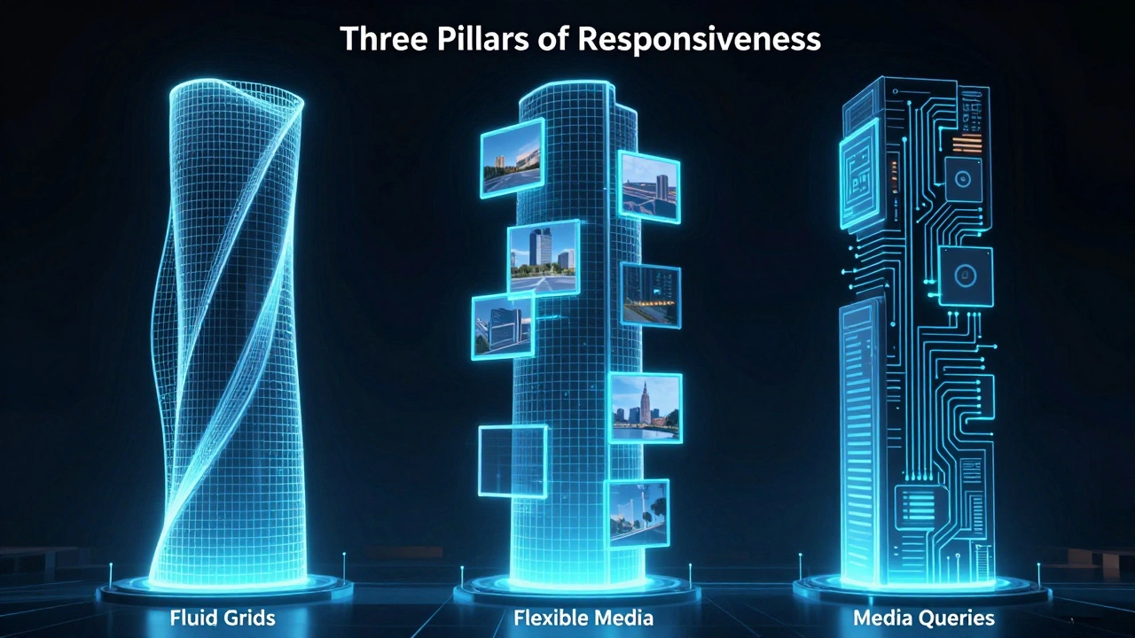
How It Works: The Three Pillars of Responsiveness
To build a site that is genuinely responsive, you need three core technical components working together. If one fails, the experience breaks.
- Fluid Grids: Instead of using fixed pixel widths (e.g., width: 960px), layouts use relative units like percentages or fractions. A column might be 50% wide on desktop but 100% wide on mobile. This allows elements to stretch or shrink smoothly as the viewport changes.
- Flexible Images and Media: Images must scale within their containers. If you hardcode an image width to 800px, it will overflow a 375px mobile screen. Using CSS properties like max-width: 100% ensures images never exceed their parent container. Modern approaches also use the srcset attribute to serve smaller image files to mobile devices, saving bandwidth and improving load times.
- CSS Media Queries: These are conditional rules that apply styles only when certain conditions are met. For example, "if the screen is less than 768 pixels wide, stack these columns vertically." Media queries allow you to target specific breakpoints-common ones include 320px (small phones), 768px (tablets), and 1024px (laptops).
When these three pillars work in harmony, the site feels native to whatever device it’s viewed on. No horizontal scrolling. No tiny text. No broken buttons.
Why "Fully" Responsive Matters in 2026
You might wonder why we emphasize the word "fully." Can’t a site just be "responsive"? Here’s the difference. A partially responsive site might resize its text and images but leave behind desktop-specific navigation menus, complex hover effects that don’t work on touch screens, or forms that are impossible to fill out with thumbs.
In 2026, user expectations have shifted dramatically. With over 60% of global web traffic coming from mobile devices, a site that works well on desktop but poorly on mobile is effectively broken for the majority of users. Furthermore, Google’s Core Web Vitals metrics-Largest Contentful Paint (LCP), Interaction to Next Paint (INP), and Cumulative Layout Shift (CLS)-heavily favor sites that render quickly and remain stable on mobile connections.
A fully responsive site optimizes for these metrics by default. It loads lighter assets on mobile, avoids layout shifts by reserving space for dynamic content, and ensures touch targets are large enough for accurate tapping. This directly impacts SEO rankings and conversion rates.
Mobile-First vs. Desktop-First Approaches
There are two main strategies for building responsive sites. Understanding which one to choose can save you hours of debugging later.
| Feature | Mobile-First Approach | Desktop-First Approach |
|---|---|---|
| Development Order | Design for smallest screen first, then enhance for larger screens | Design for largest screen first, then constrain for smaller screens |
| CSS Strategy | Uses min-width media queries (progressive enhancement) | Uses max-width media queries (graceful degradation) |
| Performance | Naturally lighter base code; adds complexity only when needed | Often requires stripping out unused styles for mobile |
| User Experience | Prioritizes essential content and fast loading | Risk of cluttered mobile interfaces if not carefully pruned |
| Best For | Content-heavy sites, blogs, e-commerce, news portals | Complex dashboards, data visualization tools, admin panels |
Most experts recommend mobile-first. Why? Because constraints breed creativity. When you start with a small screen, you’re forced to prioritize what truly matters. You strip away decorative fluff. Then, as you move up to tablets and desktops, you add features progressively. This results in cleaner code and faster performance.
Desktop-first often leads to "shrinking" problems. You take a sprawling desktop layout and try to squeeze it into a phone screen. The result is usually cramped text, hidden navigation, and poor usability. Unless you’re building a specialized tool primarily used on desktops, mobile-first is the safer bet.
Common Mistakes That Break Responsiveness
Even experienced developers make errors that undermine responsiveness. Here are the most frequent pitfalls to avoid:
- Ignoring Viewport Meta Tag: Without
<meta name="viewport" content="width=device-width, initial-scale=1.0">, mobile browsers assume the page is designed for desktop and zoom out to fit it. This makes text unreadable. Always include this tag in your HTML head. - Hardcoding Dimensions: Avoid setting fixed heights or widths on containers, images, or videos. Use relative units like vh, vw, em, rem, or %. Fixed pixels create overflow issues on unexpected screen sizes.
- Overlooking Touch Targets: Buttons and links need to be at least 44x44 pixels (Apple’s guideline) or 48x48 pixels (Google’s guideline). Tiny clickable areas frustrate users and increase error rates.
- Forgetting Font Scalability: Text should scale appropriately. Use relative units like rem for font sizes so users can adjust browser defaults without breaking your layout. Ensure contrast ratios meet WCAG 2.1 AA standards for accessibility.
- Testing Only on Default Devices: Don’t just test on Chrome DevTools’ preset devices. Real-world usage involves older Android phones, iPads in landscape mode, foldable screens, and varying network speeds. Test on actual hardware whenever possible.

Accessibility and Responsiveness Go Hand in Hand
A fully responsive website must also be accessible. These two goals overlap significantly. If your site adapts to different viewports, it should also adapt to different user needs.
Consider keyboard navigation. On a desktop, users might tab through links. On a tablet, they might use a trackpad. Your focus states must be visible and logical. Consider color blindness. Don’t rely solely on color to convey meaning (e.g., red for error). Add icons or text labels. Consider motor impairments. Large touch targets help everyone, not just those with limited dexterity.
Using semantic HTML helps here too. Screen readers interpret headings, lists, and landmarks correctly regardless of screen size. If you hide content with CSS display:none, screen readers ignore it. If you hide it visually but keep it in the DOM, screen readers still read it. Choose wisely based on context.
Tools and Techniques for Building Responsive Sites
You don’t need to reinvent the wheel. Several modern tools simplify responsive development:
- CSS Flexbox and Grid: These layout models replace old float-based hacks. Flexbox handles one-dimensional layouts (rows or columns). Grid handles two-dimensional layouts (rows and columns simultaneously). They make creating complex, responsive structures intuitive.
- Container Queries: A newer CSS feature that allows components to react to their own container’s size rather than the viewport. This is huge for reusable components like cards or widgets that appear in different contexts.
- Framework Utilities: Libraries like Tailwind CSS or Bootstrap provide pre-built responsive classes. Tailwind’s utility-first approach lets you write responsive code directly in your HTML (e.g.,
md:flex lg:grid). Bootstrap offers a grid system that handles breakpoints automatically. - Image Optimization Tools: Services like Cloudinary or plugins like ShortPixel automatically generate multiple image sizes and serve the right one based on device capabilities. This reduces bandwidth usage significantly.
Combine these tools with a solid understanding of CSS fundamentals, and you’ll build sites that perform beautifully everywhere.
Measuring Success: How to Know If Your Site Is Truly Responsive
How do you verify your work? Start with automated tests. Google Lighthouse provides a free audit that checks responsiveness, performance, accessibility, and SEO. Aim for scores above 90 in all categories. Look specifically for warnings about viewport configuration, tap targets, and font legibility.
Next, conduct manual testing. Resize your browser window slowly. Watch for layout shifts. Check if text reflows naturally. Try rotating your phone. Does the layout adjust smoothly? Open your site on three different real devices: a low-end Android phone, an iPhone, and a tablet. Note any friction points.
Finally, monitor real-user data. Use analytics to track bounce rates by device type. If mobile bounce rates are significantly higher than desktop, investigate why. Are pages loading too slowly? Is navigation confusing? Heatmap tools like Hotjar can show you where users struggle on mobile versus desktop.
Is a responsive website the same as a mobile-friendly website?
Not exactly. "Mobile-friendly" is a broader, often vaguer term. It usually means the site works on phones without major errors. "Fully responsive" implies a deliberate design strategy that adapts seamlessly across all screen sizes, orientations, and input methods. All fully responsive sites are mobile-friendly, but not all mobile-friendly sites are fully responsive.
Do I need separate CSS files for mobile and desktop?
No. Best practice is to use a single CSS file with media queries. Loading multiple CSS files increases HTTP requests and slows down page loads. Modern CSS allows you to organize your styles logically within one file, keeping maintenance simple and performance high.
What are the best breakpoints to use in 2026?
There’s no universal answer. Breakpoints should be based on your content’s needs, not arbitrary device sizes. However, common starting points are 320px (small phones), 480px (large phones), 768px (tablets), 1024px (laptops), and 1280px+ (desktops). Use container queries for component-level responsiveness instead of relying solely on viewport breakpoints.
Can WordPress themes be fully responsive?
Yes, most modern premium WordPress themes are built with responsive principles. However, always test thoroughly. Some themes may have rigid layouts or plugins that inject non-responsive elements. Look for themes that mention "fluid grids," "mobile-first," or "flexbox/grid support" in their documentation.
How does responsive design affect SEO?
Significantly. Google uses mobile-first indexing, meaning it primarily crawls and indexes the mobile version of your site. If your mobile experience is poor-slow loading, hard to navigate, or broken layout-your rankings will suffer. Responsive design ensures a consistent, high-quality experience for both users and search engine bots.