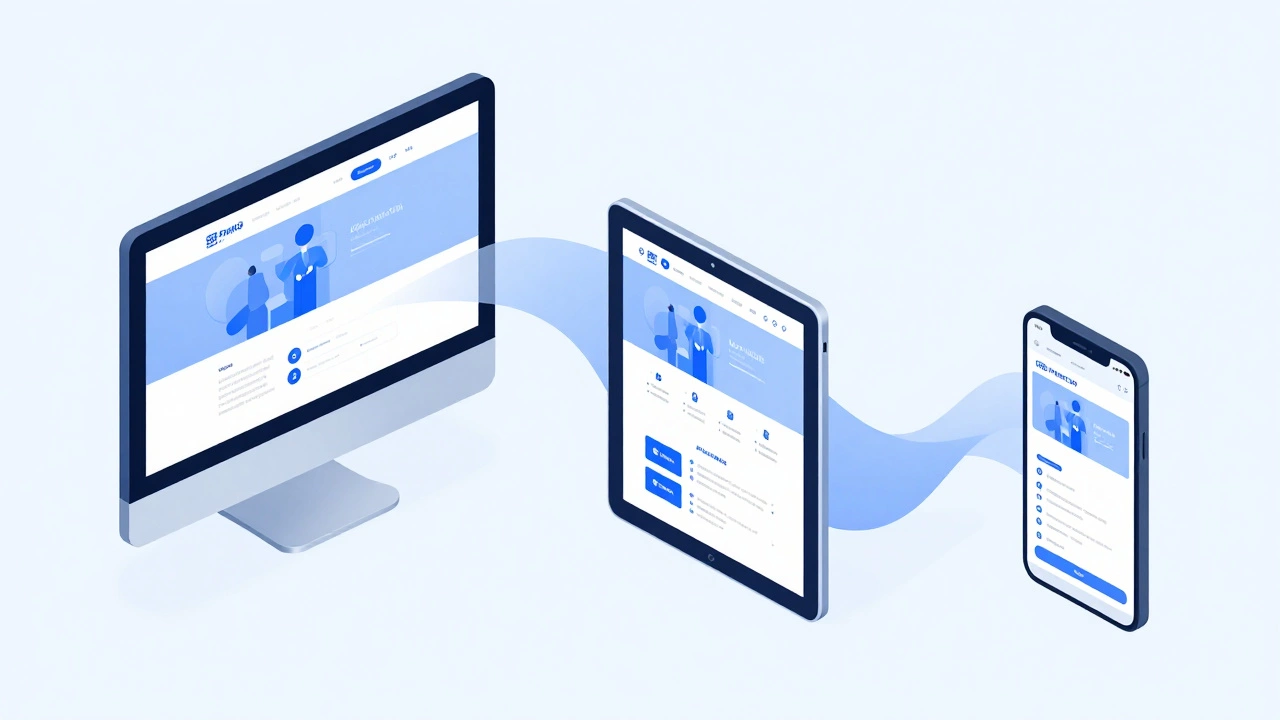
Mobile‑First Design: Why It’s a Must and How to Get Started
When most people browse the web, they’re on a phone. If your site looks broken on a small screen, you lose visitors instantly. Mobile‑first design flips the usual process: you design for the smallest device first, then add features for larger screens. It’s not a fancy buzzword – it’s a practical way to make sure every user gets a smooth experience.
Start Simple: Layout and Content
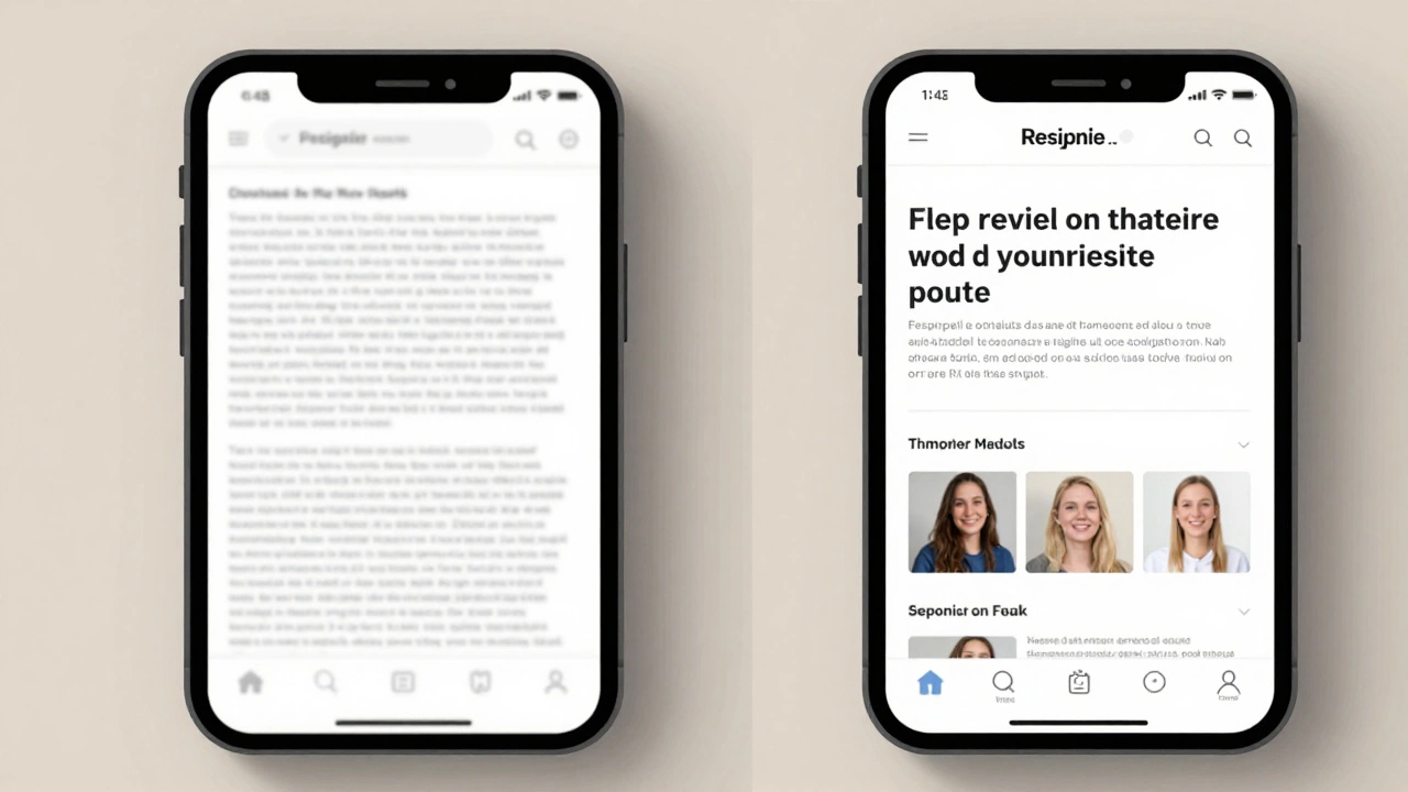
Begin with a single‑column layout. Stack headings, images, and text so they flow naturally on a narrow screen. Use large, readable fonts and generous line‑height – smaller devices need clear text. Keep the most important content above the fold; users on phones scroll quickly, so show value right away.
Images are a common performance killer. Serve responsive images with srcset so the browser picks the right size. Compress files, use modern formats like WebP, and lazy‑load below‑the‑fold visuals. These steps shave seconds off load time, which directly improves bounce rates.
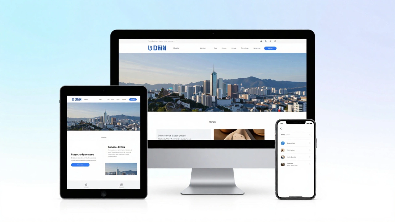
Progressively Enhance for Bigger Screens
Once the mobile version feels solid, add breakpoints for tablets and desktops. Use CSS media queries to adjust grid columns, increase font sizes, and reveal secondary navigation. The key is to layer enhancements – never overwrite the mobile layout, just expand it.
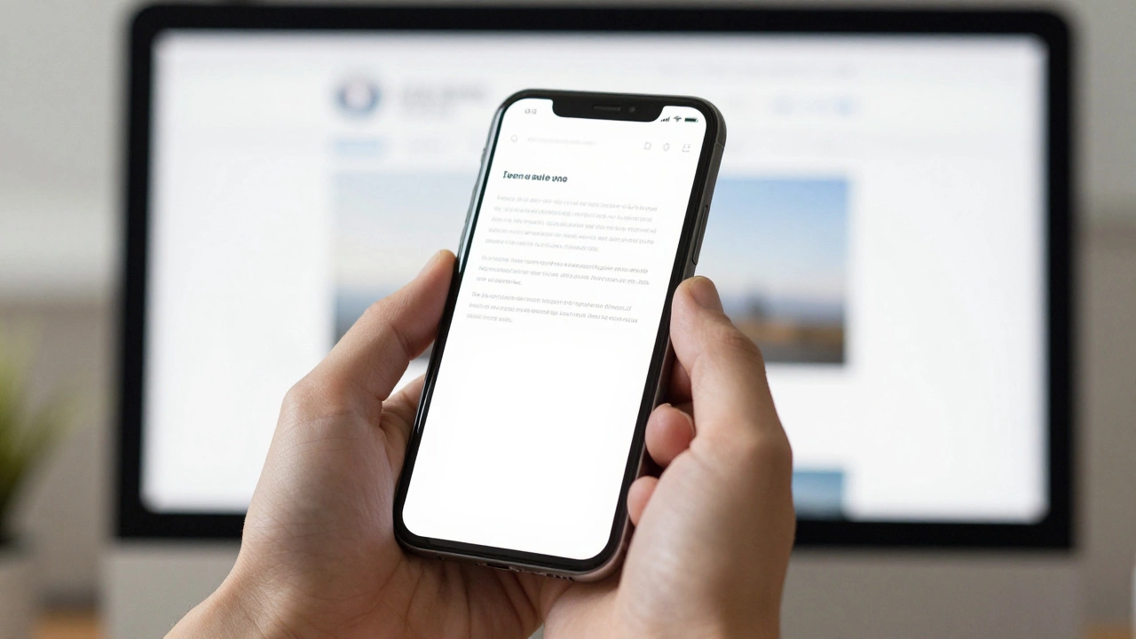
Testing is crucial. Open your site on real devices, not just simulators. Check tap targets, form fields, and navigation menus. A button that’s easy to tap on a phone can feel clunky on a laptop if you’ve added extra padding for desktop only.
Performance tricks that work on mobile also boost SEO. Google rewards fast sites, especially on phones, with higher rankings. Keep JavaScript bundles small, defer non‑essential scripts, and leverage browser caching. Every millisecond saved helps you rank better and keeps users happy.
Finally, think about accessibility. Use semantic HTML, proper heading hierarchy, and ARIA labels where needed. Mobile users often rely on screen readers, and a clean, accessible structure benefits everyone.
Mobile‑first design isn’t a one‑time checklist; it’s an ongoing mindset. As new devices emerge, revisit breakpoints and performance metrics. By starting with the smallest screen and building out, you create a flexible, future‑proof website that looks great everywhere.