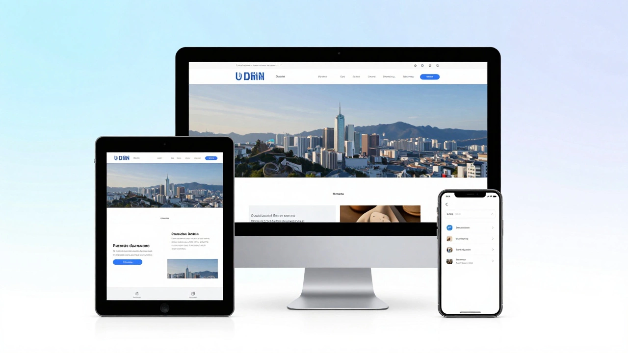
Responsive Layout Simulator
Watch how the grid columns change and the navigation transforms as the width decreases!
Our Collection
Quick Takeaways
- Responsive design uses a single codebase to adapt to different screen sizes.
- The core tools are fluid grids, flexible images, and CSS media queries.
- It prioritizes user experience (UX) by eliminating the need for separate mobile sites.
- Google uses mobile-first indexing, making responsiveness a requirement for SEO.
The Perfect Example: Amazon
If you want a gold-standard example of responsive web design is an approach to web development that makes web pages render well on a variety of devices and window or screen sizes, look no further than Amazon. Try this: open Amazon on a desktop browser and slowly shrink the width of the window. You'll notice the layout doesn't just squash; it transforms. The navigation bar disappears into a "hamburger" menu, the product grids shift from five columns to three, and then to one. The buttons get larger and easier to tap with a thumb. This is a prime example of a site that doesn't just "fit" the screen, but optimizes the experience for the device being used.
How the Magic Happens: The Technical Trio
A website doesn't become responsive by accident. Developers rely on three main technical pillars to make this happen. First, there are Fluid Grids. Unlike old-school layouts that used fixed pixels (e.g., 960px wide), fluid grids use percentages. If a sidebar is set to 25% width, it stays 25% whether the screen is 1000 pixels or 4000 pixels wide.
Next are Flexible Images. A common mistake in early web design was setting an image to a fixed width, which caused it to "bleed" off the edge of a mobile screen. By using the CSS property max-width: 100%, the image tells the browser: "I can be my original size, but if the container is smaller than me, shrink down to fit exactly."
Finally, the real brains of the operation are Media Queries. These are snippets of CSS (Cascading Style Sheets) that act like a set of instructions. A media query says: "If the screen width is 768 pixels or less, change the font size to 14px and hide the side navigation." This allows the site to change its entire look based on the device's hardware specs.
| Feature | Fixed Layout | Responsive Layout |
|---|---|---|
| Width Unit | Pixels (px) | Percentages (%) / Viewport Units (vw) |
| User Experience | Requires zooming on mobile | Seamless across all devices |
| Maintenance | Often requires a separate "m.site.com" | One codebase for all screens |
| SEO Impact | Can be penalized for poor mobile UX | Positive impact via mobile-first indexing |

The Strategy of Mobile-First Design
In the past, designers built a desktop site and then tried to "strip away" features to make it work on mobile. Today, the pros do the opposite: Mobile-First Design. This means you design for the smallest screen first. Why? Because it forces you to prioritize the most important content. If you only have a few inches of space, you can't afford to waste it on a giant rotating banner or five paragraphs of fluff. Once the core experience is polished for a phone, you "progressively enhance" the site by adding more complex layouts for tablets and desktops.
This approach is closely tied to the Viewport. The viewport is the user's visible area of a web page. To make a site responsive, developers add a specific meta tag in the HTML header that tells the browser to set the width of the page to the width of the device. Without this tag, a mobile browser might pretend it's a desktop, rendering the page at 980px and making everything look tiny.
Common Pitfalls to Avoid
Even experienced developers trip up on responsiveness. One of the biggest mistakes is over-reliance on "breakpoints." A breakpoint is the specific pixel width where the layout changes. Some people try to design for specific devices (e.g., "the iPhone 14 breakpoint"). This is a losing battle because new phones come out every month with slightly different screen sizes. The better way is to let the content dictate the breakpoint. If your text starts looking too stretched or your images get too small, that's where you add a media query.
Another trap is ignoring "touch targets." A mouse cursor is precise, but a human thumb is not. A responsive site that looks great but has buttons placed 2 pixels apart is a failure in UI UX Design. Every clickable element on a mobile view should be at least 44x44 pixels to prevent "fat-finger" errors where a user accidentally clicks the wrong link.

How to Test Your Own Site's Responsiveness
You don't need to own ten different phones to see if your site works. The easiest way is using the Chrome DevTools. Right-click anywhere on your page, select "Inspect," and then click the device toggle icon (it looks like a phone and a tablet). This lets you simulate various devices and even drag the screen edge to see exactly where your layout breaks. This real-time testing is how developers fine-tune their Front End Development workflow.
For a more thorough test, check your site's performance on different network speeds. A site might be responsive in terms of layout, but if the images are massive, it will take forever to load on a 4G connection. Using tools like Google PageSpeed Insights helps you find where your assets are slowing down the mobile experience.
Is a responsive website the same as a mobile-friendly website?
Not exactly. A mobile-friendly site might just be a simplified version of a desktop site, or a separate mobile URL (like m.facebook.com). A responsive website is more advanced; it uses a single URL and a single set of code that dynamically adapts its layout based on the screen size.
Does responsive design slow down a website?
If done poorly, yes. If you load giant desktop-sized images on a mobile phone, it will be slow. However, by using techniques like "responsive images" (the srcset attribute) and lazy loading, you can ensure the browser only downloads the image size it actually needs, which can actually make the site faster for mobile users.
What is the best way to build a responsive site today?
Most developers use modern CSS layout systems like CSS Grid or Flexbox. These tools make it much easier to create dynamic layouts that shift and grow without needing hundreds of lines of media queries. Frameworks like Bootstrap or Tailwind CSS are also popular because they come with pre-built responsive grids.
Why is the viewport meta tag so important?
Without the viewport meta tag, a mobile browser assumes the page is designed for a desktop and zooms out to fit the whole page on the screen. This results in tiny, unreadable text. The tag tells the browser to match the website's width to the device's actual screen width.
Can a site be too responsive?
Rarely, but you can over-engineer it. If the layout changes too drastically every 10 pixels, the user might get confused. The key is to maintain a consistent visual hierarchy so that the user always knows where the navigation and main content are, regardless of the screen size.
Next Steps for Optimization
If you've already made your site responsive, the next step is focusing on "adaptive" elements. While responsive design focuses on the screen size, adaptive design considers the device's capabilities. For example, you might want to disable a heavy video background for users on slow 3G connections or provide different interactions for a stylus-enabled tablet versus a finger-touch phone.
Start by auditing your most visited pages on a real mobile device. Check for "horizontal scroll"-the cardinal sin of responsive design. If you can scroll left and right, something is breaking your layout. Fix that first, then move on to optimizing your image formats (switching to WebP) to ensure your responsive site is as fast as it is flexible.