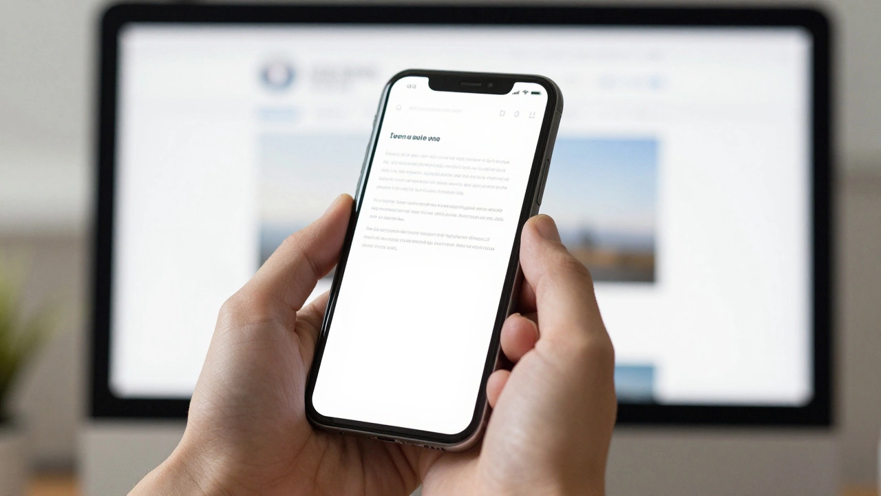
Responsive Design Simulator
Welcome to the Site
This is a simulated webpage content area to demonstrate how layout shifts based on your settings.
Observation Guide:
- Fixed Mode: The content width is locked at 960px. On mobile, you must scroll horizontally to see everything.
- Fluid Mode: The content uses percentages and
max-width. It adapts to the screen size seamlessly. - Breakpoints: Switch between Mobile, Tablet, and Desktop to see how the "Fluid" grid items stack or expand.
Quick Guide to Responsiveness
- Viewport Setup: Tell the browser to scale the content to the device width.
- Fluid Layouts: Swap fixed pixels (px) for relative units like percentages (%) or viewport units (vw/vh).
- Media Queries: Create specific rules for different screen widths (breakpoints).
- Flexible Images: Ensure images shrink to fit their containers.
The Foundation: The Viewport Meta Tag
Before you touch a single line of CSS, you have to talk to the browser. By default, mobile browsers try to render a desktop page by zooming out, which is why everything looks so small. To stop this, you need to add a specific tag to the section of your HTML.When we talk about
Viewport is
an instruction to the browser that controls how the website is displayed on mobile devices by setting the width and initial scale.
Adding <meta name="viewport" content="width=device-width, initial-scale=1.0"> tells the browser: "Make the width of the page equal to the width of the device and don't zoom out by default." Without this, your media queries will likely be ignored because the browser thinks it's still on a desktop.
Moving from Fixed Widths to Fluid Grids
Old websites rely on fixed pixel widths. For example, a sidebar might be set to 300px. On a 320px wide iPhone, that sidebar takes up almost the whole screen, leaving no room for the main content. The secret to responsive web design is replacing these rigid numbers with relative values.Instead of saying a column is 600px, you say it is 50%. If the screen is 1200px, the column is 600px. If the screen is 400px, the column is 200px. This is the essence of a
Fluid Grid is
a layout system where elements are sized in relative units like percentages rather than fixed pixels
.
To make this work effectively, you should avoid using fixed-width containers. If your main wrapper is set to width: 1000px;, change it to max-width: 1000px; width: 100% ;. This ensures the site can shrink on small screens but won't stretch awkwardly on massive 4K monitors.
| Attribute | Fixed Layout (Old) | Fluid Layout (Responsive) |
|---|---|---|
| Container Width | width: 960px; |
width: 90%; max-width: 1200px; |
| Sidebar Width | width: 300px; |
width: 25%; |
| Images | width: 600px; |
max-width: 100%; height: auto; |
| Font Sizes | font-size: 14px; |
font-size: 1rem; (Relative to root) |
Mastering CSS Media Queries
Fluid grids do a lot of the heavy lifting, but sometimes a layout just needs to change entirely. For instance, a three-column footer on a desktop looks great, but on a phone, those columns become impossibly skinny. This is where CSS Media Queries are a CSS technique that allows the application of different styles based on the device's characteristics, such as viewport width come into play.Think of media queries as "if/then" statements for your design. "If the screen is narrower than 768px, then stack these columns on top of each other instead of keeping them side-by-side." A common approach is to define breakpoints based on standard device sizes. For example, 480px for phones, 768px for tablets, and 1024px for desktops.
A pro tip here is to use min-width instead of max-width. This is known as the
Mobile-First Design is
a design strategy where the mobile version of a site is developed first, and complexity is added as the screen size increases
approach. You write the styles for the smallest screen first (which is the simplest layout), and then add media queries to expand the layout as the screen gets bigger. It's much easier to add elements to a layout than it is to try and hide or shrink them.
Handling Images and Media
One of the biggest culprits of a broken mobile layout is an image that refuses to shrink. If you have a 1200px wide banner image, it will push the edges of your site far beyond the mobile screen, creating that dreaded horizontal scroll bar.To fix this, you need to make your images flexible. The gold standard is to use max-width: 100%; and height: auto;. This ensures the image will never be wider than its container, and the height will adjust automatically to keep the image from looking squashed.
For more advanced control, you can use the picture element is an HTML element that allows developers to specify multiple image sources for different screen sizes, improving performance and art direction . This lets you serve a small, cropped image to mobile users and a high-resolution wide shot to desktop users. This doesn't just help with layout; it drastically improves load times because mobile users aren't downloading a 2MB image they can't even see in full.
Modern Layout Engines: Flexbox and Grid
If you're still usingfloat: left; to create your columns, it's time to upgrade. Modern CSS has given us two incredibly powerful tools:
Flexbox is
a one-dimensional layout model that allows items to align and distribute space within a container
and
CSS Grid is
a two-dimensional layout system that allows for the creation of complex grid-based designs with rows and columns
.
Flexbox is perfect for things like navigation bars or centering content. With a single line-display: flex; flex-wrap: wrap;-you can tell your elements to sit side-by-side until they run out of room, at which point they'll automatically wrap to the next line. This eliminates the need for dozens of media queries for every tiny screen variation.
CSS Grid, on the other hand, is for the overall page structure. You can define a grid of columns and then tell a specific element to span two columns on desktop but only one on mobile. This gives you a level of control that was previously impossible without rewriting your entire HTML structure for mobile.

Testing Your Responsive Conversion
You can't just trust your eyes on one screen. The world of devices is fragmented. Some users have tiny SE iPhones, while others have massive Samsung Foldables. How do you know it actually works?The fastest way to test is using the browser's built-in developer tools. In Chrome or Firefox, right-click and select "Inspect," then click the device toolbar icon. This allows you to simulate various screen sizes and see exactly where your layout breaks. Look for "the jump"-the moment where the content starts to overflow or the text becomes too small to read. That's where you need a new breakpoint.
Don't forget to check your touch targets. A link that is easy to click with a mouse might be impossible to hit with a thumb. Ensure buttons and links have enough padding and space around them. A general rule of thumb is to keep interactive elements at least 44x44 pixels to avoid user frustration.
Do I need a separate mobile website (like m.example.com)?
No. In fact, having a separate mobile site is generally discouraged now. It's harder to maintain two sets of content, and it's bad for SEO because it splits your authority between two URLs. Responsive design allows one single URL to serve every device, which is what search engines prefer.
What is the difference between responsive and adaptive design?
Responsive design is fluid; it changes smoothly as the window resizes. Adaptive design uses a set of predefined layouts (e.g., one for 320px, one for 768px, one for 1024px) and "snaps" to the closest one. Responsive is generally more flexible and modern.
Will converting to responsive design slow down my site?
Generally, no. The CSS for media queries is very lightweight. However, if you load huge desktop images on mobile, it will slow down. Using the picture element or CSS media queries to load smaller images for mobile devices will actually make your site feel faster.
What are the most common breakpoints for 2026?
While there is no "perfect" number because devices change, common standards are: 480px (small mobile), 768px (tablets), 1024px (laptops), and 1200px+ (large desktops). The best approach is to design your content and add a breakpoint wherever the layout looks broken, regardless of the specific device.
Can I make a site responsive without changing the HTML?
Mostly, yes. You can achieve a lot using only CSS. However, you must add the viewport meta tag to the HTML head for it to work. Additionally, some structural changes (like moving a sidebar) are much easier if you can reorganize the HTML or use modern CSS Grid.