How to Convert a Normal Website to Responsive Web Design
14 Apr 2026Learn how to convert a static website into a responsive one using viewport tags, fluid grids, and CSS media queries for a better mobile experience.
If you’re building a site that works on phones, tablets, and desktops, media queries are the tool you’ll reach for. They let you apply different CSS rules based on screen width, orientation, or even resolution. The good news? You don’t need a PhD to get them working. Below you’ll see how to set them up, which breakpoints make sense for most projects, and a few tricks to keep your code clean.
Think of a website as a shirt. One size fits nobody. Media queries let the shirt shrink or grow so it fits any body. Without them, your layout will either look squished on a phone or stretched on a big monitor. Browsers read the @media rule and only apply the CSS inside if the conditions match. That means you can hide a sidebar on small screens, increase button sizes for touch, or switch to a single‑column layout when space is tight.
Another win is SEO. Google favors sites that load quickly on mobile. When you serve a leaner stylesheet for tiny screens, you reduce download size and improve rankings. So media queries aren’t just a design nicety—they’re a performance boost.
Start with a mobile‑first approach. Write the base CSS for the smallest screen, then add @media blocks for larger widths. This keeps the default stylesheet light and forces you to think about what really needs to change at each size.
Here’s a simple pattern many developers use:
@media (min-width: 480px) { /* small tablets */ }
@media (min-width: 768px) { /* standard tablets */ }
@media (min-width: 1024px) { /* small laptops */ }
@media (min-width: 1280px) { /* desktops */ }
The numbers aren’t set in stone—pick breakpoints that match your design. If your layout breaks at 1024 px, that’s the point to add a rule. Avoid “one size fits all” breakpoints like 600 px or 900 px unless your design truly needs them.
Use max-width for cases where you want to target everything below a size, for example:
@media (max-width: 767px) { /* hide big images on phones */ }
Combine conditions for sharper control. Want to target portrait tablets?
@media (min-width: 768px) and (orientation: portrait) { /* portrait tweaks */ }
Keep your media query file separate from the main stylesheet or use a pre‑processor like SCSS to nest them. This makes it easier to update breakpoints later.
Finally, test on real devices. Browser dev tools are great, but nothing beats checking a site on an actual phone. Look for overlapping elements, tiny touch targets, and long lines of text that need more spacing.
By mastering these basics, you’ll be able to build sites that adapt gracefully, load faster, and rank better. Media queries are simple, but they pack a big punch for modern web development. Ready to try them out? Grab a stylesheet, add a @media block, and watch your design transform across screens.
Learn how to convert a static website into a responsive one using viewport tags, fluid grids, and CSS media queries for a better mobile experience.
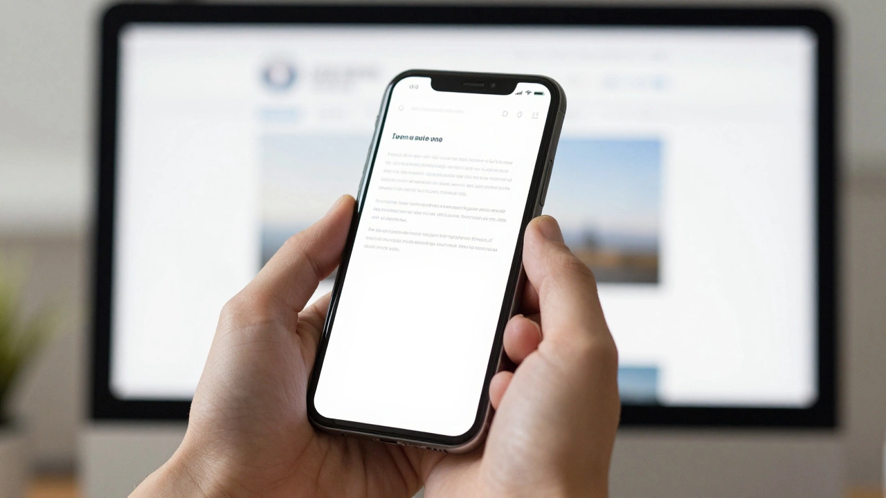
There's no one-click fix for responsive websites, but using modern CSS tools like Flexbox, Grid, and relative units lets you build sites that adapt automatically. Learn how to make your site truly mobile-friendly without plugins or guesswork.

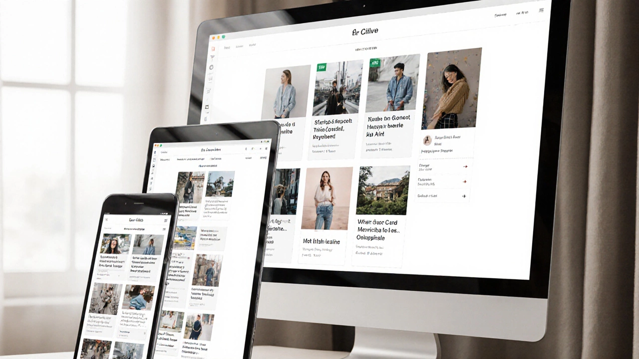
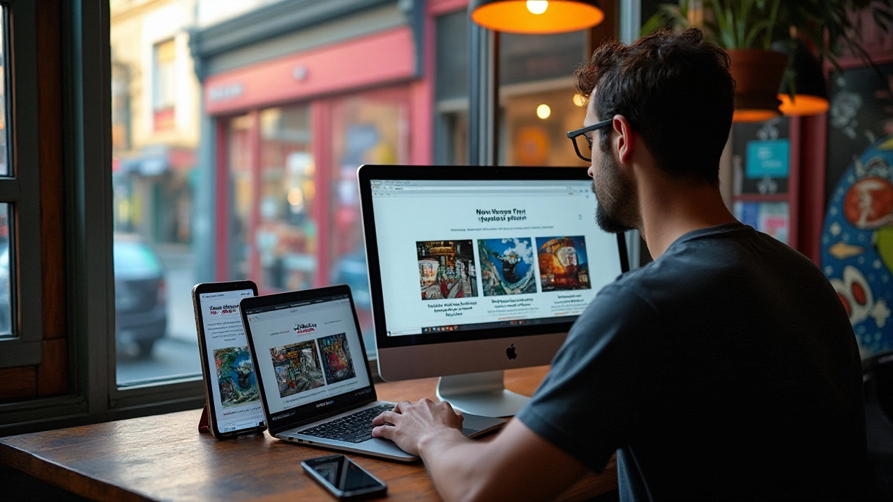
This article shows you exactly how to build a website that adapts to any screen, from phones to desktop monitors. You'll learn what makes web design 'responsive,' why it's not just about shrinking content, and how to use flexible layouts, media queries, and smart images. Expect direct tips, real examples, and tricks to sidestep common beginner mistakes. No fluff—just practical know-how for developers in 2025.

Trying to make your website work smoothly on every screen size can feel overwhelming, but it’s completely doable. This article breaks down how you can build a website that looks sharp on both mobile and desktop without extra headache. You'll get clear, real-world tips for using responsive layouts, flexible images, and media queries. No fancy tricks—just straight answers about what really works. Time to make your site feel modern and easy to use, whatever device your visitors pick up.
Responsive web design is a crucial aspect of modern web development, ensuring that websites function seamlessly across various devices. To achieve this, designers focus on three basic elements: flexible layouts, media queries, and responsive images. These components work together to provide an optimal user experience regardless of screen size. By understanding and implementing these essentials, web designers can create sites that are both user-friendly and adaptable.