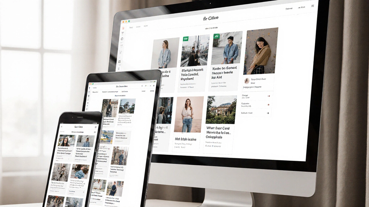
Responsive Unit Converter
Convert fixed pixel values to responsive relative units (rem, em, %, vw, vh) to make your website truly responsive.
Enter a pixel value and select a unit to see the conversion.
rem
1rem = 16px (root font size). Relative to browser's default font size.
em
1em = current element's font size. Relative to parent element.
%
Percentage of parent container width/height. Flexible relative to container.
vw
1vw = 1% of viewport width. Scales with screen width.
vh
1vh = 1% of viewport height. Scales with screen height.
There’s no magic button that turns a static website into a perfectly responsive one with a single click. But that doesn’t mean you’re stuck manually resizing every element for every screen. The truth is, automatic responsive design isn’t about automation-it’s about building with the right tools from the start. If you’re asking if you can just throw a plugin at your site and call it done, the answer is no. But if you’re asking if you can set up systems that handle responsiveness without touching each component every time, the answer is yes-and it’s easier than you think.
What Responsive Design Really Means
Responsive design isn’t just about making your site look good on phones. It’s about adapting layout, spacing, typography, and interaction to fit any screen size-whether it’s a smartwatch or a 4K monitor. A responsive site doesn’t shrink everything down. It rearranges content, hides what’s unnecessary, and scales what matters. Think of it like a living thing that breathes with the space it’s given.
Early web designers tried to solve this by creating separate mobile sites (m.example.com). That meant double the work: two codebases, two sets of updates, and broken links everywhere. Then came CSS media queries. That was the real turning point. Now, one HTML file can serve every device, and CSS decides how it looks based on screen width, resolution, or orientation.
Why You Can’t Fully Automate It
There are tools that claim to make your site responsive automatically-like website builders that add a "responsive toggle" or plugins that claim to fix layouts with one install. But here’s the problem: they don’t understand context.
Imagine a navigation menu with five items. On desktop, it’s fine as a horizontal bar. On mobile, it needs to collapse into a hamburger menu. A tool might hide the menu and slap on a button, but it won’t know if the button should be top-right or bottom-center. It won’t know if your logo should shrink or stay full-size. It won’t know if your image gallery should go from three columns to one, or if it should become a carousel.
These decisions require design judgment. Automated tools can adjust font sizes or padding, but they can’t decide what’s important. That’s why even the best auto-responsive plugins often leave you with a site that’s technically responsive but feels broken.
The Real Way to Automate Responsiveness
Forget plugins. The real automation comes from using modern CSS frameworks and techniques that handle the heavy lifting for you.
First, start with a mobile-first approach. Write your base styles for small screens, then use media queries to add complexity for larger ones. This means your site loads fast on phones and scales up gracefully. It’s not just a best practice-it’s the only way to build something that doesn’t break.
Use CSS Grid and Flexbox. These aren’t just fancy layout tools-they’re the backbone of automatic responsiveness. With Flexbox, you can make a row of cards stack vertically on mobile and line up horizontally on desktop without writing a single media query. Grid lets you define areas that rearrange based on screen size. Here’s a simple example:
.container {
  display: grid;
  grid-template-columns: repeat(auto-fit, minmax(250px, 1fr));
}
This one line creates a grid that automatically adjusts the number of columns based on available space. On a phone, it shows one column. On a tablet, two. On a desktop, three or four. No media queries needed. That’s automation.
Use relative units: rem, em, %, and vw/vh instead of fixed pixels. A font size of 1.5rem scales with the user’s default browser settings. A width of 80% adjusts to the container. A height of 50vh takes up half the viewport. These units adapt. Pixels don’t.

Tools That Help (But Don’t Do It All)
There are tools that make responsive design faster-but they’re assistants, not replacements.
- Bootstrap and Tailwind CSS come with pre-built responsive classes. Need a column that stacks on mobile? Use
col-md-6ormd:w-1/2. These frameworks handle the media queries behind the scenes. - CSS Frameworks with Fluid Typography like Clamp.js or Modern CSS Solutions let you set font sizes that scale smoothly between breakpoints. For example:
font-size: clamp(1rem, 4vw, 2rem);means the text grows as the screen gets wider but never gets too big or too small. - Browser DevTools let you simulate any device size. Test your site live in Chrome or Firefox. You’ll catch layout issues before you even deploy.
These tools reduce manual work. But you still need to understand how they work. Blindly copying classes without knowing what they do leads to bloated, slow sites.
What Happens When You Skip the Basics
I’ve seen too many sites built with drag-and-drop builders that promise "responsive by default." They look fine on the demo screen. Then you view them on a real phone-and the buttons are too small to tap, the text overlaps, the images stretch weirdly.
Why? Because those builders use fixed widths and absolute positioning. They assume every screen is the same. They don’t account for touch targets, retina displays, or portrait vs. landscape modes. The result? A site that’s "responsive" in name only.
Real responsiveness requires:
- Touch targets at least 44px wide
- Images that load the right size for the device (using
srcset) - Text that doesn’t require zooming
- Forms that work with mobile keyboards
No tool can guess these things for you. You have to build them in.

How to Test If Your Site Is Actually Responsive
Don’t just resize your browser window. That’s not enough. Test on real devices-or at least, use accurate emulators.
Here’s a quick checklist:
- Can you tap every button without accidentally hitting the one next to it?
- Does text reflow without horizontal scrolling?
- Do images shrink or load smaller versions on mobile?
- Is the navigation easy to open and close?
- Does the site load fast on 3G?
Use Google’s Mobile-Friendly Test tool. It doesn’t just check if it’s responsive-it checks if it’s usable. If your site fails, it tells you exactly why: "Tap targets too small," "Content wider than screen," etc.
The Future: AI and Responsiveness
AI tools are starting to help. Some design platforms now suggest layout changes based on screen size. AI can analyze your current site and recommend fixes. But these are still in early stages. They can point out problems, but they can’t make design decisions.
Right now, the best "automation" is a well-structured codebase. Use modern CSS. Build with components. Write reusable styles. Once you set that up, adding a new page or changing a layout becomes a matter of copying and tweaking-not rebuilding from scratch.
The goal isn’t to remove human input. It’s to remove repetitive work. Responsive design isn’t a one-time fix. It’s a mindset. Build once, adapt everywhere.
What to Do Next
If you’re starting from scratch:
- Use a CSS framework like Tailwind or Bootstrap
- Write mobile-first styles
- Use
gridandflexboxfor layout - Use relative units, not pixels
- Test on real devices
If you have an existing site:
- Run it through Google’s Mobile-Friendly Test
- Check for fixed-width containers
- Replace pixel-based widths with percentages or
clamp() - Update image tags to use
srcset - Remove any plugins that "auto-responsive" your site-they’re probably making things worse
There’s no shortcut. But there is a path. And it’s not about automation-it’s about building smartly.
Can I use a WordPress plugin to make my site responsive?
Some WordPress plugins claim to make your site responsive, but most just add basic CSS overrides. They can’t fix poor layout structure, small touch targets, or unoptimized images. If your theme isn’t built for responsiveness, a plugin won’t save you. The best approach is to use a responsive theme like Astra, GeneratePress, or Kadence from the start.
Do I need to write media queries for every screen size?
No. Modern CSS lets you use fluid layouts with minmax(), clamp(), and CSS Grid to adapt without media queries. You only need media queries for major layout changes-like switching from a single column to a two-column sidebar. Most styling can be handled with flexible units and container queries.
What’s the difference between responsive and adaptive design?
Responsive design uses fluid layouts that adjust continuously based on screen size. Adaptive design uses fixed layouts for specific screen widths-like 320px, 768px, 1024px. Responsive is smoother and more flexible. Adaptive is easier to control but requires more work to maintain. Most modern sites use responsive techniques.
Why does my site look fine on my phone but bad on my friend’s phone?
Different phones have different screen densities, aspect ratios, and browser rendering engines. A site that looks good on an iPhone 14 might break on a Samsung Galaxy with a notch or a foldable screen. Always test across multiple devices. Use Chrome DevTools to simulate different models, not just resolutions.
Can I make an old static website responsive without rebuilding it?
You can improve it, but you can’t fully automate it. Start by adding a viewport meta tag, replacing fixed widths with percentages, and using flexible images. Then gradually replace fixed-position elements with flexbox or grid. It’s a process, not a one-click fix. If the site is heavily reliant on tables or inline styles, rebuilding may be faster than patching.