
Design Approach Selector
What's the best alternative to responsive design for your project? Answer these questions to get tailored recommendations based on your content, device focus, and control needs.
Responsive design has been the go-to solution for making websites work across phones, tablets, and desktops since Ethan Marcotte introduced it in 2010. But as screens get weirder-foldables, smart TVs, wearable displays, and AR headsets-responsive design starts to feel like a bandage on a broken bone. It’s not broken, but it’s not enough anymore. So what’s the real alternative?
Adaptive Design: Building for Specific Screen Sizes
Adaptive design doesn’t try to stretch one layout to fit every screen. Instead, it creates several fixed layouts for specific breakpoints. Think of it like having five different versions of your website, each tuned for a known device type: mobile (320px), tablet (768px), small laptop (1024px), desktop (1200px), and large monitor (1920px+).
Companies like Amazon and eBay still use adaptive approaches for their core shopping experiences. Why? Because they need pixel-perfect control over how buttons look on a 6-inch phone versus a 32-inch TV. Responsive design might make a button smaller on a phone, but adaptive design makes it bigger, bolder, and easier to tap with a thumb-exactly how users interact with it.
Adaptive design uses server-side detection to serve the right layout. This means faster load times on mobile because you’re not downloading desktop CSS and JavaScript that’ll never be used. It also gives designers more freedom to rearrange content completely between layouts, not just resize it.
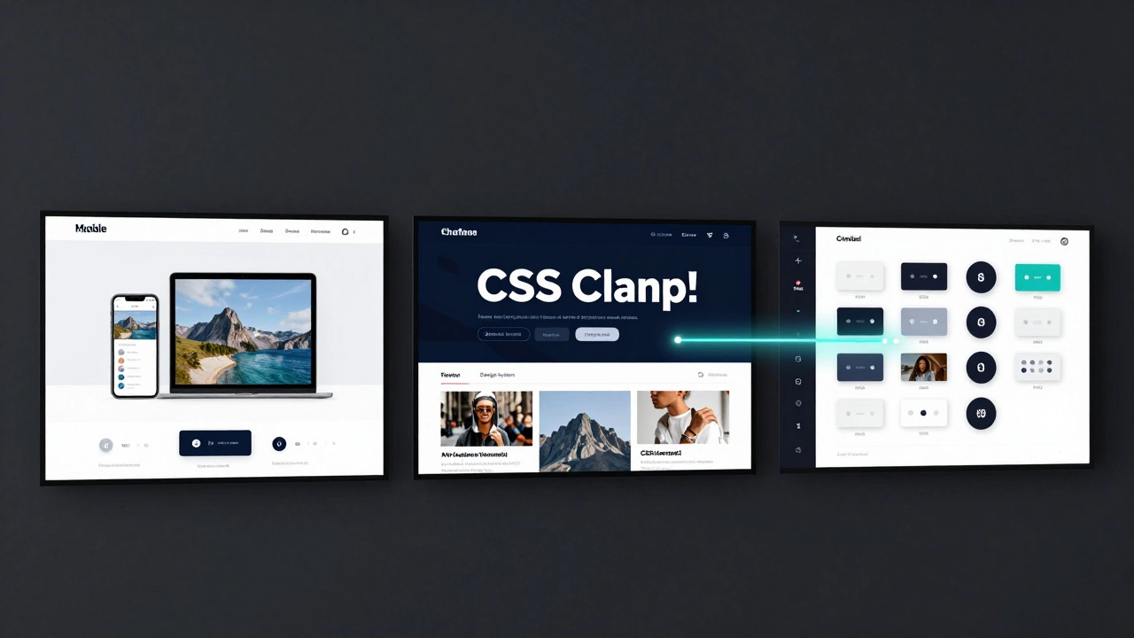
Fluid Design: Letting Layouts Flow Like Water
Fluid design takes responsive design’s core idea-using percentages instead of pixels-but pushes it further. Instead of setting breakpoints every 200px, fluid design removes them entirely. Elements scale continuously based on viewport width, using clamp(), minmax(), and calc() in CSS.
For example, a heading might use:
font-size: clamp(1.5rem, 4vw + 1rem, 3rem);This means the font size will never go below 1.5rem, never exceed 3rem, and grow smoothly between those points based on screen width. No breakpoints. No jumps. Just natural scaling.
Fluid design works best for content-heavy sites-blogs, news platforms, documentation portals-where readability matters more than rigid layout control. It’s also the foundation of modern design systems like Tailwind CSS’s fluid typography and Apple’s new website redesigns.
Design Systems: The Real Long-Term Alternative
Here’s the truth: the best alternative to responsive design isn’t a technique-it’s a mindset. Design systems treat layout as one part of a larger structure that includes typography, color, spacing, components, and interaction patterns.
Companies like Google, Airbnb, and Salesforce don’t build separate mobile and desktop sites. They build atomic components: a button, a card, a navigation bar-each with rules for how it behaves across contexts. A button might be 44px tall on mobile (for thumb access), 36px on desktop, and animated differently on touch devices. But it’s still the same component, defined once in code and reused everywhere.
Design systems use CSS custom properties (variables) to manage scale:
:root {
  --spacing-unit: 8px;
  --button-height: calc(var(--spacing-unit) * 5);
}

@media (min-width: 768px) {
  :root {
    --spacing-unit: 10px;
  }
}
This lets you adjust spacing globally with one change. It’s not about making layouts responsive-it’s about making components intelligent.
Mobile-First Isn’t a Technique-It’s a Philosophy
Many developers think mobile-first means starting with a small screen and scaling up. That’s half the story. True mobile-first means designing for constraints first: slow networks, small screens, limited attention spans, one-handed use.
When you design for those limits, you naturally strip away bloat. You prioritize content. You make interactions simple. Then, when you scale to desktop, you’re not adding features-you’re enhancing them. A hamburger menu becomes a full navbar. A stacked card layout becomes a grid. A single-column form becomes a two-column wizard.
Netflix’s interface evolved this way. On a phone, you scroll through rows of thumbnails. On a TV, you use a remote to navigate the same rows, but with bigger focus states and smoother animations. The structure didn’t change-only the interaction layer adapted.
Why Responsive Design Isn’t Enough Anymore
Responsive design was revolutionary because it solved a real problem: too many screen sizes. But today’s problem isn’t just screen size-it’s context. A user on a phone in bright sunlight, on a slow 3G connection, with one hand holding a baby, needs a different experience than someone on a 4K monitor in a quiet office.
Responsive design assumes all users are the same. It treats devices as static rectangles. But users aren’t static. They switch contexts constantly. They pause videos on their phone and resume on their tablet. They start reading an article on their laptop and finish it on their smartwatch.
Responsive design can’t adapt to that. It can’t detect if a user is in motion. It can’t know if they’re using a stylus or a finger. It can’t adjust based on ambient light or network speed.
That’s why modern alternatives focus on context-aware design: using device APIs, user preferences, and environmental data to tailor experiences-not just layouts.

What Should You Use Today?
Here’s the practical answer:
- If you’re building a content site (blog, news, documentation) → use fluid design with
clamp()and relative units. - If you’re building a complex app with precise control needs (e-commerce, admin panels) → use adaptive design with server-side detection.
- If you’re building for multiple platforms (web, iOS, Android, TV) → invest in a design system with shared components and tokens.
- If you’re starting from scratch → start with mobile-first principles, then layer on context-aware enhancements.
There’s no single winner. The best approach depends on your users, your content, and your goals. But the old rule-"make one layout that scales"-is outdated. The future isn’t about making things fit. It’s about making them feel right.
What About CSS Grid and Flexbox?
They’re tools, not alternatives. CSS Grid and Flexbox made responsive design possible in the first place. Today, they’re the foundation of fluid and adaptive layouts. You don’t replace responsive design with Grid-you upgrade it.
For example, a responsive layout might use Flexbox to stack cards vertically on mobile. A modern fluid layout uses Grid with auto-fit and minmax() to create dynamic columns that adjust continuously:
.grid {
  display: grid;
  grid-template-columns: repeat(auto-fit, minmax(280px, 1fr));
}
This creates columns that shrink or grow based on space, without breakpoints. It’s responsive design, but smarter.
Future-Proofing Your Design
The next five years will bring even more screen types: rollable phones, transparent displays, AR glasses, car dashboards. If your design relies on fixed breakpoints, you’ll be stuck rewriting everything.
Instead, build with:
- Relative units: rem, em, vw, vh
- CSS functions: clamp(), minmax(), calc()
- Design tokens: variables for spacing, color, typography
- Component libraries: reusable, context-aware UI elements
- Progressive enhancement: start simple, add complexity only when needed
These aren’t trends. They’re the building blocks of the next decade of web design.
Is adaptive design better than responsive design?
Adaptive design gives you more control over how your site looks on specific devices, which is great for apps with strict layout needs. Responsive design is more flexible and easier to maintain for content-heavy sites. Neither is universally better-it depends on your project’s goals. Use adaptive when precision matters. Use responsive when speed and simplicity do.
Can I use fluid design with WordPress?
Yes. Most modern WordPress themes (like Astra, GeneratePress, or Kadence) support fluid typography and spacing using CSS clamp() and custom properties. You don’t need to switch themes-just update your CSS. Many block themes in WordPress 6.0+ use fluid layouts by default.
Do I need to learn a new framework to use design systems?
No. Design systems are about structure, not tools. You can build one with plain HTML and CSS. Frameworks like Tailwind, Storybook, or Figma help, but they’re not required. Start by defining your spacing, colors, and button styles in CSS variables. Then reuse them across components. That’s a design system.
Is mobile-first still relevant?
More than ever. Mobile traffic still makes up over 60% of global web traffic. But mobile-first isn’t about designing for small screens-it’s about designing for limitations. If your site works well under slow networks, small screens, and one-handed use, it’ll work well everywhere else too.
What’s the biggest mistake people make when switching from responsive design?
They think it’s about replacing breakpoints with fluid layouts. But the real mistake is ignoring user context. A layout that looks great on a 14-inch laptop might be unusable on a 7-inch tablet held in a moving car. Always test in real conditions-not just in browser dev tools.
Stop asking what comes after responsive design. Start asking: what does your user need right now? The answer isn’t in a CSS property. It’s in how they live, move, and interact with the web.