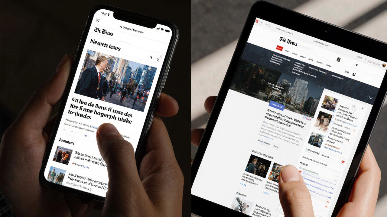
Responsive Design Breakpoint Calculator
Understand how your layout adapts to different screen sizes with this visual breakpoint calculator. Learn how to set proper breakpoints and avoid common responsive design mistakes.
Breakpoint Analysis
Common Responsive Mistakes
Don't make these errors:
- Using fixed pixel widths instead of percentages
- Not testing on real devices
- Assuming JavaScript fixes layout issues
- Forgetting the viewport meta tag
Mobile-First Best Practices
Follow these principles:
- Start with single-column layout for mobile
- Use flexbox and grid for layout
- Set images to max-width: 100%
- Make tap targets at least 48px
There’s no single language that builds a responsive website - but there’s a clear winning team. If you’re asking what language to learn or use for responsive design, you’re asking the wrong question. The real answer is a combo: HTML, CSS, and JavaScript. Together, they’re the only stack that works across every browser, device, and screen size today.
HTML is the skeleton - not the designer
HTML doesn’t make a site responsive. It just holds the content. But how you write it matters. A responsive site starts with clean, semantic HTML. That means using proper heading tags (<h1> to <h6>), wrapping content in <section> and <article> tags, and avoiding div soup. Sites built with messy HTML often break on mobile because the structure can’t adapt.
For example, a navigation menu built with a simple <ul> list is easy to turn into a hamburger menu on small screens. A menu built with ten nested <div> tags? That’s a nightmare to restructure with CSS. Good HTML gives CSS room to breathe.
CSS is where the magic happens
CSS is the real hero of responsive design. It’s what changes layouts based on screen size. The key tools? Media queries, flexbox, and grid.
Media queries let you apply styles only when certain conditions are met - like screen width. A common rule:
@media (max-width: 768px) {
  .container {
    padding: 1rem;
  }
}
This tells the browser: "When the screen is 768 pixels wide or smaller, shrink the padding." That’s how you go from a desktop layout to a mobile-friendly one.
Flexbox and CSS Grid are the backbone of modern layouts. Flexbox is perfect for one-dimensional layouts - like navigation bars or card lists that flow left to right. Grid handles two-dimensional layouts - think entire page layouts with headers, sidebars, and footers that rearrange on mobile.
Here’s the truth: if you’re using tables or floats for layout in 2025, you’re using outdated tools. Every major browser supports flexbox and grid. There’s no reason not to use them.
JavaScript adds behavior - not responsiveness
JavaScript doesn’t make a site responsive. But it can improve the experience. For example, a sticky header that hides when scrolling down, or a mobile menu that slides in with a tap. These are enhancements, not requirements.
Some developers think they need JavaScript to make a site work on mobile. That’s wrong. A responsive site should work with CSS alone. JavaScript should only add features that improve usability - not fix broken layouts.
Overusing JavaScript for responsiveness leads to slow loading. On a cheap Android phone in rural India, a 500KB JavaScript file can take 10 seconds to load. CSS? It loads in under a second. Keep JavaScript light. Use it for interactivity, not layout.
What about frameworks like React or Vue?
React, Vue, and Angular are JavaScript libraries. They help you build complex apps - but they don’t make sites responsive by themselves. You still need HTML and CSS to handle layout.
Many developers assume using React means their site is responsive. Not true. A React app with fixed-width containers and no media queries will look broken on phones. Frameworks don’t replace core web standards. They build on top of them.
Some frameworks come with built-in CSS systems - like Bootstrap or Tailwind. These can help, but they’re not magic. You still need to understand media queries, flexbox, and grid to use them well. Blindly copying a Bootstrap template won’t teach you responsive design. It just hides the learning.

What languages don’t work for responsive design?
Let’s clear up some myths.
- PHP - runs on the server. It can output HTML, but it can’t change layout based on screen size.
- Python - same as PHP. It can generate HTML, but doesn’t handle layout.
- Java - used for Android apps, not websites.
- C# - used in .NET apps, not for front-end responsive design.
These languages are great for back-end work - handling databases, user logins, or APIs. But none of them touch how a button looks on a 4-inch screen. That’s all CSS.
Real-world example: A news site that broke on mobile
A client came to me last year with a site that looked fine on desktop but was unusable on phones. The text overflowed the screen. Buttons were too small to tap. Images stretched out of bounds.
The problem? The site used a fixed-width container (1200px wide) and no media queries. The developer thought "it works on my monitor," so it was good enough.
We fixed it in two days:
- Replaced the fixed width with
max-width: 1200px; width: 100%- so it shrinks on small screens. - Added flexbox to the navigation - turned it from a horizontal bar into a vertical menu on mobile.
- Set images to
max-width: 100%; height: auto;- so they never overflow. - Increased tap targets to at least 48px - the WCAG standard for mobile buttons.
No JavaScript. No new framework. Just clean CSS and proper HTML.
What about CSS frameworks like Bootstrap or Tailwind?
They’re tools, not rules. Bootstrap gives you pre-built components. Tailwind gives you utility classes. Both can speed up development.
But here’s the catch: if you don’t understand how media queries work, you’ll end up with a site that looks like every other Bootstrap site - generic and bloated. Tailwind can help you write less CSS, but you still need to know when to use md:flex or sm:hidden.
For beginners, Bootstrap is easier to start with. For advanced developers, Tailwind gives more control. But neither replaces learning the core three: HTML, CSS, JavaScript.

The one rule that matters
Build mobile-first. That means design for the smallest screen first, then add complexity for larger screens.
Most developers start with desktop. They make a fancy layout with sidebars, big images, and hover effects. Then they try to "make it work" on mobile - and end up hiding everything with display: none;.
Mobile-first flips that. Start with a single column. Stack content. Make buttons big. Use simple fonts. Then, as the screen gets wider, use media queries to add columns, adjust spacing, and bring back hover effects.
This approach forces you to focus on what’s essential. It also makes your site faster - because you’re not loading desktop assets on phones.
What skills should you learn next?
Master these in order:
- HTML structure - semantic tags, form inputs, accessibility attributes
- CSS layout - flexbox, grid, positioning
- Media queries - breakpoints, mobile-first approach
- CSS variables - for consistent theming across devices
- JavaScript basics - event listeners, DOM manipulation, form validation
Don’t jump into React or Vue until you can build a responsive layout with plain HTML and CSS. You’ll thank yourself later.
Common mistakes to avoid
- Using fixed pixel widths for containers - use percentages or
max-widthinstead. - Ignoring touch targets - buttons should be at least 48x48 pixels.
- Not testing on real devices - emulators lie. Test on an old iPhone or Android phone.
- Using images that are too big - serve different sizes with
<picture>orsrcset. - Assuming JavaScript fixes layout - it doesn’t. CSS does.
One client I worked with spent $12,000 on a React app that failed Google’s Mobile-Friendly Test. Why? They used a fixed-width container and no media queries. The fix? $0. Just change the CSS. No code rewrite needed.
Final answer: What’s the best language?
There is no single language. The best "language" for a responsive website is the combination of HTML, CSS, and JavaScript - used correctly.
HTML gives structure. CSS makes it adapt. JavaScript adds polish.
Learn them in that order. Ignore the hype. Stop chasing frameworks. Build something simple. Test it on your phone. Then make it better. That’s how responsive design works in 2025 - not with magic code, but with clear thinking and clean standards.
Is JavaScript required for a responsive website?
No, JavaScript is not required. A responsive website can be built entirely with HTML and CSS. JavaScript enhances interaction - like opening a mobile menu or hiding a banner - but it doesn’t control layout. If your site only works with JavaScript enabled, it’s not truly responsive.
Can I use Python or PHP to make a site responsive?
No. Python and PHP run on the server and generate HTML. They can output different HTML based on the device, but that’s not responsive design - it’s server-side rendering. Responsive design means the browser adjusts the layout using CSS, not the server sending different code. Modern responsive sites use the same HTML for all devices and let CSS handle the rest.
What’s the best breakpoint for mobile design?
There’s no single "best" breakpoint. Start with mobile-first, then adjust based on your content. Common breakpoints are 480px (small phones), 768px (tablets), and 1024px (small laptops). But the real rule is: test your layout as you resize the browser. Change the breakpoint when the design breaks - not because you’re following a template.
Do I need to learn CSS Grid if I use Bootstrap?
Yes. Bootstrap uses grid under the hood, but if you don’t understand how CSS Grid works, you’ll be stuck copying classes without knowing why they work. You’ll also struggle to customize layouts that Bootstrap doesn’t provide. Learning CSS Grid gives you full control - even when frameworks fall short.
Why does my site look fine on my phone but broken on my friend’s phone?
Your phone might be newer, with a high-resolution screen and fast browser. Your friend’s phone might be older, with a smaller screen or slower processor. Test on multiple devices - especially older Android phones. Also check if you’re using viewport meta tag: <meta name="viewport" content="width=device-width, initial-scale=1">. Without it, mobile browsers assume the site is desktop-sized and zoom out, breaking the layout.
