Touch Target Size Calculator
Mobile Touch Target Checker
The article explains that touch targets should be at least 44px x 44px for mobile usability. This tool helps you verify if your design elements meet this standard.
44px minimum is industry standard for buttons, links, and interactive elements on mobile devices.
Enter dimensions to check if your element meets mobile touch target standards.
Most websites today get more than half their traffic from phones. If your UI doesn’t adjust to different screen sizes, you’re losing users before they even see your content. Making a responsive UI design isn’t about making things look pretty on an iPhone-it’s about ensuring your site works, loads fast, and feels natural no matter what device someone uses.
Start with the viewport meta tag
Before you write a single line of CSS, make sure your HTML has the right viewport tag. It’s simple, but it’s often missing. Without it, mobile browsers will render your site as if it’s a desktop page, then shrink it down to fit. That means tiny text, horizontal scrolling, and frustrated users.
Add this inside the <head> of every page:
<meta name="viewport" content="width=device-width, initial-scale=1">This tells the browser: "Use the actual width of the device, and don’t zoom out." It’s the foundation. Skip this, and everything else you do will be fighting against the browser’s default behavior.
Use fluid layouts, not fixed pixels
Fixed widths like width: 960px break on small screens. Responsive design means your layout flows. Use percentages, max-width, and flexbox instead.
Instead of this:
.container { width: 960px; margin: 0 auto; }Do this:
.container { max-width: 1200px; width: 90%; margin: 0 auto; }Now your container will never be wider than 1200px on big screens, but it’ll shrink to 90% of the screen width on phones. That’s fluid. Combine this with CSS Grid or Flexbox, and you can build layouts that rearrange themselves without needing dozens of media queries.
Build mobile-first, not desktop-first
Most designers start by designing for a big screen, then try to shrink it down. That’s backwards. Start with the smallest screen, then add complexity as the screen gets bigger.
Here’s how:
- Write your base CSS for mobile. No media queries yet.
- Only use
@media (min-width: 768px)to add styles for tablets and up. - Never use
@media (max-width: 767px)unless you’re overriding something specific.
This approach means your site works on phones out of the box. Larger screens get enhancements, not fixes. It’s faster to develop, easier to test, and more reliable in the long run.
Use media queries to refine, not rebuild
Media queries are your tool for fine-tuning-not rewriting your whole layout. Don’t create a new layout for every screen size. Most sites only need three breakpoints:
- Mobile: under 768px
- Tablet: 768px to 1024px
- Desktop: over 1024px
Here’s a real example:
.nav-menu { display: block; }

@media (min-width: 768px) {
  .nav-menu { display: flex; }
}

@media (min-width: 1024px) {
  .nav-menu { justify-content: flex-end; }
}
On mobile, the menu stacks vertically. On tablets, it turns horizontal. On desktop, it aligns to the right. That’s three states, one layout, no clutter.
Avoid going beyond five breakpoints. Every extra one adds complexity, testing time, and bugs. Stick to the essentials.
Images and media must adapt too
A 3MB hero image looks great on a desktop, but it’s a disaster on a phone with slow data. Responsive design isn’t just about layout-it’s about performance.
Use srcset and sizes to serve different image sizes:
<img src="image-800.jpg"
     srcset="image-400.jpg 400w, image-800.jpg 800w, image-1600.jpg 1600w"
     sizes="(max-width: 768px) 100vw, (max-width: 1024px) 50vw, 25vw"
     alt="Hero image">
This tells the browser: "If the screen is under 768px wide, use 100% of the viewport width. If it’s between 768px and 1024px, use half the width. Otherwise, use a quarter." Then it picks the best image file from the list.
Also, use object-fit: cover on background images so they don’t stretch or leave empty space:
.hero-image {
  width: 100%;
  height: 300px;
  object-fit: cover;
}
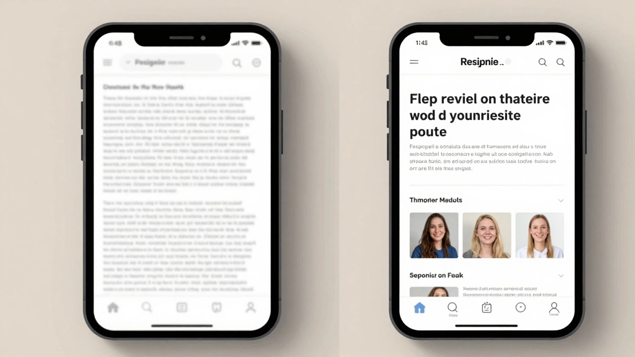
Touch targets matter
People tap with their fingers, not mouse pointers. A button that’s 10px wide is impossible to tap accurately. The industry standard is at least 44px by 44px for touch targets.
Check your links, buttons, and form fields. If they’re smaller than that, make them bigger-even if it means changing the design. Better to have some extra whitespace than frustrated users tapping the wrong thing.
Also, leave space between interactive elements. At least 8px of padding between buttons prevents accidental taps. This isn’t just design-it’s usability.
Test on real devices, not just simulators
Chrome DevTools is useful, but it doesn’t tell the whole story. Real phones have different screen densities, browser quirks, and performance limits.
Test on:
- An older Android phone (5-7 years old)
- An iPhone SE or older
- A tablet in portrait and landscape mode
Load your site on these devices. Does it take more than 3 seconds to render? Do buttons feel sluggish? Does text get cut off? If yes, go back and fix it.
Don’t skip this step. 68% of users abandon a site if it takes longer than 3 seconds to load on mobile (Google, 2025).
Responsive isn’t optional-it’s expected
There’s no such thing as a "desktop-first" website anymore. If your design doesn’t work on a phone, it doesn’t work at all. Responsive UI design isn’t a feature. It’s the baseline.
Every element you build-from a navigation menu to a contact form-must be tested across devices. You don’t need fancy tools. You need discipline: start small, keep layouts fluid, serve smart images, and test on real hardware.
Once you do, you’ll notice something: users stay longer. They complete forms. They buy things. They come back. That’s the real goal-not just making things look good on every screen, but making them work well.
Do I need to use a framework like Bootstrap to make a responsive UI?
No. Frameworks like Bootstrap, Tailwind, or Foundation can speed up development, but they’re not required. Many responsive sites are built from scratch using only CSS Grid, Flexbox, and media queries. The key isn’t the tool-it’s the approach: fluid layouts, mobile-first design, and testing on real devices. If you’re learning, skip the framework at first. Build it yourself so you understand how it works.
How many breakpoints should I use?
Most sites work well with three: mobile (under 768px), tablet (768px-1024px), and desktop (over 1024px). You can add a fourth for large monitors (1440px+), but beyond that, you’re over-engineering. The goal is to support common device sizes, not every possible width. Use real user data if you have it-Google Analytics shows which screen sizes your visitors actually use.
Why does my site look fine on Chrome but broken on Safari?
Safari has different default styles and sometimes doesn’t support newer CSS features as quickly as Chrome. Always test on Safari, especially on iOS. Common issues include flexbox alignment, grid gaps, and viewport units. Use vendor prefixes if needed (like -webkit-flex), and always validate your CSS with the W3C validator. Also, check for missing viewport meta tags-Safari is strict about that.
Can I use JavaScript to make my UI responsive?
You can, but you shouldn’t rely on it. JavaScript can adjust layouts, but it’s slower than CSS and can cause flickering or delays. CSS handles responsiveness natively and is more reliable. Use JavaScript only for dynamic behavior-like hiding a menu when a button is clicked-not for resizing elements. If your layout changes based on JS, you’re probably missing a CSS solution.
What’s the biggest mistake people make with responsive design?
Designing for desktop first, then trying to shrink it down. This leads to tiny text, overlapping elements, and slow load times on mobile. The fix is simple: start with mobile. Build the simplest version that works, then add complexity for larger screens. It’s easier, faster, and results in a better experience for the majority of users.