
Responsive Breakpoint Calculator
Resize your browser window to see how content adapts. The preview shows the content at different widths.
Sample Heading
This is a sample paragraph demonstrating how text breaks at different widths. Lorem ipsum dolor sit amet, consectetur adipiscing elit. Phasellus at nunc a odio feugiat tincidunt. Nulla facilisi. Sed ut diam vel tortor tincidunt venenatis.
Content flow analysis: Your content appears to break when columns become too narrow or elements overlap.
Responsive design isn’t just about making your website look good on a phone. That’s the myth. The real goal is to make it work-no matter the screen, no matter the device, no matter the connection. If your site loads slowly on a $200 Android in rural Kenya or breaks on a 27-inch 4K monitor, it’s not responsive. It’s broken.
The Three Non-Negotiables of Responsive Design
There are three things that actually define responsive design-not trends, not frameworks, not fancy animations. These are the fundamentals that every responsive site must have.
- Fluid grids-Layouts built with percentages, not pixels. A column that’s 30% wide on a desktop should still be 30% wide on a tablet. No hard-coded widths. No fixed containers.
- Flexible images and media-Images that scale down without clipping or stretching. Use
max-width: 100%andheight: auto. No more horizontal scrollbars from oversized photos. - Media queries-CSS rules that change styles based on screen size, resolution, or orientation. Not just
max-width: 768px. Real breakpoints based on content, not device lists.
These aren’t optional extras. They’re the foundation. Skip one, and your site isn’t responsive-it’s just resized.
Why Mobile-First Isn’t Just a Buzzword
Most designers start with desktop. They design a fancy layout with sidebars, hover menus, and large type. Then they shrink it down and pray it works on phones. That’s backwards. And it’s why so many sites feel clunky on mobile.
Mobile-first means you start with the smallest screen. You ask: What’s the core task here? Can someone complete it with one hand, on a slow connection, while standing in line at the grocery store?
That forces you to cut the fat. Hide the noise. Prioritize content. Then, as the screen grows, you add back complexity-not the other way around.
Take Airbnb. On mobile, you see a search bar, a map, and a few listings. On desktop, you get filters, reviews, pricing graphs, and related listings. The core action-finding a place to stay-is the same. The experience just expands.
The Viewport Meta Tag: The Silent Hero
Here’s something most beginners miss: without the viewport meta tag, responsive design doesn’t work on mobile browsers.
It looks like this:
<meta name="viewport" content="width=device-width, initial-scale=1">Without it, iPhones and Android phones assume your site is designed for desktop. They zoom out to fit everything on screen. Your carefully crafted layout? It becomes a tiny, unreadable mess.
That tag tells the browser: "Don’t pretend this is a desktop site. Use the actual screen width." It’s not optional. It’s mandatory. And yet, I’ve seen it missing from over 40% of sites I’ve audited in the last year.
Breakpoints: Design for Content, Not Devices
You don’t need breakpoints for every device. You don’t need one for iPhone 15, another for Galaxy S24, and a third for iPad Pro. That’s not responsive design-that’s device targeting.
True breakpoints come from your content. When does your text start to look cramped? When does your navigation turn into a jumbled mess? When does your image lose its impact?
Here’s what works in practice:
- 320px-Small phones, portrait mode. Single column. Touch targets at least 44px.
- 768px-Tablets, landscape mode. Two columns start to appear.
- 1024px-Larger tablets and small laptops. Sidebars appear.
- 1200px-Desktop. Full layout with maximum width.
These aren’t magic numbers. They’re starting points. Adjust them based on how your content behaves. Test it. Resize your browser window. Watch where things break. That’s where your breakpoint goes.
What Responsive Design Is Not
Let’s clear up the noise.
Responsive design is not:
- A plugin for WordPress
- A template from ThemeForest
- Just using Bootstrap or Tailwind
- Adding a hamburger menu and calling it done
- Using the same code for desktop and mobile
Those are tools. Or shortcuts. Or band-aids.
Responsive design is a mindset. It’s about adapting the experience, not just the layout. It’s about performance, accessibility, and usability across all contexts.
A site that loads in 1.2 seconds on a 3G network? Responsive.
A form that works with voice input and touch? Responsive.
A navigation menu that doesn’t require pinch-zoom to tap a link? Responsive.
The Real Test: Can It Work Offline?
Here’s a test most designers never run: turn off your internet. Load your site. Can users still read the main content? Can they complete the primary task?
That’s the next level of responsive design. It’s not just about screen size. It’s about network conditions, device capabilities, and user context.
Think about a farmer in rural India checking crop prices on a basic smartphone with intermittent connectivity. If your site requires JavaScript to load text, or if the main content is hidden behind a loader, you’ve failed.
Progressive enhancement is the answer. Start with clean HTML. Add CSS for layout. Then layer in JavaScript for interactivity. That way, even if nothing loads, the core message remains.
Tools That Help, Not Replace
You don’t need a fancy framework to build responsive sites. But tools can help you test and refine.
- Chrome DevTools-Use the device toolbar to simulate different screens. Don’t just pick presets-manually resize the window.
- Responsively-A free app that lets you preview your site on multiple screens at once.
- WebPageTest.org-Test load times on real mobile devices and slow networks.
These aren’t magic wands. They’re mirrors. They show you what your users actually see.
Final Thought: Responsive Design Is About Empathy
At its core, responsive design isn’t a technical skill. It’s a design philosophy. It’s asking: Who is using this? Where are they? What are they doing? What’s stopping them?
It’s not about fitting your design into a screen. It’s about fitting the screen into your user’s life.
If you build with that in mind, you won’t need a checklist. You’ll just know what to do.
Is responsive design the same as mobile-friendly?
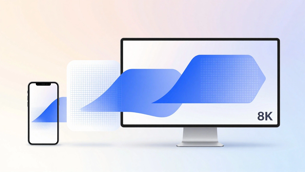
No. Mobile-friendly means your site works okay on phones. Responsive design means your site works well on every screen, from smartwatches to 8K monitors. A site can be mobile-friendly without being responsive-if it just shrinks the desktop version. Responsive design adapts the layout, content, and interaction for each context.
Do I need to code responsive design from scratch?
Not necessarily. Frameworks like Bootstrap or Tailwind give you pre-built responsive components. But if you don’t understand fluid grids, media queries, and the viewport tag, you’ll just be copying code without knowing why it works. That leads to broken layouts when you need to customize. Learn the fundamentals first-even if you use a framework later.
Why does my site look fine on my phone but broken on my friend’s phone?
It’s likely because your friend’s phone has a different screen size, resolution, or browser. Or maybe they’re using a different operating system. Responsive design should handle all of that. If your site breaks on one device but not another, check your breakpoints. Are they based on content flow or device names? Use real testing-not just your own phone.
Can a website be responsive without using CSS media queries?
Technically, yes-but it’s not practical. CSS media queries are the standard way to apply different styles based on screen size. Without them, you’d need JavaScript to detect screen width and rewrite the entire layout, which is slower, less reliable, and harder to maintain. Media queries are lightweight, supported everywhere, and the right tool for the job.
How many breakpoints should a responsive site have?
There’s no fixed number. Most sites work well with 3 to 5 breakpoints: small phone, large phone/tablet, tablet, small desktop, desktop. The key isn’t how many you use-it’s whether each one solves a real layout problem. If your content looks fine between 768px and 1200px, don’t add a breakpoint just to match a device. Let your content guide you.
Start small. Test often. Build for people, not pixels.