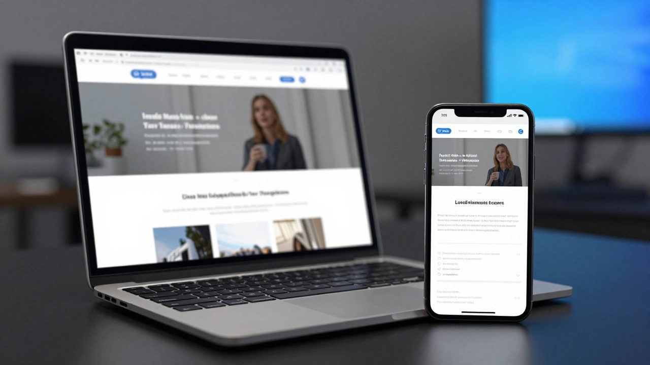
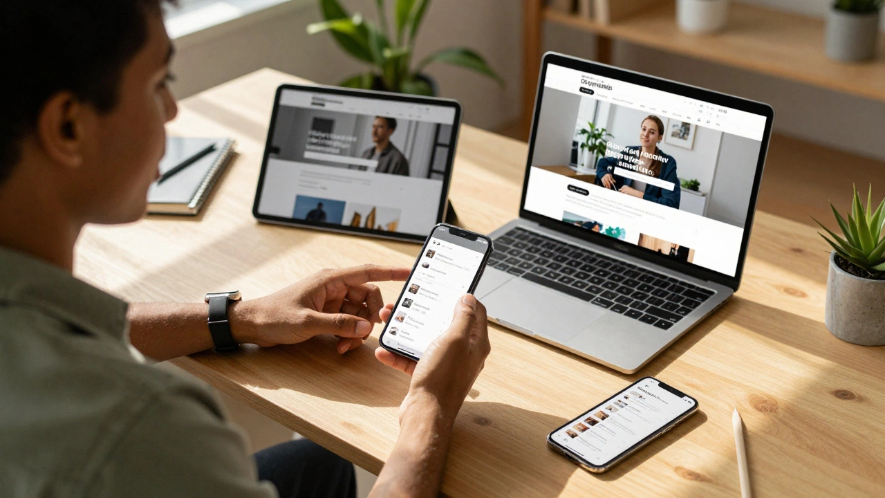
Responsive Design Studio
Unit Converter (Px to Rem/Pct)
Replace rigid pixel values with flexible units based on your base font size.
Touch Target Validator
Check if buttons are large enough for fingers (min 44x44px).
Ready-to-Copy Snippets
Essential code blocks from the guide.
<meta name="viewport" content="width=device-width, initial-scale=1.0">.container {
display: flex;
flex-wrap: wrap;
}
.item {
flex: 0 0 50%; /* Half width */
max-width: 50%;
}img {
max-width: 100%;
height: auto;
display: block;
}Your website might look perfect on a large laptop screen, but does it survive a quick glance on a smartphone? In 2026, over half of all global internet traffic comes from mobile devices. If your visitors have to pinch and zoom to read your content, they leave. You don't necessarily need a total rebuild to fix this. Most older sites just need specific structural adjustments to become truly mobile-ready.
This guide skips the theory and gives you the exact steps to adapt your legacy code. We cover everything from fixing the fundamental metadata to handling stubborn layout glitches. Let's get your site working everywhere.
The Quick Fix: Meta Tags and Basic Reset
Before touching complex CSS, you need to tell the browser how to handle your page on small screens. The biggest mistake developers make is missing the viewport configuration. Without this, mobile browsers assume you built for a desktop monitor and simply shrink the entire page down, making text unreadable.
You need to add a specific line to your HTML head section. Look for where your other meta tags live. Insert the Viewport Meta Tagis an HTML element that controls width and scaling on mobile devices. right there.
This single line tells the device to match the viewport width to the screen size and set the initial zoom level to 100%. If you skip this step, no amount of styling will save your layout. It effectively switches off the browser's default desktop emulation mode.
Moving Away From Fixed Pixels
Old websites often rely on fixed measurements. You might have set a container div to 960 pixels wide or buttons to 100 pixels tall. These absolute numbers are rigid anchors that break when the screen gets smaller than them. To fix this, we switch to relative units.
Replace hard-coded pixel widths with percentages or fractional units. Instead of `width: 960px`, use `max-width: 100%` combined with a `margin: 0 auto` to center content. This ensures the element shrinks to fit the phone screen but doesn't stretch infinitely wide on massive monitors.
Fonts work the same way. If your paragraph text is locked at 12px, it might vanish on a high-density retina display. Switch your typography to using `rem` or `em` units instead. These units calculate size based on the browser's default setting or parent element, allowing text to scale comfortably across different device densities.
Implementing CSS Grid and Flexbox
If your layout relies on floated elements or old-school table structures, you're fighting against gravity. Modern tools make alignment much easier. CSS Gridis a two-dimensional layout system for designing complex web structures. and Flexboxis a one-dimensional layout method for arranging items in rows or columns. solve the stacking issue completely.
Start by wrapping your content columns in a Flexbox container. Set the container to `display: flex` and give the items `flex-wrap: wrap`. This simple change allows your three-column layout to stack vertically automatically when the screen width drops below a certain limit. You stop worrying about clearing floats because the browser handles the overflow logic for you.
Making Images Adapt to Screen Size
Images are often the heaviest assets on a page. On a non-responsive site, a large hero banner image often forces horizontal scrolling on a phone. The browser loads the full file size even if the screen only shows a tiny fraction of it. This kills performance and frustrates users.
To fix this, apply `max-width: 100%` and `height: auto` to your image classes. This constraint stops an image from ever being wider than its container. When the phone shrinks the container, the image shrinks with it proportionally. You won't see cut-off edges anymore.
| Property | Old Method (Fixed) | New Method (Fluid) |
|---|---|---|
| Width | 500px | max-width: 100% |
| Height | 300px | auto |
| Sizing Logic | Static | Parent-relative |

Handling Navigation Menus
A navigation bar designed for a desktop monitor often breaks badly on mobile. Long menus spill off the side of the screen, becoming unusable. You need a mechanism that reorganizes links when space runs out.
The industry standard is a hamburger menu icon. On small screens, hide the long list of links and show a generic button. When tapped, a vertical drawer slides out or expands downward. This preserves space while keeping functionality intact.
However, don't hide essential options too deep. If you sell products, put top categories near the top. If the only way to find them is digging through three levels of hidden menus, users drop off. Balance clean visuals with accessibility.
Touch Targets and Spacing
Fingers are clumsy compared to mouse cursors. An old site might have links separated by two pixels. That works fine with a mouse click, but it's impossible to tap on a touchscreen without mistakes.
Ensure every clickable link or button has a touch target of at least 44x44 pixels. Add enough padding around text links so users can tap safely. Increase the gap between interactive elements. If two buttons sit right next to each other, separate them visually to prevent accidental clicks. This attention to spacing drastically improves user experience and reduces bounce rates.
Testing Your Changes Properly
You can't guess if your changes work. You have to test them. While simulators in browser developer tools are convenient, they aren't perfect. They simulate resolution well but sometimes miss how real hardware renders fonts or handles JavaScript interactions.
Use the Browser DevToolsare built-in debugging tools that allow inspection of code and device simulation. in Chrome or Safari to toggle the device toolbar. Select specific models like an iPhone SE or Pixel to see exact pixel dimensions. Scroll through your entire site in this mode.
If possible, open your local server version on an actual physical phone connected to your network. Nothing beats seeing the real thing. Watch out for unexpected behavior like font smoothing or weird rendering quirks that only appear on native operating systems.
Addressing Performance on Mobile Data
Responsiveness isn't just about sizing; it's also about speed. Many mobile users rely on cellular data, which can be slower than home Wi-Fi. Heavy scripts and massive unoptimized images drain battery and patience.
Lazy load your images so they only download when the user scrolls close to them. Use the `
Minimize external requests. Old themes often pull in jQuery libraries or fonts that the browser can't cache efficiently. Consolidate these calls to improve load times. Fast loading pages rank better in search results and keep people reading longer.
Troubleshooting Common Legacy Issues
Sometimes, despite best efforts, things still glitch. Here is what to look for when the layout refuses to behave.
- Horizontal Scrollbar: This happens when something exceeds 100% of the viewport width. Check for images with hardcoded pixel widths or containers without negative margins handled properly.
- Z-Index Layering: Floating elements like banners might disappear behind text or navbars. Adjust your z-index properties in your media queries to ensure overlays stay on top.
- Font Scaling: Text jumping sizes unexpectedly might be due to mixed font units. Stick to one base unit, typically `rem`, throughout your stylesheet to maintain consistency.
Container Queries vs Media Queries
We used to rely entirely on Media Queries, which check the screen size of the browser window. But in 2026, we have better tools. Container Queries allow components to adjust based on the size of their immediate parent container rather than the whole screen. This makes your modules more reusable and flexible.
If a widget sits in a narrow sidebar versus a wide main column, Container Queries let that specific widget resize itself independently without needing a global breakpoint rule. It decouples the component from the page layout, offering cleaner separation of concerns.
While not all legacy browsers support this fully, fallback support for older versions is straightforward. Start implementing this for new modules while maintaining media queries for major breakpoints like tablets vs phones.
Summary of Actions
Turning a static site into a dynamic one takes focused effort. You must update the viewport settings, shift from pixels to percentages, and embrace flexible box models. Test rigorously on real devices and focus on speed. The result is a site that welcomes everyone, regardless of how they access it.
Do I need to rewrite my whole website to make it responsive?
Not necessarily. Often, adding a viewport meta tag and updating CSS to use relative units solves most issues. Major structural overhauls are only needed if your site relies heavily on fixed pixel widths or obsolete table layouts.
What is the best tool for testing responsive design?
Google Chrome DevTools is excellent for quick checks because it simulates various devices. However, testing on a real physical device like an iPhone or Android tablet is always recommended for final verification.
Why is my text too small on mobile devices?
This usually happens when fonts are set to fixed pixel sizes. Switch your CSS font-size to rem or em units and ensure your root font size scales appropriately within your mobile media queries.
How do I handle images that don't fit the screen?
Add the CSS rule max-width: 100% and height: auto to your img selector. This forces images to shrink to fit their container while maintaining their aspect ratio automatically.
What are Container Queries and do I need them yet?
Container Queries let styles depend on the element's container size rather than the screen. As of 2026, most modern browsers support them, making them valuable for modular designs, though standard media queries remain useful for overall layout shifts.