
Fixed-Width Layout Simulator
See how fixed-width layouts break on different devices. This simulator demonstrates why responsive design is essential for modern websites.
Layout Demonstration
This is a fixed-width layout at 960px. Notice how it breaks on smaller screens.
Most websites today adapt to any screen size - phones, tablets, laptops, even smart TVs. But if you’ve ever visited a site that looks broken on your phone, or forces you to pinch and zoom just to read a paragraph, you’ve seen the opposite of responsive web design. It’s not just outdated - it’s frustrating. And it’s still out there.
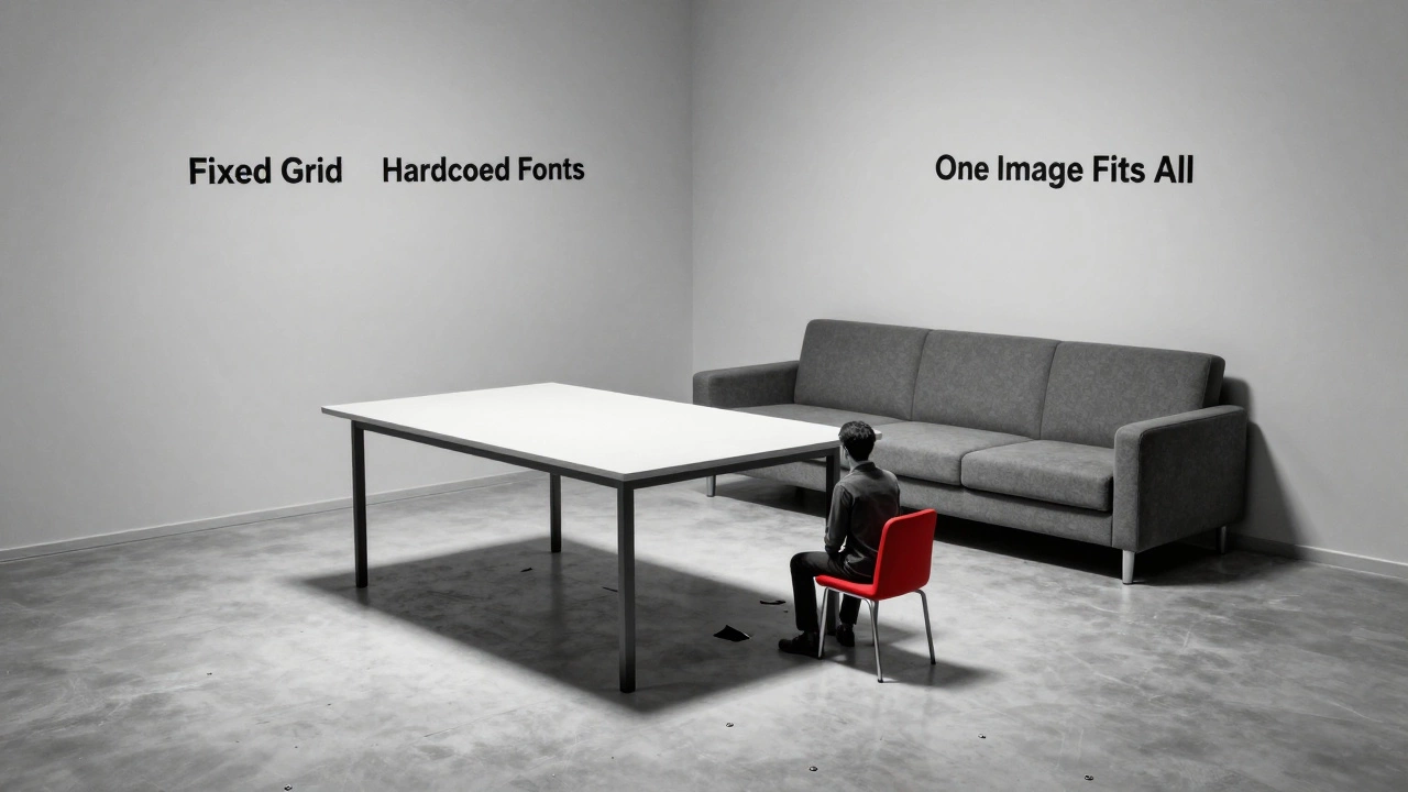
What You’re Actually Seeing
The opposite of responsive web design isn’t one single thing. It’s a group of old-school techniques that ignore how people actually use the web today. You’ll find them on legacy systems, small business sites that haven’t been updated since 2012, or in poorly built templates. These sites assume everyone views content on a 1920px desktop monitor. That’s it. No exceptions.
When you land on one of these sites, you don’t get a smooth experience. You get horizontal scrollbars. Text that spills off the screen. Buttons too small to tap. Images that stretch unnaturally. It’s like trying to fit a full-sized poster into a phone case.
Fixed Width Layouts
The most common form of non-responsive design is the fixed width layout. These sites use hard-coded pixel values like width: 960px; or width: 1024px;. That means no matter what device you’re on - iPhone 15, iPad, or a 4K monitor - the site stays exactly that size. On a phone, you’re forced to scroll sideways. On a large monitor, you’re left with giant empty spaces on both sides.
Back in the early 2000s, this made sense. Most people used desktops with similar screen sizes. But today? The average mobile screen width is around 414px. A 960px layout is over twice that. It’s like designing a car for 1998 and expecting it to work on a highway built in 2026.
Desktop-Only Design
Some sites don’t just ignore mobile screens - they actively block them. You’ll see messages like: "This site works best on desktop." Or worse - the site loads, but buttons don’t work, forms freeze, or navigation menus vanish entirely on touch devices.
This isn’t accidental. It’s a choice. Developers who build these sites often assume mobile users are less important. Maybe they think their audience is all corporate users with laptops. Maybe they’re lazy. Or maybe they’re stuck with an old CMS that doesn’t support modern CSS.
Here’s the truth: Google penalizes non-mobile-friendly sites in search rankings. If your site doesn’t work on phones, you’re invisible to half the web.
Fluid Grids vs. Static Grids
Responsive design uses fluid grids - layouts built with percentages, vw units, or CSS Flexbox and Grid. These systems stretch and shrink based on the screen. A column might be 50% wide on a desktop, but 100% on a phone.
The opposite? Static grids. These use fixed pixel widths for every container. No flexibility. No adaptability. A sidebar stays 300px wide no matter what. A header stays 1200px. Even if the user’s browser window is 600px wide.
Imagine a room where every piece of furniture is bolted to the floor. You can’t rearrange it. You can’t move it. Even if you’re in a tiny apartment. That’s a static grid.

Non-Adaptive Images
Responsive sites serve different image sizes based on device. A phone gets a 400px-wide image. A desktop gets a 1200px version. This keeps load times fast and visuals sharp.
The opposite? One giant image - say, 2000px wide - forced to shrink down on mobile. That’s a 5MB file on a phone with a 2G connection. Load times jump to 10+ seconds. Data usage spikes. Users leave.
Worse, some of these sites use img tags without srcset or sizes attributes. No fallbacks. No optimization. Just one size fits none.
Hardcoded Font Sizes
Responsive typography uses relative units: rem, em, or vw. These scale based on the user’s settings or screen size. A heading might be 2.5rem on desktop and 1.8rem on mobile - still readable, still proportional.
Non-responsive sites? They use font-size: 16px; - fixed. On a phone, that text is tiny. On a TV, it’s microscopic. Users can’t zoom in without breaking the layout. And if they use accessibility settings to increase text size? The site breaks completely.
Why This Still Exists
You might think these designs are dead. But they’re not. They’re hiding in plain sight.
- Small businesses using cheap website builders that lock them into static templates.
- Legacy government portals that haven’t been updated since 2015.
- Corporate intranets built for desktop-only use (even though employees now work remotely).
- Freelancers who learned web design before 2014 and never updated their skills.
Even some agencies still offer "desktop-first" packages because they’re easier to build. They don’t mention the mobile trade-off. Clients think they’re getting a modern site. They’re not.
What Happens When You Ignore Responsiveness
Let’s say you run a local bakery. You have a website built in 2011. It looks great on your laptop. But when customers try to find your hours on their phones, they can’t tap the "Contact" button. They call instead. You get 20 extra calls a day. You lose sales. You lose trust.
Or imagine you’re a freelance designer. You show a client a portfolio site with fixed-width layouts. They say, "This looks old." They hire someone else. You lose the job.
Google’s mobile-first indexing means your site’s mobile version is now the main version. If it’s broken, your rankings drop. Your traffic drops. Your revenue drops.
The Real Cost
It’s not just about aesthetics. It’s about accessibility. It’s about compliance. In the EU and US, websites must meet accessibility standards. A fixed-width layout that can’t be zoomed fails WCAG 2.1 guidelines. You could be legally at risk.
And then there’s the human cost. People with motor impairments, low vision, or older users rely on zoom and screen readers. A static site ignores them. It says: "You don’t belong here."
What Should You Do?
If you’re still building or maintaining a non-responsive site, stop. It’s not a matter of "maybe." It’s a matter of "now."
Start by auditing your site with Google’s Mobile-Friendly Test. If it fails, you have work to do. You don’t need to rebuild everything. But you need to:
- Replace fixed widths with relative units (
%,rem,vw) - Use media queries to adjust layouts at key breakpoints
- Optimize images with
srcsetandsizes - Set viewport meta tag:
<meta name="viewport" content="width=device-width, initial-scale=1"> - Test on real devices - not just Chrome DevTools
There’s no excuse in 2026. Tools like CSS Grid, Flexbox, and modern frameworks make responsive design easier than ever. You don’t need to be a coding expert. You just need to care.
Final Thought
The opposite of responsive web design isn’t a technical term. It’s a mindset. It’s the belief that users should adapt to your site - not the other way around. That mindset is dead. And if you’re still living in it, you’re not just behind. You’re invisible.
Is a static website the opposite of responsive web design?
Yes, a static website is one of the clearest opposites of responsive web design. Static sites use fixed pixel widths, hardcoded fonts, and single-image versions that don’t adjust to screen size. They were common before 2012, but today they fail on mobile devices, hurt accessibility, and hurt SEO. Responsive design adapts. Static design doesn’t.
Can a website be partially responsive?
Technically, yes - but it’s a bad idea. A site that works well on desktop but breaks on mobile isn’t "partially responsive." It’s broken. Google treats it as non-mobile-friendly. Users leave. Conversion rates drop. Partial responsiveness is like having half a seatbelt - it gives a false sense of safety. Full responsiveness is the only standard that matters today.
Do all old websites have fixed layouts?
Not all, but most. Websites built before 2013 rarely included responsive features. Even sites built with tools like WordPress before 2015 often used themes that didn’t support fluid layouts. If a site looks like it was designed for a 1024px screen with no scrolling on mobile, it’s almost certainly not responsive. Tools like Google’s Mobile-Friendly Test can confirm this in seconds.
Is responsive design the same as mobile-first design?
They’re related, but not the same. Responsive design means the layout adapts to any screen size - from phones to 4K monitors. Mobile-first design is a strategy: you start by designing for the smallest screen, then add features for larger ones. Most modern responsive sites use mobile-first principles. But you can build a responsive site without going mobile-first - it’s just harder and less efficient.
Why do some companies still use non-responsive designs?
Three main reasons: ignorance, cost, and legacy systems. Some owners don’t know mobile traffic is over 60%. Others think redesigning is too expensive - even though fixing a broken site costs more in lost sales. And many use old platforms (like early WordPress themes or custom-built intranets) that can’t be easily updated. The result? Sites that look outdated, perform poorly, and turn users away.