Fitts's Law Calculator
How Target Size and Distance Affect Click Time
Fitts's Law states that the time it takes to reach a target depends on its size and distance. Learn how small changes to your UI elements impact user experience.
Calculate Click Time
Estimated Click Time
Estimated time to reach the target
Increasing target size by just 10 pixels can reduce click time by up to 25%—making the difference between frustration and smooth interaction.
Why This Matters in UX Design
When you design buttons, menus, or navigation elements, understanding Fitts's Law helps you create interfaces that feel effortless. As the article explains:
"A big button that's close to your cursor is faster to click than a tiny one far away. That's why mobile menus often have large tap targets."
Even small design changes—like increasing a button from 44px to 56px—can dramatically improve user experience, as shown in the real example of the banking app redesign mentioned in the article.
Think UX design is all about colors, buttons, and making things pretty? Think again. Behind every smooth scroll, intuitive menu, or effortless checkout is a quiet system of numbers, patterns, and measurements. You don’t need to be a mathematician to design great user experiences-but you absolutely need to understand how math works in the background.
Math isn’t about equations-it’s about patterns
When someone asks if UX design requires math, they’re usually imagining long formulas, calculus, or algebra. That’s not it. UX math is about recognizing patterns in how people behave. It’s noticing that users consistently click 20% lower than the center of a button. It’s seeing that 70% of users abandon a form after the third field. These aren’t guesses-they’re measurable outcomes.
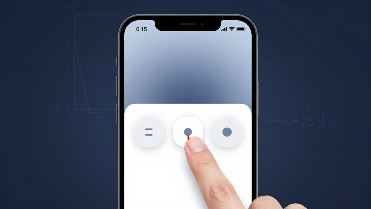
Take Fitts’s Law, for example. It’s not a theory you memorize-it’s a rule you use. The law says: the time it takes to reach a target depends on its size and distance. A big button that’s close to your cursor is faster to click than a tiny one far away. That’s why mobile menus often have large tap targets. That’s math. Not because you solved for X, but because you observed how humans move and designed around it.
Usability testing runs on statistics
Every time you run a usability test with five users and spot three major issues, you’re using math. It’s not advanced stats-it’s basic probability. Research from the Nielsen Norman Group shows that testing with just five users uncovers about 85% of usability problems. Why? Because people repeat the same mistakes. The first user misses a button. The second does too. The third clicks the wrong link. By the fifth, you’ve seen the pattern.
You don’t need a p-value or a confidence interval to know something’s broken. But if you want to prove it to a skeptical stakeholder? You need numbers. Say 8 out of 10 users couldn’t find the ‘Submit’ button. That’s 80%. That’s not an opinion-it’s data. And data gets buy-in.
Wireframes and spacing rely on ratios
Ever wonder why your design feels ‘off’ even though everything looks fine? Chances are, the spacing is wrong. Designers use the golden ratio (1:1.618) and the rule of thirds not because they’re pretty-they’re proven to guide the eye naturally. Instagram’s grid layout? It’s based on thirds. Apple’s app icons? Their padding follows a consistent 8-point grid system.
These aren’t artistic choices. They’re mathematical systems that reduce cognitive load. If every element is spaced 8px, 16px, or 24px apart, your brain doesn’t have to work to process the layout. That’s math. And it makes interfaces feel effortless.
Conversion rates are pure math
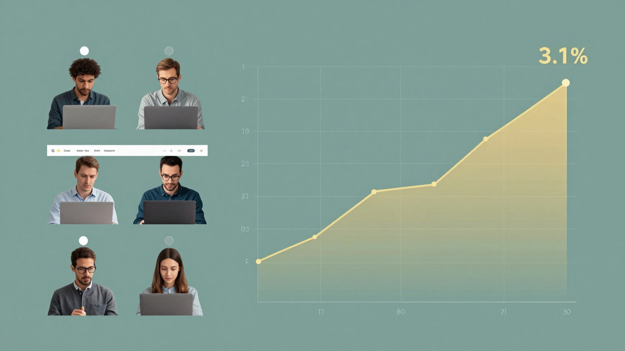
If you’re designing an e-commerce product page, your job isn’t just to make the product look good. It’s to get people to buy. And that’s a math problem. Let’s say your current conversion rate is 2.3%. You change the CTA button from green to orange and it jumps to 3.1%. That’s a 34.8% increase. That’s not luck. That’s A/B testing-controlled experimentation with measurable outcomes.
You don’t need to know how to calculate standard deviation to run a test. But you do need to understand that a 0.8% increase in conversion on a site with 100,000 visitors per month means 800 more sales. That’s $24,000 extra revenue if each sale is $30. That’s the real impact of small design changes. Math turns guesswork into revenue.
Color contrast and accessibility aren’t optional
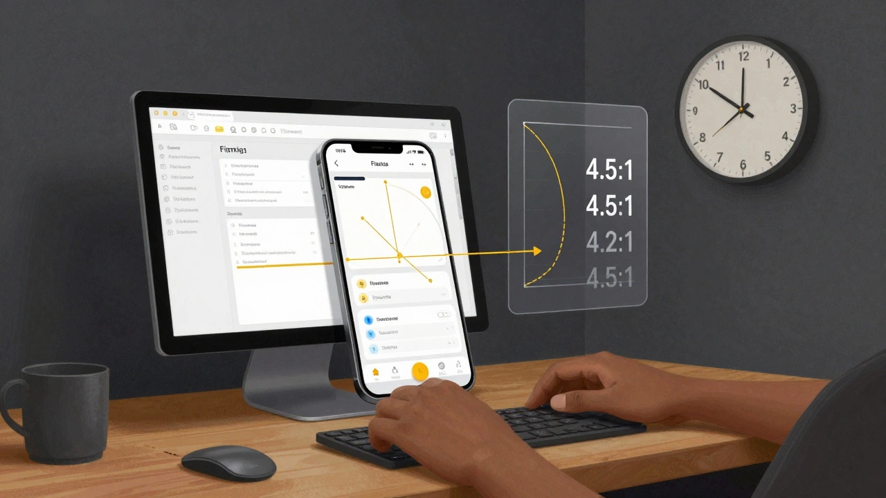
WCAG guidelines require a minimum contrast ratio of 4.5:1 for normal text. That’s not a suggestion-it’s a legal standard in many countries. To check if your text passes, you plug hex codes into a contrast calculator. That’s math. You don’t need to derive the formula, but you do need to know what the number means.
Imagine designing a dark-mode interface with navy text on black. It looks cool-but 70% of users over 60 can’t read it. That’s not a design flaw. It’s a failure to apply basic luminance math. Accessibility isn’t about being nice. It’s about meeting measurable thresholds so everyone can use your product.
Performance matters-speed is a UX metric
Page load time isn’t a backend problem. It’s a UX problem. Google found that a 1-second delay in page load leads to a 7% drop in conversions. That’s not a rumor-it’s from their 2018 study, still cited today. If your homepage takes 4 seconds to load, you’re losing 21% of potential customers before they even see your product.
UX designers who ignore performance are ignoring a core part of the experience. Optimizing image sizes, reducing HTTP requests, lazy-loading content-these are all mathematical trade-offs. Less data = faster load = better experience. It’s simple arithmetic.
You don’t need to be a coder-but you need to speak the language
You don’t need to write Python scripts or build regression models. But you do need to read a spreadsheet. You need to understand what ‘average time on task’ means. You need to know the difference between mean and median when a user test result is skewed. You need to ask, ‘How many users?’ and ‘What’s the sample size?’
Many UX designers avoid numbers because they’re intimidated. But you don’t need to be an expert-you need to be curious. Tools like Hotjar, Google Analytics, and Figma’s built-in analytics give you numbers without requiring you to calculate them. Your job is to interpret them.
What math skills do you actually need?
- Basic arithmetic: percentages, ratios, averages
- Understanding of statistics: sample size, significance, trends
- Geometry: spacing, alignment, grid systems
- Logic: if-then reasoning for user flows
- Measurement: pixels, ems, viewport units
You don’t need to know calculus. You don’t need to code algorithms. But if you can’t look at a chart and say, ‘This drop-off spike happened after we changed the navigation,’ you’re designing blind.
Real example: A banking app redesign
A fintech startup in Dublin redesigned their mobile app to look ‘modern’-clean lines, minimalist buttons, subtle shadows. After launch, support calls about lost transactions jumped 40%. The team thought it was a bug.
Turns out, the ‘Transfer’ button was now 44px tall instead of 56px. Users kept tapping the space beside it. The new design looked sleek-but it violated Fitts’s Law. They went back to the old size. Support calls dropped. Revenue recovered.
That wasn’t a design decision. It was a math error.
Final thought: Math is the hidden language of usability
UX design isn’t about being artistic. It’s about being human-centered. And humans operate in predictable, measurable ways. Math is the tool that lets you see those patterns. It turns opinions into evidence. It turns guesses into decisions.
You don’t need to love math. But if you want to design experiences that actually work-for real people, in the real world-you need to respect it. The numbers aren’t cold or soulless. They’re the voice of your users. Listen to them.
Do I need a math degree to be a UX designer?
No. You don’t need a degree in math, statistics, or engineering. But you do need to be comfortable working with numbers-reading graphs, understanding percentages, interpreting user data. Most UX designers learn these skills on the job through tools like Google Analytics, Hotjar, or Figma’s built-in metrics.
Can I rely only on intuition for UX design?
Intuition helps, but it’s not enough. Your gut might tell you a button should be red because it ‘feels urgent.’ But data might show blue converts better because users associate it with trust. Relying only on intuition leads to design by guesswork. Real UX combines intuition with evidence. Numbers ground your instincts in reality.
What if I hate math?
You don’t have to love it. But you do have to respect it. Think of math like a translator. It takes messy human behavior-clicks, scrolls, drop-offs-and turns it into clear signals. You don’t need to build the machine. You just need to read the output. Start small: track one metric. Ask one question. Over time, it becomes second nature.
Is math more important than creativity in UX?
They’re not opposites-they’re partners. Creativity finds new ways to solve problems. Math tells you if the solution actually works. A beautiful interface that confuses users is just art. A functional interface that delights users is UX. You need both. But without math, you can’t measure delight.
What tools help UX designers use math without coding?
Figma’s analytics, Google Analytics, Hotjar, Maze, and UsabilityHub let you see user behavior without writing code. Contrast checkers like WebAIM’s tool or Stark plug-ins tell you if your colors meet accessibility standards. A/B testing platforms like Optimizely or VWO show you which version performs better. These tools handle the math-you handle the decisions.