
Responsive Design Breakpoint Simulator
Drag the slider below to simulate different device widths. Watch how the navigation, grid columns, and typography adapt based on standard industry breakpoints.
Welcome to Our Site
Building better experiences for everyone.
Details about our first service offering.
More information regarding second feature.
Additional details for the third column.
Your website looks perfect on your desktop monitor but squished and unreadable on a phone. You tap a link, it misses the target, and the visitor leaves. This is the classic pain point for site owners who built their pages in the pre-mobile era or simply ignored the shift toward mobile-first browsing. Converting an existing static site into a responsive website is a process that involves adjusting HTML, CSS, and JavaScript to ensure content adapts seamlessly to any screen size. It’s not just about shrinking text; it’s about rethinking how users interact with your content across devices. The good news? You don’t need to rebuild from scratch. Most modern sites can be made responsive with targeted changes. The key is understanding the three pillars of responsive design: fluid grids, flexible images, and media queries. Let’s break down exactly how to execute this without breaking your current layout.
Start with the Viewport Meta Tag
Before you touch a single line of CSS, check your HTML head section. If you’re missing the viewport meta tag, your browser is rendering your page at a default width of 980 pixels, then scaling it down. This makes text tiny and buttons unusable. Add this line inside your<head> tag:
<meta name="viewport" content="width=device-width, initial-scale=1.0">
This tells the browser to set the width of the page to follow the screen-width of the particular device. Without this, no amount of CSS will fix the fundamental rendering issue. It’s the most common oversight, yet it solves 50% of the "my site looks broken on mobile" complaints instantly.
Replace Fixed Widths with Fluid Grids
Legacy sites often use fixed pixel widths for containers, columns, and sidebars. For example, a container might be set towidth: 960px. On a 375-pixel iPhone screen, this forces horizontal scrolling. To fix this, switch to percentage-based widths or relative units like rem and em.
Instead of:
.container { width: 960px; }
Use:
.container { width: 90%; max-width: 1200px; margin: 0 auto; }
This approach ensures the content area shrinks proportionally on smaller screens while capping its size on large monitors so text lines don’t become too long to read comfortably. For inner columns, use percentages that add up to 100%. If you have a two-column layout, make each column 48% wide with a 4% gap. On mobile, you’ll likely want these to stack vertically, which we’ll handle next.
Make Images and Media Flexible
Images are often the culprits behind broken layouts. A high-resolution banner image with a fixed width of 1200 pixels will overflow the screen on a tablet. The solution is simple CSS:img, video, iframe { max-width: 100%; height: auto; }
This rule ensures that no media element exceeds the width of its parent container. The height: auto part preserves the aspect ratio, preventing distortion. If you’re using background images, consider replacing them with actual <img> tags where possible, as they’re easier to control responsively. For critical decorative backgrounds, use CSS background-size properties like cover or contain to manage how they scale.

Implement Media Queries for Breakpoints
Media queries allow you to apply specific CSS rules based on the device’s characteristics, primarily screen width. Instead of designing for one size, you design for multiple sizes. The standard breakpoints used in the industry are:- Mobile: Up to 767px (smartphones)
- Tablet: 768px to 1023px (iPad and similar)
- Desktop: 1024px and above (laptops and desktops)
@media (max-width: 767px) {
  .nav-links { display: none; }
  .hamburger-menu { display: block; }
}
This conditional logic is what truly makes a site responsive. It’s not just about scaling; it’s about changing the layout structure itself when space is limited.
Optimize Navigation for Touch Screens
Mouse hover states don’t exist on touchscreens. If your dropdown menus rely on:hover, they won’t work on phones. Replace hover-triggered interactions with click or tap events. Ensure all clickable elements, including links and buttons, have a minimum touch target size of 44x44 pixels. This gives fingers enough room to tap accurately without selecting the wrong item. Test your navigation by turning off your mouse and trying to navigate using only a touchscreen or trackpad. If it feels clunky, adjust the spacing and sizing.
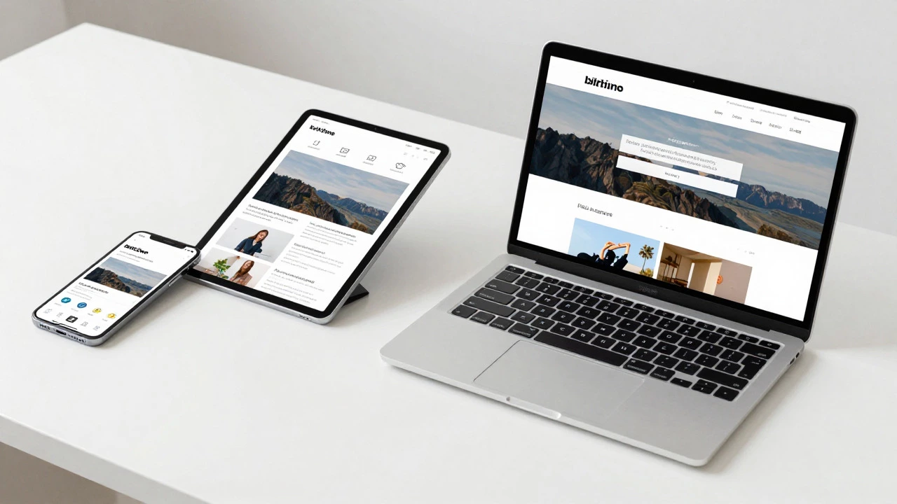
Test Across Real Devices and Simulators
Browser developer tools are great for quick checks, but they aren’t a substitute for real-world testing. Use Chrome DevTools’ device mode to simulate various screen sizes, but also test on at least one physical smartphone and one tablet. Check for:- Horizontal scrolling (should be eliminated)
- Text readability (no zooming required)
- Button and link accessibility (easy to tap)
- Loading speed (ensure images aren’t oversized for mobile)
Common Pitfalls to Avoid
Many developers fall into traps that undo their hard work. Here are the most frequent mistakes:- Using !important excessively: This overrides your media queries, making it impossible to change styles for specific breakpoints. Refactor your CSS specificity instead.
- Ignoring font scaling: Small text becomes unreadable on mobile. Use relative units like
remfor font sizes so they scale appropriately with user preferences and screen density. - Not updating third-party widgets: Embedded maps, social feeds, or chat widgets often have fixed dimensions. Check their documentation for responsive options or wrap them in a container with
overflow: hiddenand a defined aspect ratio.