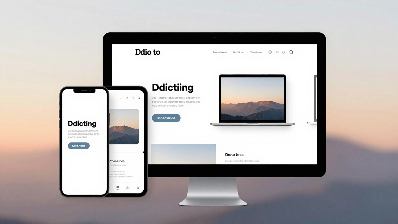
Responsive Web Design: Real Problems and Practical Fixes for 2025
If your site looks great on a laptop but collapses on a phone, you’re not alone. Responsive web design is supposed to make every device happy, yet developers still run into broken layouts, slow loads, and hard‑to‑read text. The good news? Most of these issues have simple, proven solutions you can add today without a full redesign.
Why Responsive Design Still Trips Up
First, many sites still rely on fixed widths or old‑school px units. That forces elements to stay the same size no matter the screen, so they overflow or shrink into unreadable fragments. Second, images are often served at full size, making mobile pages sluggish. Third, developers forget to test real devices and only look at browser resize windows, missing quirks like Safari’s viewport handling. Finally, accessibility is left out of the mix, so screen readers and keyboard users get a poor experience.
Actionable Fixes You Can Apply Today
Switch to fluid units. Replace px with rem, em, or percentages. Use vw for truly fluid typography. This lets text and containers grow or shrink naturally.
Set up proper breakpoints. Instead of guessing, look at your content. Common breakpoints are 320px (small phones), 480px (large phones), 768px (tablets), 1024px (small desktops), and 1440px (large screens). Write media queries that adjust layout, not just hide stuff.
Serve responsive images. Use the srcset and sizes attributes or picture tags. Let the browser pick the best size, cutting load time dramatically on mobile.
Test with real devices. Open the site on a phone, tablet, and laptop. Pay attention to tap targets – they should be at least 44×44 px – and make sure forms are easy to fill out.
Add accessibility basics. Include alt text for images, use proper heading order, and ensure colour contrast meets WCAG AA (minimum 4.5:1 for normal text). Keyboard navigation should work without a mouse.
Putting these steps together gives you a solid, future‑proof base. Start small: pick one page, swap the px units, add a srcset image, and test on two devices. Once that works, roll the same changes across the site.
Remember, responsive design isn’t a one‑time checkbox. Web standards evolve, new devices appear, and user expectations rise. Keep an eye on performance numbers in Chrome DevTools, and revisit breakpoints every few months. A quick audit each quarter will catch drift before it hurts users.
By focusing on fluid layouts, smart image handling, real‑device testing, and basic accessibility, you’ll solve the biggest headaches that still plague responsive design in 2025. Your site will load faster, look better, and be usable for everyone – without needing a massive redesign.