Responsive Design Savings Calculator
Calculate how much you could save annually by switching from a separate mobile site to a responsive design. Based on 2023 Web Almanac data showing 40-60% maintenance cost reduction.
Back in 2010, if you wanted a good mobile experience, you built a separate site-m.yoursite.com. It was the norm. You’d make a stripped-down version for phones, send users there automatically, and call it done. But that approach? It’s outdated. And if you’re still considering it in 2025, you’re setting yourself up for headaches you don’t need.
One site, every device
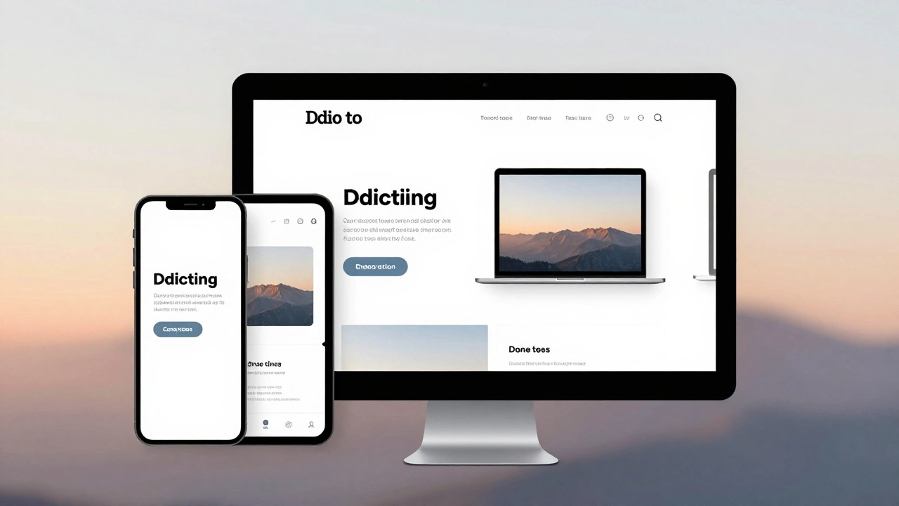
Responsive design means one website that adapts to any screen size-whether it’s a 27-inch monitor, a tablet held sideways, or a phone in your pocket. No redirects. No duplicate content. No separate URLs. Just one codebase that flows naturally across devices.
Think about it: how many devices do you own? A phone, a tablet, a laptop, maybe a smart TV? Now imagine your customer does the same. They start browsing on their phone during lunch, switch to their tablet on the couch, then finish on their desktop at night. If you have three different sites, they’ll have to re-login, re-find what they were looking at, and deal with inconsistent layouts. That’s not convenience. That’s friction.
Cost and maintenance? Way lower
Building two sites isn’t twice the work-it’s three times. You need to design two layouts, develop two codebases, test two versions, update two sets of content, and fix bugs in both places. A change to your header menu? You fix it once on a responsive site. On separate mobile and desktop sites? You fix it twice. And if you add a new product page? Now you’re duplicating that effort again.
Companies that switched from separate mobile sites to responsive design saw maintenance costs drop by 40% to 60% within two years. That’s not a guess. It’s from a 2023 study by the Web Almanac team, which analyzed over 12 million websites. Responsive sites had fewer reported bugs, faster deployment cycles, and less technical debt.
SEO doesn’t play favorites
Google has been pushing responsive design since 2015. Why? Because it makes their job easier. One URL means one indexable page. One set of backlinks. One ranking signal. No confusion over which version is the "real" one.
With separate mobile sites, you’re forced to manage canonical tags, redirect chains, and duplicate content warnings. Google has to figure out whether m.yoursite.com and www.yoursite.com are the same thing. Sometimes it gets it wrong. And when it does, your rankings drop.
According to Google’s own data, responsive sites rank higher on average than their separate-mobile counterparts. Why? Because they’re simpler. Fewer technical errors. Fewer crawl budget wastes. More trust from search engines.

Performance is better than you think
You’ve probably heard that responsive sites are slower because they load desktop assets on phones. That used to be true. But today? Not even close.
Modern tools like lazy loading, responsive images with srcset, and CSS containment let you serve exactly what each device needs. A phone doesn’t load a 3MB hero banner meant for a 4K screen. It loads a 150KB optimized version. The browser handles it automatically.
And here’s the kicker: responsive sites load faster on mobile than most separate mobile sites. Why? Because those old mobile sites often had outdated code, no caching, and no modern optimizations. They were built when mobile networks were slow and developers assumed users wouldn’t wait. Now? Users expect speed-and they’ll leave if a site takes more than 2.5 seconds to load. Responsive sites, built with current best practices, hit that target consistently.
Testing is simpler
Testing two sites means double the test cases. You need to check forms, buttons, menus, images, analytics tracking, and conversions on both versions. You need separate QA checklists. You need to coordinate between teams.
With responsive design, you test one site across breakpoints. Tools like Chrome DevTools let you simulate any device in seconds. You can see how your layout behaves on a 320px screen, then flip to 1440px-all in the same browser tab. No switching between URLs. No logging in twice. No guessing if the mobile version is even up to date.
And if you’re using automated testing? Responsive sites integrate cleanly with tools like Cypress and Playwright. You write one test suite that runs across all screen sizes. Separate mobile sites? You need two. And they often drift out of sync.
Accessibility improves
Responsive design naturally supports accessibility. When you build with semantic HTML, flexible grids, and scalable fonts, you’re already making your site usable for people with visual impairments, motor difficulties, or cognitive differences.
Separate mobile sites often cut corners. Text gets shrunk. Buttons disappear. Navigation gets simplified to the point of being unusable. A 2024 WebAIM report found that 78% of dedicated mobile sites had serious accessibility issues compared to 41% of responsive sites.
Why? Because responsive sites are built with inclusion in mind from the start. They don’t treat mobile users as an afterthought. They treat all users as equals.
Future-proofing matters
What’s the next big screen size? Foldables? Wearables? AR glasses? We don’t know. But we do know one thing: new devices keep popping up. If you’ve built a responsive site, you’re ready. The layout adjusts. The content scales. The buttons stay tappable.
If you built a separate mobile site? You’re stuck. You’ll need to build a new version for every new form factor. That’s not innovation. That’s maintenance hell.
Look at companies like Airbnb, Spotify, and BBC. They all moved away from separate mobile sites years ago. Why? Because responsive design scales. It adapts. It lasts.
What about apps?
You might be thinking: "Why not just build an app?"
Apps have their place. But they’re not a replacement for a website. Most users won’t download an app just to check your prices, read a blog, or contact you. Apps require installation, storage space, updates, and permissions. Websites? Just open a link.
And here’s the truth: 70% of mobile web traffic comes from people who don’t have your app installed. If your mobile experience is only available through an app, you’re missing most of your audience.
Bottom line
Building a separate mobile site in 2025 is like building a fax machine when everyone uses email. It’s not that it can’t work-it’s that it’s outdated, expensive, and unnecessary.
Responsive design isn’t just a trend. It’s the standard. It’s cheaper. It’s faster. It’s better for users. It’s better for SEO. It’s easier to maintain. And it prepares you for whatever comes next.
If you’re starting a new project? Go responsive. If you’ve got an old mobile site? Start planning your upgrade. The longer you wait, the harder-and more expensive-it becomes.