
GWD Breakpoint & Responsiveness Checker
Test Your GWD Project Responsiveness
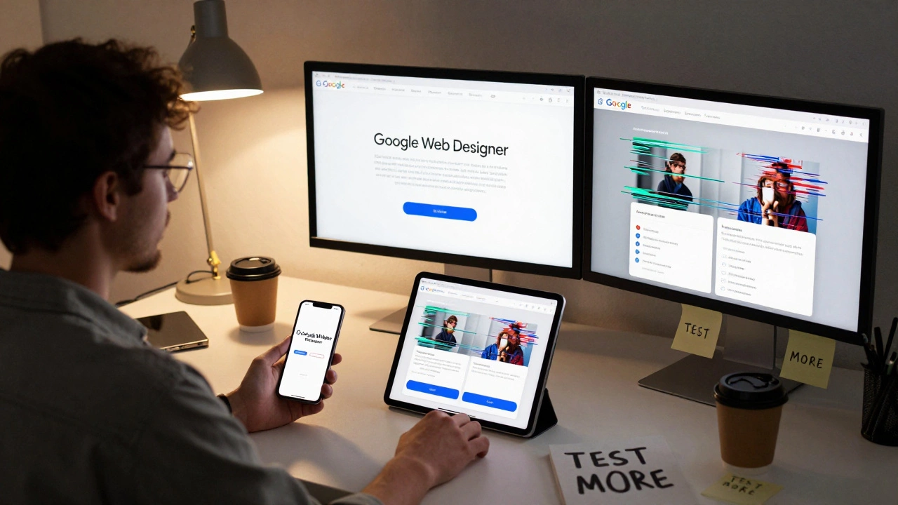
This tool helps you evaluate how your Google Web Designer project will handle different screen sizes. Enter your breakpoints and see potential issues based on the article's insights about GWD's limitations.
Responsiveness Analysis
Google Web Designer isn’t just another design tool-it’s a free, HTML5-based environment built for creating interactive ads and simple web experiences. But if you’re asking whether it’s truly responsive, the answer isn’t a simple yes or no. It depends on how you use it, what you’re building, and whether you understand its limits.
What Google Web Designer Actually Does
Google Web Designer (GWD) was launched in 2013 as a replacement for Adobe Flash. It lets you build animated banners, interactive ads, and lightweight web pages using HTML5, CSS3, and JavaScript. Unlike drag-and-drop website builders like Wix or Squarespace, GWD doesn’t generate full websites. It’s meant for short-form, high-impact content-think YouTube banners, Google Display Network ads, or micro-sites.
It’s not a CMS. It doesn’t connect to databases. It doesn’t handle user logins or e-commerce flows. If you’re trying to build a full business website with blog posts, contact forms, and product catalogs, GWD isn’t the right tool. But if you need a banner that scales from mobile to desktop, or an interactive ad that reacts to clicks, it’s still widely used-especially in digital advertising teams.
How Responsiveness Works in Google Web Designer
Yes, GWD has a responsive design mode. You can set up multiple breakpoints: mobile, tablet, desktop. When you switch between them, you can adjust the position, size, and visibility of elements for each screen size. You can hide a button on mobile, resize an image on tablet, or reposition text on desktop-all within the same project file.
Under the hood, it generates CSS media queries and uses absolute positioning with percentage-based widths. That’s the same approach used by professional developers building responsive sites from scratch. So technically, it’s capable of responsiveness.
But here’s the catch: GWD doesn’t auto-generate semantic HTML. It doesn’t use flexbox or CSS grid by default. Most layouts rely on absolute positioning, which can break on unusual screen sizes or when content reflows. If you export a GWD project and test it on a 12-inch tablet or a 4K monitor, you might see gaps, overlaps, or misaligned elements.
Real-World Example: A Banner That Breaks
Last year, a client hired a freelance designer to create a Google Display ad using GWD. The ad looked perfect on a 320x50 mobile banner and a 728x90 desktop banner. But when it ran on a 300x250 rectangle-common on news sites-the text overlapped the logo. Why? The designer used fixed pixel positions and didn’t test the third breakpoint.
Google Web Designer lets you add custom breakpoints, but it doesn’t force you to. Many users create just two or three layouts and assume that’s enough. That’s where things go wrong. Responsive design isn’t about having breakpoints-it’s about fluid behavior across all sizes.
What GWD Gets Right
Despite its flaws, GWD has strengths:
- Animation tools: Easy timeline-based animation for fades, slides, and scale effects-no coding needed.
- Ad templates: Pre-built templates for Google Ads, YouTube, and DoubleClick formats.
- Export options: One-click export to HTML5, GIF, MP4, or ZIP for ad platforms.
- Free and lightweight: No subscription. Runs on most laptops.
For advertisers who need to produce dozens of banners a week, GWD is fast. It’s not elegant, but it gets the job done. Many agencies still use it because it integrates directly with Google Ads Manager and Campaign Manager.
What GWD Gets Wrong
Here’s where it falls short for true responsive web design:
- No fluid grids: Elements snap to pixels, not percentages. Scaling isn’t smooth.
- Heavy reliance on absolute positioning: This breaks when content changes or fonts load differently.
- No accessibility controls: No built-in ARIA labels, keyboard navigation, or contrast checks.
- Not mobile-first: The default canvas is desktop-sized. You have to manually switch to mobile.
- No CMS integration: Can’t pull in live data, user content, or dynamic feeds.
Compare that to modern tools like Figma with responsive design plugins, or even Webflow-which uses real CSS grid and flexbox. GWD feels like a relic from 2015, even though it’s still updated.
When Should You Use Google Web Designer?
You should use GWD if:
- You’re creating display ads for Google Ads or YouTube
- You need to animate buttons or banners without writing JavaScript
- Your team already uses Google’s ad ecosystem
- You’re on a tight budget and need a free tool
You should NOT use GWD if:
- You’re building a website for customers to browse products
- You need a site that works on every device without manual tweaking
- You care about accessibility, SEO, or performance
- You want to scale content dynamically (like blogs or user-generated content)
For full websites, use Webflow, WordPress with a responsive theme, or hand-code with HTML/CSS/JS. For ads? GWD still holds up.
Alternatives That Are More Responsive
If you need true responsiveness, here are better options:
| Tool | Responsive by Default | Uses CSS Grid/Flexbox | Best For |
|---|---|---|---|
| Google Web Designer | Manual breakpoints only | No (absolute positioning) | Google Ads, simple banners |
| Webflow | Yes | Yes | Full websites, no code |
| Figma (with plugins) | Yes | Yes | Design-to-development workflow |
| Adobe XD | Yes | Yes | Prototyping, UI design |
| WordPress + Astra/GeneratePress | Yes | Yes | Blogs, business sites |
Webflow is the closest to a modern replacement. You can build responsive sites visually, export clean code, and even host them. It’s not free, but it’s designed for real-world responsiveness-not just ad formats.
Final Verdict: Is Google Web Designer Responsive?
Google Web Designer can be made responsive-but only if you know what you’re doing. It’s not responsive by design. It’s responsive by effort.
If you’re creating ads for Google’s network, it’s still a solid, free option. Many marketers use it successfully. But if you’re trying to build a website that needs to work perfectly on every screen, from a smartwatch to a 4K monitor, GWD will hold you back. It lacks the foundation modern responsive design requires.
Think of it like using a hammer to drive screws. It can work if you’re careful. But you’ll get better results with the right tool.
Can Google Web Designer be used to build full websites?
Technically yes, but it’s not practical. Google Web Designer creates static HTML5 files without backend functionality. You can’t add forms, user accounts, databases, or dynamic content. It’s meant for ads and micro-sites, not full websites. For real websites, use WordPress, Webflow, or custom code.
Does Google Web Designer support mobile-first design?
No, it doesn’t enforce mobile-first design. The default canvas is desktop-sized (960px wide). You have to manually switch to smaller breakpoints and rebuild layouts from scratch. Modern tools like Figma and Webflow start with mobile and scale up, which is more efficient and user-friendly.
Is Google Web Designer still being updated?
Yes, but slowly. Google last updated it in late 2024 with minor bug fixes and new ad template support. It’s no longer a priority for Google’s engineering team. Most innovation has shifted to Webflow, Figma, and browser-based tools. Don’t expect major new features.
Can I export GWD projects to WordPress?
You can export the HTML and CSS, but you can’t drop it directly into WordPress. WordPress needs themes with PHP templates, hooks, and dynamic content systems. GWD exports static files. You’d need a developer to integrate the code into a child theme or custom plugin-which defeats the purpose of using a no-code tool.
Is Google Web Designer better than Adobe Animate for responsive ads?
For responsive ads, Google Web Designer is better. Adobe Animate was built for Flash and still leans heavily on timeline-based animation with fixed dimensions. GWD was built from the start for HTML5 and Google’s ad ecosystem. It exports cleaner code, supports responsive breakpoints natively, and integrates directly with Google Ads. Animate is better for complex animations, but GWD wins for ads.
What to Do Next
If you’re using Google Web Designer today, audit your projects. Open each one on a phone, tablet, and desktop. Look for overlapping text, misaligned buttons, or content that gets cut off. If you see problems, you’re not alone-most GWD users skip testing beyond their main breakpoints.
For new projects, ask yourself: Am I building an ad, or a website? If it’s an ad, stick with GWD. If it’s a website, choose a tool built for full responsiveness. Don’t force the wrong tool into the wrong job.
Responsive design isn’t about tools-it’s about thinking. Tools like GWD can help, but they can’t replace good design habits. Test on real devices. Use real content. Don’t rely on preview screens alone.