
Responsive Breakpoint Calculator
Breakpoint Calculator
Determine optimal responsive breakpoints based on common device resolutions. This tool helps you apply the best practices from the article.
Breakpoint Recommendations
Based on your input, these breakpoints optimize your responsive design:
Optimal Breakpoint Range
Tip from the article: Don't overuse JavaScript for layout. Use CSS Grid/Flexbox for layout changes and only use JavaScript when CSS can't express the rule.
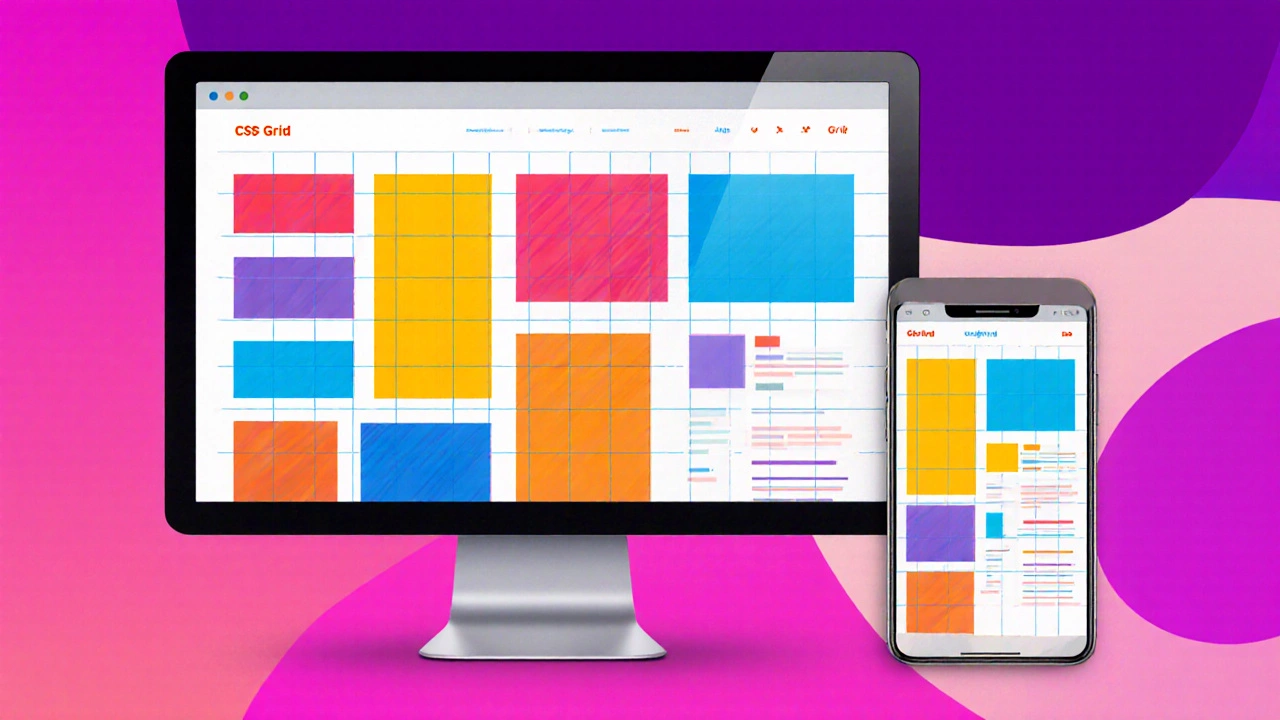
When you think about Responsive Web Design is a design approach that makes web pages adapt smoothly to different screen sizes and devices, the first thing that comes to mind is the code behind it. Over the past decade the stack has matured, but the question still pops up: which language should you bet on when you need a site that looks great everywhere?
Key Takeaways
- HTML5 provides the semantic skeleton; you can’t build a responsive page without it.
- CSS3, especially Flexbox, Grid, and media queries, does the heavy lifting for layout adjustments.
- JavaScript adds interactivity and fine‑grained control, but it should augment, not replace, CSS.
- Pre‑processors like Sass and type‑safe JavaScript via TypeScript speed up development and reduce bugs.
- Utility‑first frameworks (e.g., Tailwind CSS) can dramatically cut CSS bloat while keeping designs flexible.
HTML5 - The Foundation
HTML5 is the latest version of the markup language that structures web content. It introduces semantic tags like <header>, <section> and <picture>, which help browsers and assistive technologies understand page intent. When you write clean, semantic markup, media queries and flexible units have a reliable base to work on.
CSS3 - The Layout Engine
CSS3 is the style language that controls visual presentation, including responsive features. Three features make it indispensable for responsive design:
- Media Queries - define breakpoints based on viewport width, height, orientation, and even device pixel ratio.
- Flexbox - provides one‑dimensional layout control, perfect for nav bars, cards, and simple column structures.
- CSS Grid - offers two‑dimensional layout, enabling complex magazine‑style layouts that re‑flow gracefully on smaller screens.
Combine these with relative units (rem, em, vh, vw) and you have a fluid design system without a single line of JavaScript.
JavaScript - The Interactive Layer
JavaScript is the scripting language that adds interactivity and dynamic behavior to web pages. For responsive design, it shines in two scenarios:
- Detecting device capabilities not covered by CSS (e.g., touch support) and adjusting UI components accordingly.
- Creating pattern‑based components like carousels or accordions that need to recalculate dimensions on resize.
Best practice: let CSS handle layout whenever possible; use JavaScript only when CSS falls short.
Sass - Writing CSS Faster
Sass is a CSS pre‑processor that adds variables, nesting, mixins, and functions. It doesn’t change the browser’s capabilities, but it makes maintaining a large responsive stylesheet far easier. Variables for breakpoints, mixins for vendor prefixes, and functions for fluid typography keep your code DRY and less error‑prone.
TypeScript - Safer JavaScript
TypeScript is a superset of JavaScript that adds static typing. When building complex UI components that respond to size changes, TypeScript catches mismatched property names and incorrect event handling at compile time, reducing runtime bugs on devices of all shapes.
Tailwind CSS - Utility‑First Speed
Tailwind CSS is a utility‑first CSS framework that lets you compose designs directly in HTML. Instead of writing custom media queries, you use responsive prefixes like md: or lg: on utility classes. This approach cuts down stylesheet size, ensures consistency, and speeds up prototyping.
Side‑by‑Side Comparison
| Entity | Primary Role | Key Strengths | Typical Use‑Case |
|---|---|---|---|
| HTML5 | Structure | Semantic tags, native media support | Base markup for any responsive site |
| CSS3 | Layout & Styling | Flexbox, Grid, media queries, relative units | All layout adjustments across breakpoints |
| JavaScript | Interactivity | DOM manipulation, event handling, APIs | Dynamic components, feature detection |
| Sass | CSS Authoring | Variables, mixins, nesting, functions | Large, maintainable stylesheet projects |
| Tailwind CSS | Utility Framework | Responsive prefixes, low CSS bloat | Rapid prototyping, design systems |
How to Pick the Right Language for Your Project
Answer these three questions before you settle on a stack:
- Is the design highly custom or based on a pattern library? Custom layouts usually stay within pure HTML+CSS; pattern libraries benefit from utility frameworks.
- Will the site need complex UI logic (e.g., drag‑and‑drop, real‑time charts)? If yes, invest in JavaScript/TypeScript early.
- What’s the team’s skill set? A team comfortable with Sass will write cleaner CSS faster, while a JS‑first team may gravitate toward Tailwind and TypeScript.
In most real‑world cases, the optimal mix is responsive web design languages - HTML5 for markup, CSS3 for layout, and a dash of JavaScript for enhancements. Add Sass for maintainability and Tailwind if you need rapid UI building.
Practical Tips & Common Pitfalls
- Don’t over‑use JavaScript for layout. Rely on CSS Grid/Flexbox first; JavaScript should only adjust when CSS can’t express the rule.
- Keep breakpoints consistent. Define them as variables (Sass) or constants (TypeScript) so every component uses the same values.
- Test on real devices, not just browser resize. Media queries can behave differently on high‑density screens.
- Avoid long‑hand media queries in every component. Centralize them with mixins or utility classes.
- If you adopt Tailwind, purge unused utilities in production to keep file size small.
Frequently Asked Questions
Can I build a fully responsive site using only HTML and CSS?
Yes. HTML5 provides the structure, while CSS3’s Flexbox, Grid, and media queries handle every layout change. JavaScript is optional for added interactivity.
When should I reach for Sass instead of plain CSS?
If your stylesheet exceeds a few hundred lines, or you need reusable breakpoints, variables, and mixins, Sass will keep the code organized and reduce duplication.
Is Tailwind CSS a replacement for media queries?
Tailwind introduces responsive prefixes that compile into standard media queries. It doesn’t replace them; it just makes them easier to write.
Do I need TypeScript for responsive design?
Not mandatory. TypeScript shines when you have complex UI logic that reacts to resize events. It helps catch bugs early but adds a build step.
How many breakpoints should a typical site have?
Most designers use three to four: mobile (<600px), tablet (600‑900px), desktop (900‑1200px), and large desktop (>1200px). Adjust based on your audience’s device data.