Mobile Traffic Impact Calculator
See how much revenue you're losing due to non-responsive design based on your mobile traffic percentage and current conversion rate.
Key Statistics from the Article:
- 62% of global web traffic comes from mobile devices (2025)
- 53% of mobile visitors leave sites taking >3 seconds to load
- Responsive sites increase mobile conversion rates by 25%
- Mobile-first indexing prioritizes mobile experience in rankings
Your Estimated Revenue Impact
Current Mobile Revenue
$0
Based on your current conversion rate
Potential Revenue with Responsive Design
$0
25% higher conversion rate achievable
When a site has a responsive web design, it doesn’t just look good on your phone-it works better. Every button, image, and paragraph adjusts smoothly as you zoom out on a tablet, flip your phone sideways, or open the site on a 27-inch monitor. This isn’t magic. It’s smart coding that matches the screen, not the other way around.
It Fits Every Screen Without Breaking
Before responsive design, websites were built for one screen size-usually desktops. On a phone, you’d pinch and zoom just to read a paragraph. Clicking a button meant guessing where it was. That’s gone. With responsive design, layouts use fluid grids, flexible images, and media queries to rearrange themselves. A three-column layout on a laptop becomes a single column on a phone. Menus turn into hamburger icons. Forms shrink to fit touch targets. The content stays readable, usable, and clean-no matter the device.
Mobile Traffic Isn’t an Afterthought-It’s the Main Event
In 2025, over 62% of global web traffic comes from mobile devices. If your site doesn’t adapt, you’re losing more than half your audience before they even start browsing. A responsive site doesn’t just avoid frustrating users-it keeps them there. Studies from Google show that 53% of mobile visitors leave a site that takes longer than three seconds to load. Responsive design helps here too: by serving optimized images and streamlined code for smaller screens, load times drop significantly. A site that loads fast on a phone keeps people engaged. A site that doesn’t? They’re gone.
One Site, No More Copies
Years ago, companies ran two versions of their site: one for desktop and a separate mobile site, often with a URL like m.example.com. That meant double the work-updating content twice, fixing bugs in two places, managing two sets of analytics. Responsive design killed that. Now, you build one site that serves everyone. That cuts development time, reduces maintenance costs, and makes SEO easier. Google explicitly recommends responsive design because it avoids duplicate content issues. One URL. One set of backlinks. One ranking signal. Simple.
It Boosts SEO-Naturally
Search engines don’t just want content. They want good user experiences. Responsive sites score higher because they reduce bounce rates, increase time on site, and improve mobile usability-all factors Google uses in rankings. In 2020, Google rolled out mobile-first indexing. That means it primarily uses the mobile version of your site to rank you. If your mobile experience is broken, your rankings suffer-even if your desktop version looks perfect. Responsive design ensures your mobile version isn’t just a shadow of the desktop. It’s the full experience, built right.

Users Stay Longer and Convert More
Think about your own behavior. You’re on your phone, scrolling through a product page. The buttons are tiny. The text is too small. The checkout button is hidden under a banner. You leave. That’s exactly what happens to your customers if your site isn’t responsive. A responsive site removes friction. Forms fill out easily. Buttons are big enough to tap. Navigation is clear. A 2024 study by Adobe found that companies with responsive designs saw a 25% increase in conversion rates on mobile devices. That’s not a small bump. That’s revenue. Whether you’re selling products, collecting leads, or getting sign-ups, a site that works on any device turns visitors into customers.
It’s Future-Proof
Phones get bigger. Tablets get slimmer. Foldables, smartwatches, car dashboards-they all browse the web now. Responsive design doesn’t assume a fixed set of screen sizes. It adapts continuously. You don’t need to rebuild your site every time a new device launches. The code responds to the screen’s width, not a preset list of models. That’s why companies like Airbnb, Spotify, and The New York Times all use responsive design. They don’t chase trends. They build systems that last.
It Makes Your Brand Look Professional
When a site looks like it was designed for a 2010 desktop computer, it screams outdated. Even if your content is great, a clunky layout undermines trust. Responsive design signals that you care about your users. That you’ve thought through how people actually use your site. It’s not just about looks-it’s about credibility. A clean, fluid experience makes your brand feel modern, reliable, and in control.
What Happens When You Don’t Have It?
Without responsive design, you get:
- High bounce rates on mobile
- Lost sales from frustrated users
- Lower search rankings
- More support tickets about broken layouts
- Wasted ad spend-people click your ads, then leave immediately
It’s not just a design choice. It’s a business risk.

How It Works (Simply)
Responsive design uses three core tools:
- Fluid grids-Layouts use percentages instead of fixed pixels, so elements resize proportionally.
- Flexible images-Images scale down without breaking the layout, often using CSS like max-width: 100%.
- Media queries-CSS rules that apply different styles based on screen size. For example: "If the screen is under 768px wide, stack the columns vertically."
That’s it. No plugins. No apps. Just clean code that listens to the device.
Real Example: A Local Bakery
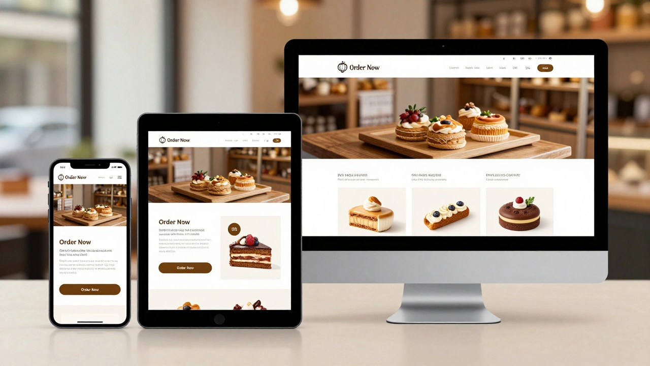
Take a small bakery in Dublin. Before responsive design, their site looked great on a laptop-but on a phone, the menu was a horizontal scroll nightmare. People couldn’t find the order button. They called instead. After switching to responsive design, phone orders jumped 40% in three months. The site now shows a single-column menu on mobile, with big "Order Now" buttons. No one has to zoom. No one has to hunt. They just tap and buy.
It’s Not Just for Ecommerce
Even blogs, portfolios, and service sites benefit. A photographer’s portfolio looks stunning on a tablet. A consultant’s contact form works on a bus ride. A nonprofit’s donation page loads fast on a slow connection. Responsive design doesn’t care what your site does. It just makes sure anyone, anywhere, can use it.
Does responsive design slow down my website?
No-not if it’s done right. Responsive design uses the same files for all devices, but smart coding ensures only the necessary assets load. For example, a mobile device gets a smaller image version, not the full HD one meant for desktop. Tools like lazy loading and CSS media queries help keep performance high. Poorly built responsive sites can be slow, but that’s due to bad implementation, not the design approach itself.
Do I need a separate app if my site is responsive?
Not unless you need features only a native app can provide, like offline access, push notifications, or camera integration. For most businesses, a responsive website does everything an app can-plus it’s easier to update, doesn’t require app store approval, and works instantly without downloads. Over 80% of mobile web interactions happen in browsers, not apps.
Can I make my old site responsive without rebuilding it?
It depends. If your site uses old HTML tables for layout or hardcoded pixel widths, a full rebuild is often faster and cheaper than patching it. But if your site has clean HTML and CSS, you can add responsive styles on top. Many WordPress themes now offer responsive upgrades. The key is testing: use browser dev tools to simulate different screens and see where things break.
Is responsive design the same as mobile-first design?
They’re related but different. Responsive design means the site adapts to any screen. Mobile-first design is a strategy: you start by designing for the smallest screen, then add complexity for larger ones. Mobile-first often leads to cleaner, faster responsive sites because you focus on essentials first. Most modern responsive sites use mobile-first principles.
How do I test if my site is truly responsive?
Open your site in a browser like Chrome or Firefox. Press F12 to open developer tools, then click the device toggle icon. You’ll see a toolbar with preset screen sizes-phone, tablet, desktop. Scroll, click, and test buttons on each. Does the menu collapse? Do images shrink? Is text readable? Also test on real devices. Simulators help, but nothing beats seeing it on your own phone.
What’s Next?
If your site isn’t responsive yet, start with a free audit. Use Google’s Mobile-Friendly Test tool-it tells you exactly what’s broken. Then, prioritize fixing the biggest pain points: tiny buttons, horizontal scrolling, slow images. Even small improvements make a difference. Don’t wait for a full redesign. Start now. Your users are already on their phones. Make sure your site is ready for them.
