
Responsive vs Adaptive Simulator
Drag the slider to change the viewport width. Observe how a Responsive layout flows continuously, while an Adaptive layout snaps to predefined fixed widths.
Layout recalculates instantly at every pixel change using CSS Media Queries.
Server detects device type and serves one of 3 fixed layouts. No change until reload or new request.
You’re staring at two websites on your phone. One looks perfect, the text wraps nicely, and buttons are easy to tap. The other? It’s a squished desktop site you have to pinch-zoom just to read the menu. That difference isn’t magic-it’s the result of how the developers built the layout. But here’s the catch: most people use "responsive web design an approach where layouts change fluidly through CSS media queries to fit any screen size" and "adaptive web design" interchangeably. They aren’t the same thing. Knowing which one you actually need can save you thousands in development costs and prevent your users from rage-quitting your site.
The Core Difference: Fluidity vs. Fixed Layouts
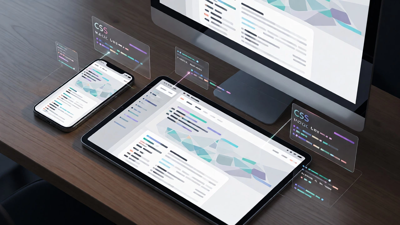
Think of responsive web design like water. You pour it into a glass, it takes the shape of the glass. You pour it into a bowl, it spreads out. The content flows continuously as the browser window changes size. This is achieved using flexible grids, relative units (like percentages or ems), and CSS media queries. There are no hard stops; the layout adjusts pixel-by-pixel as you resize your browser.
Adaptive web design, on the other hand, is more like a set of tailored suits. You have a small suit for a child, a medium suit for an adult, and a large suit for a giant. If you don’t fit exactly into one of those sizes, you’re stuck with something too tight or too baggy. Adaptive design detects the device’s width and serves one of several fixed static layout designs. It doesn’t flow; it jumps. Once the server decides which layout to serve, that’s what you get until you reload or switch devices.
How They Work Under the Hood
When you load a responsive site, the browser downloads one single HTML file. Then, the CSS kicks in. Media queries check conditions like `min-width` or `max-width`. If your screen is 375px wide, the CSS applies specific styles. If you rotate your phone to landscape mode (812px wide), the CSS instantly recalculates and reflows the content without asking the server for new files. This happens client-side, meaning your device does the heavy lifting.
Adaptive design works differently. When you request a page, the server checks your User-Agent string (the data your browser sends about itself). Based on that info, the server decides whether you’re on a mobile, tablet, or desktop. It then sends back a completely different HTML/CSS package tailored for that specific device class. This means the initial load might be faster because the code is stripped down for your specific device, but it requires more complex backend logic.

Pros and Cons: Which One Fits Your Project?
Choosing between these two isn’t just about preference; it’s about budget, maintenance, and user experience. Here’s a breakdown of why you might pick one over the other.
| Feature | Responsive Design | Adaptive Design |
|---|---|---|
| Layout Approach | Fluid, continuous adjustment | Fixed, pre-defined layouts |
| Development Effort | High initial effort, easier long-term | Lower initial effort, higher maintenance |
| User Experience | Consistent across all devices | Optimized for known devices only |
| SEO Impact | Preferred by Google (single URL) | Riskier (requires careful canonical tags) |
| Performance | Can be slower if not optimized | Potentially faster initial load |
Responsive design is generally the safer bet for new projects. Why? Because the number of screen sizes is exploding. From foldable phones to ultra-wide monitors, trying to create a fixed layout for every possible resolution is a nightmare. With responsive design, you build once and it adapts to whatever weird screen size comes next. Plus, Google explicitly recommends responsive design for SEO. Since it uses a single URL for all devices, you don’t split your link equity between m.yoursite.com and www.yoursite.com.
Adaptive design still has its place. If you’re working with a legacy system where rewriting the entire frontend is impossible, adding an adaptive layer might be cheaper. Or, if you know your traffic is 90% iPhone and 10% Desktop, you can tailor those two experiences perfectly without worrying about random Android tablets. However, this approach becomes brittle when new devices hit the market. Remember when the iPad Pro launched? Many adaptive sites broke because they didn’t have a breakpoint for that specific width.
The Role of Breakpoints
In responsive design, we talk about breakpoints. These are specific widths where the layout changes significantly. Common breakpoints include 576px, 768px, 992px, and 1200px. But here’s a pro tip: don’t just guess these numbers based on popular devices. Design for content. If your sidebar starts looking cramped at 800px, add a breakpoint there. Let the content dictate the structure, not the device specs.
Adaptive design relies on similar concepts but handles them server-side. You define your breakpoints in your backend configuration. If a user visits with a 1024px screen, the server serves the "tablet" version. If they resize their window to 1023px, nothing happens until they refresh. This disconnect can feel jarring to users who expect smooth transitions.
Common Pitfalls to Avoid
One major mistake developers make with responsive design is forgetting about touch targets. On a desktop, a 10px button is fine. On a touchscreen, you need at least 44x44 pixels for comfortable tapping. If you just shrink the desktop layout down, your users will miss-click constantly.
With adaptive design, the biggest pitfall is poor detection. If your server incorrectly identifies a high-end Android tablet as a mobile phone, you’ll serve a stripped-down mobile layout to a user with a large screen. They’ll see tiny text and wasted space. Always test your adaptive logic with real devices, not just Chrome DevTools simulators.
Hybrid Approaches and Modern Trends
Do you really have to choose? Not always. Many modern frameworks allow for hybrid approaches. You might use responsive CSS for the main layout but serve different images based on device capabilities (using `
Also, consider mobile-first design. This isn’t a separate technique but a philosophy. You start designing for the smallest screen first, then scale up. This forces you to prioritize content and prevents the bloat that often plagues desktop-first responsive sites. Whether you go responsive or adaptive, starting mobile-first usually leads to cleaner code and better performance.
Is adaptive web design obsolete?
Not entirely, but it is less common for new builds. While responsive design dominates due to its flexibility and SEO benefits, adaptive design is still used in enterprise environments with legacy infrastructure or specific performance requirements for known device classes. It remains a valid tool in specific contexts rather than a general standard.
Which is better for SEO, responsive or adaptive?
Responsive design is widely considered better for SEO. It uses a single URL for all devices, which consolidates link signals and avoids duplicate content issues. Google’s guidelines explicitly recommend responsive design as the preferred configuration for mobile-friendly sites.
Does adaptive design load faster than responsive?
It can, but not always. Adaptive design serves only the code needed for a specific device, potentially reducing payload size. However, poorly implemented responsive sites can also be highly optimized. Performance depends more on coding practices, image optimization, and server response times than on the choice between responsive or adaptive alone.
Can I convert an adaptive site to responsive?
Yes, but it often requires significant refactoring. You would need to replace fixed-width containers with flexible grids and update media queries to handle fluid resizing. In many cases, it is more cost-effective to rebuild the frontend components rather than patching an existing adaptive structure.
What tools help implement responsive design?
Popular CSS frameworks like Bootstrap and Tailwind CSS provide pre-built responsive utilities. Browser developer tools allow you to simulate various screen sizes. Additionally, testing platforms like BrowserStack help verify cross-device compatibility during the development process.