
Responsive Layout Simulator
Simulation Controls
Current Breakpoint:
CSS Advice: Use single column layout.
This card adjusts its width based on the container size using percentage-based widths or flexbox/grid properties.
On smaller screens, this element stacks vertically to ensure readability and prevent horizontal scrolling.
Notice how the navigation changes from a hamburger menu to full links as space becomes available.
Images and text reflow naturally without breaking the layout boundaries.
This demonstrates the power of CSS Grid or Flexbox in creating adaptive interfaces.
You just finished building a landing page. It looks sharp on your 27-inch iMac. You hit publish, grab your phone, and open the site. Suddenly, the text is tiny, buttons overlap, and you’re pinching and zooming like it’s 2010. This isn’t just annoying for users; Google actively penalizes sites that fail this basic usability test. Knowing how to check if a website is responsive isn’t just a developer task-it’s a critical step in ensuring your site actually works for the majority of your traffic.
Responsiveness isn’t magic. It’s a set of rules telling a browser how to rearrange content based on screen size. If you can’t verify those rules are working, you’re flying blind. Whether you’re a client waiting for a deliverable or a developer debugging a stubborn layout, here is exactly how to verify responsiveness without guessing.
What Actually Makes a Site "Responsive"?
Before we test, let’s define what we’re looking for. A responsive website is a web design approach where pages render well on a variety of devices and window or screen sizes. It relies on three core technical pillars:
- Flexible Grid Layouts: Using relative units like percentages (
%) instead of fixed pixels (px) for widths. This allows containers to shrink and grow with the browser window. - Fluid Images: Images must scale down within their container so they don’t break the layout. The standard CSS rule
max-width: 100%; height: auto;handles most of this. - CSS Media Queries: These are conditional statements in your CSS code that apply different styles based on device characteristics, primarily width. For example, hiding a sidebar when the screen is under 768px wide.
If a site uses fixed pixel widths for its main columns and no media queries, it’s not responsive. It’s just a desktop site that happens to fit on a phone by scaling everything down, which often results in unreadable text.
The Quickest Test: Browser Developer Tools
You don’t need extra software to start. Every modern browser has built-in tools that simulate various devices instantly. This is the fastest way to spot obvious breaks.
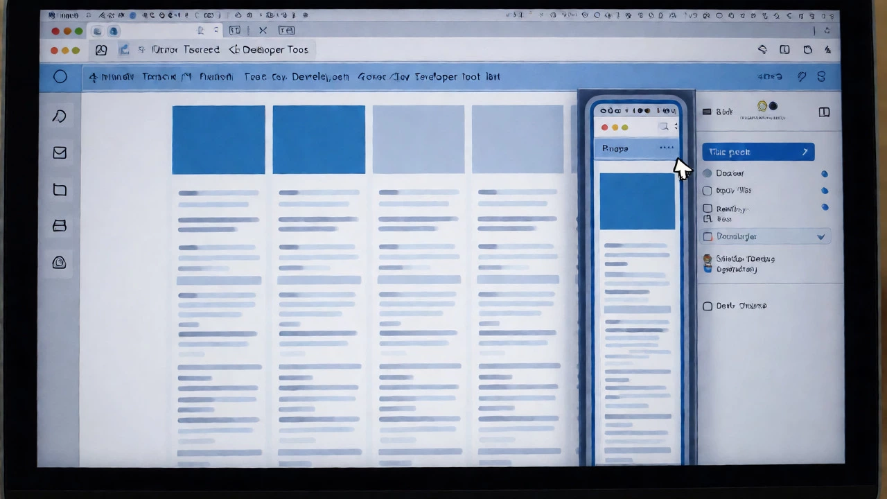
In Chrome, Firefox, or Edge, right-click anywhere on the page and select "Inspect." Look for an icon that looks like a phone and tablet (usually near the top left of the DevTools panel). Clicking this toggles "Device Toolbar." Now you can drag the edges of the viewport to resize the browser window manually, or select specific presets like iPhone SE, iPad Pro, or Galaxy S23.
Watch the layout as you resize. Does the navigation menu collapse into a hamburger icon? Do columns stack vertically instead of sitting side-by-side? If the layout snaps into new configurations at specific breakpoints, your media queries are working. If the horizontal scrollbar appears and you have to scroll sideways to see content, you’ve failed the first test. That means an element is wider than the viewport.
Using Online Testing Tools for Deeper Analysis
While DevTools show you the visual result, online tools help identify why something might be broken. They also test against real device databases rather than simulated viewports.
| Tool Name | Best For | Key Feature | Cost |
|---|---|---|---|
| Google Mobile-Friendly Test | SEO Compliance | Tells you if Google indexes it as mobile-friendly | Free |
| BrowserStack | Real Device Testing | Access to thousands of real phones/tablets | Paid (Free trial) |
| Responsinator | Quick Visual Check | Instant preview on common iOS/Android sizes | Free |
| Lighthouse (Chrome DevTools) | Performance & UX Audit | Scores mobile usability and speed | Free |
Start with the Google Mobile-Friendly Test. It’s authoritative because it tells you exactly what Google sees. Enter your URL, and it returns a pass/fail status along with screenshots of how the page renders on mobile. If it fails, it lists specific issues like "Text too small to read" or "Clickable elements too close together."
For more granular control, use Lighthouse inside Chrome DevTools. Go to the "Lighthouse" tab, select "Mobile," and run an audit. It gives a score out of 100 for Best Practices and SEO. More importantly, it flags accessibility issues that often accompany poor responsiveness, such as tap targets being smaller than the recommended 48x48 pixels.
Common Breakpoints to Watch
Responsiveness isn’t continuous; it changes at specific thresholds called breakpoints. While you can customize these, most frameworks follow industry standards. When testing, pause specifically at these widths:
- 320px - 480px (Small Phones): The most critical zone. Ensure no horizontal scrolling occurs here. Text should wrap naturally without hyphenation errors.
- 768px (Tablets): Often the point where multi-column layouts switch to single-column stacks. Check if images become too large or push content off-screen.
- 1024px (Small Laptops/Desktops): Verify that whitespace isn’t excessive. Sometimes designs look cramped on desktop but overly sparse on tablets if margins aren’t adjusted via media queries.
If your site looks fine at 1920px but breaks at 375px, your grid system likely lacks flexibility. Check your CSS for fixed widths on containers. Replace width: 960px; with max-width: 960px; width: 100%; to allow shrinking.
Testing Interactive Elements
A static layout passing the test doesn’t mean the site is fully responsive. Interactions behave differently on touch screens versus mouse pointers.
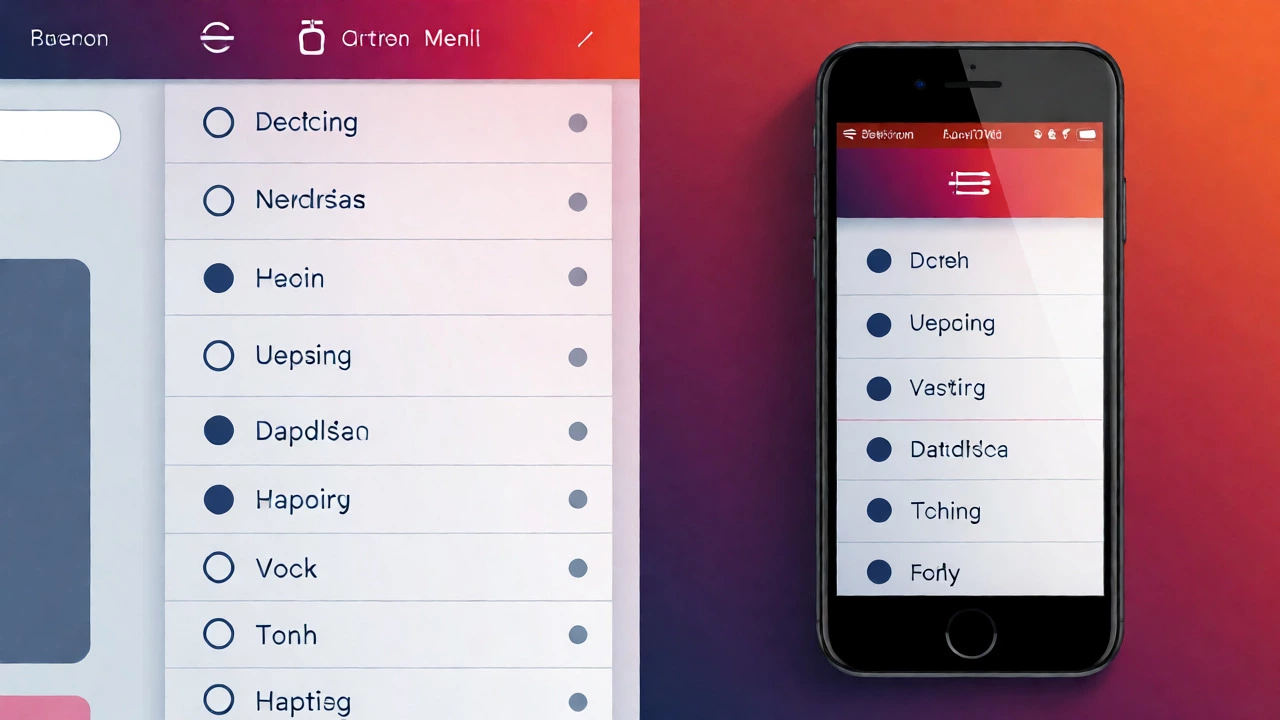
Try hovering over menus. On desktop, dropdowns appear on hover. On mobile, there is no hover state. Does the menu still work? If you rely on hover for navigation, mobile users will get stuck. Ensure click/tap areas are distinct. Also, test forms. Input fields should expand to fill the available width on mobile so users don’t struggle to type. Buttons should be spaced far enough apart to prevent accidental taps-a common frustration known as the "fat finger problem."
When Manual Testing Isn’t Enough
Simulators lie. They approximate how a browser renders HTML/CSS, but they don’t replicate the exact hardware constraints of a low-end Android device or the specific quirks of Safari on iOS. If your budget allows, physical testing matters.
Borrow an old iPhone and a mid-range Android phone. Load your site on cellular data, not just Wi-Fi. Why? Because some responsive images use srcset attributes to serve lower-resolution files on slower connections. If your server misconfigures these headers, you might see blurry images or slow loads only on mobile networks.
Also, check dark mode compatibility. Many modern browsers respect the user’s OS preference for light or dark themes. If your site forces a white background regardless of system settings, it can cause glare issues on OLED screens at night. Use CSS variables to handle color schemes dynamically.
Fixing Common Responsiveness Issues
Once you’ve identified problems, fixing them usually involves tweaking CSS. Here are the most frequent culprits:
- Horizontal Scrollbars: Usually caused by an element having a fixed width larger than the viewport, or negative margins pushing content outside the body. Inspect the offending element and change its width to
autoor100%. - Overlapping Text: Happens when font sizes don’t scale down proportionally with container widths. Use
remorvwunits for typography instead of fixed pixels. - Broken Navigation: Complex mega-menus often fail on mobile. Implement a "hamburger" menu pattern using JavaScript to toggle visibility on small screens.
Remember, responsiveness is about adaptability, not perfection. It’s okay if a complex table becomes a scrollable card list on mobile, as long as the data remains accessible.
Does Google rank non-responsive websites lower?
Yes. Since the introduction of mobile-first indexing, Google primarily uses the mobile version of content for indexing and ranking. If your site isn't responsive, it may suffer significant drops in search visibility, especially for mobile searches, which account for over half of global web traffic.
Can I make my existing WordPress theme responsive?
Most modern WordPress themes are responsive out of the box. If yours isn't, check for theme updates first. If the theme is outdated, you might need to add custom CSS media queries or consider switching to a block-based theme like Twenty Twenty-Four, which offers better native responsiveness controls in the editor.
What is the difference between responsive and adaptive design?
Responsive design uses fluid grids and flexible images that adjust continuously to any screen size. Adaptive design serves distinct fixed layouts for specific screen widths (e.g., one layout for mobile, one for tablet, one for desktop). Responsive is generally preferred today for its smoother user experience and easier maintenance.
Why does my site look good in DevTools but bad on a real phone?
DevTools simulates screen dimensions but not necessarily the rendering engine's behavior or network conditions. Real devices may have different default zoom levels, older browsers, or slower processors that affect how JavaScript-heavy components load. Always verify on actual hardware if possible.
Is testing on just one mobile size enough?
No. Screen sizes vary wildly from small foldables to large phablets. At minimum, test on a small phone (~360px), a standard phone (~390px), and a tablet (~768px) to ensure your breakpoints cover the most common user scenarios.