Responsive Breakpoint Selector
Select a breakpoint category to see details about its recommended minimum width and typical devices:
XS
Small phones
SM
Standard phones
MD
Large phones, small tablets
LG
Tablets, small laptops
XL
Desktop monitors
Selected Breakpoint Details
Click on a breakpoint card above to see its details.
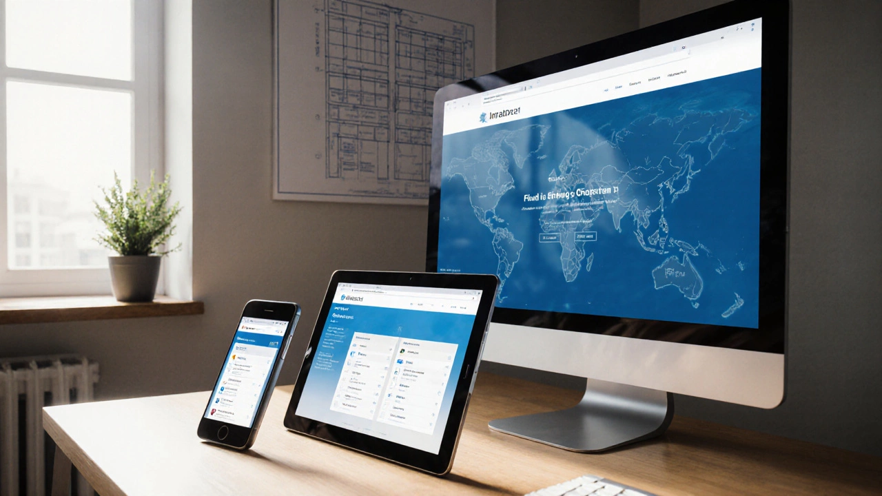
When building a site that looks good on any device, responsive design breakpoints are the key reference points that tell your CSS when to rearrange content. In practice, they’re just pixel widths where the layout switches from one configuration to another. Picking the right sizes saves you from endless guesswork, reduces re‑work, and keeps users happy whether they’re on a smartphone, tablet, laptop, or giant 4K monitor.
Key Takeaways
- Use a mobile‑first approach: start with the smallest screen and add breakpoints upward.
- Three to five well‑chosen breakpoints cover most traffic; extra ones add complexity without benefit.
- Base breakpoints on real device data (common viewport widths) and content needs, not on arbitrary numbers.
- Fluid grids and flexible images make the transition between breakpoints smoother.
- Test with browser dev tools, real devices, and emulators to catch edge cases.
Understanding Breakpoints and Their Role
Breakpoint refers to a specific viewport width where a media query fires and CSS rules change. The browser reports the viewport width in CSS pixels, which is why designers talk about “600px” or “1024px” breakpoints.
The viewport itself is the visible area of a page on a device. It’s influenced by the device’s physical screen size, pixel density, and any scaling the user applies. Modern devices report a device pixel ratio (DPR), but CSS pixels already abstract that away, letting designers think in logical widths.
Common Device Widths to Anchor Your Breakpoints
Instead of inventing numbers, look at the most used device categories in 2025:
- Small phones: 320px - 480px (e.g., iPhone SE, older Android phones)
- Standard phones: 560px - 720px (most modern smartphones in portrait)
- Large phones & small tablets: 768px - 834px (iPhone Plus, small iPad Mini)
- Tablets & small laptops: 1024px - 1280px (iPad, 13‑inch MacBook Air)
- Desktop monitors: 1440px - 1920px (full‑HD to QHD)
- Large desktops & 4K TVs: 2560px+ (high‑resolution workstations)
These ranges give you natural “sweet spots” where the layout can shift without looking cramped or overly stretched.
Crafting a Practical Breakpoint Set
Most projects get by with three to five breakpoints. Below is a solid starter set that aligns with the widths above:
| Label | Min‑width (px) | Typical devices | Layout focus |
|---|---|---|---|
| XS | 0 | Small phones | Single‑column, touch‑friendly navigation |
| SM | 576 | Standard phones | Two‑column cards, larger tap targets |
| MD | 768 | Large phones, small tablets | Three‑column grid, optional side menu |
| LG | 992 | Tablets, small laptops | Four‑column layout, fixed navigation bar |
| XL | 1200 | Desktop monitors | Full‑width hero, multi‑row grids |
These values echo the defaults used by popular CSS frameworks like Bootstrap and Tailwind, which means you can adopt them without overriding a lot of built‑in styles.
Why Not More Breakpoints?
Adding a breakpoint for every device sounds thorough, but it creates maintenance headaches:
- Each extra media query means more CSS to load and parse.
- Design consistency suffers; you end up with “pixel‑perfect” tweaks that don’t scale.
- Testing time multiplies-every new breakpoint is another scenario to verify.
Instead, aim for breakpoints that correspond to meaningful layout changes (e.g., moving from a single‑column stack to a multi‑column grid). If content still looks good at a width between two breakpoints, you probably don’t need an extra rule.
Fluid Grids, Flexible Images, and the “Content‑First” Mindset
Breakpoints work best when the underlying layout is fluid. A fluid grid uses relative units (percentages, fr units) so elements stretch or shrink naturally between breakpoints. Combine this with responsive images (srcset and sizes) and you minimize the visual jumps.
Adopt a content‑first approach: ask what the user needs at each size, then decide where the layout must adapt. For example, if a sidebar contains secondary navigation, you might hide it entirely below 768px and reveal it as a collapsible drawer at larger widths.

Testing Breakpoints Effectively
Even the best‑planned breakpoints can misbehave on real devices. Follow this quick testing routine:
- Open Chrome DevTools (or Firefox/Edge equivalents) and enable the responsive design mode.
- Select the preset widths that match your breakpoints (e.g., 375px, 768px, 1024px, 1440px).
- Manually drag the viewport edge to see where content starts to break.
- Check on at least one physical device per category (a cheap Android phone, an iPad, a laptop).
- Use the Lighthouse audit to flag any viewport‑related accessibility or performance issues.
Record any width where elements overflow, text becomes unreadable, or touch targets shrink below 44px (the recommended minimum). Adjust your media queries or grid fractions accordingly.
Checklist: Choosing the Right Breakpoint Sizes
- Start with a mobile‑first base style (0px).
- Identify the natural breakpoints where your content needs to reflow.
- Align those widths with common device categories (see the list above).
- Limit yourself to 3‑5 breakpoints unless a specific UI component demands more.
- Use relative units inside each breakpoint for smooth scaling.
- Test on real devices and in dev‑tools responsive mode.
- Document each breakpoint in your CSS comment block for future developers.
Frequently Asked Questions
What is the difference between a breakpoint and a viewport width?
A viewport width is the actual size of the browser’s visible area, while a breakpoint is a predefined width at which you apply different CSS rules using a media query.
Should I use em or rem units for breakpoints?
Both work, but rem is more predictable because it’s based on the root font size, which stays constant across breakpoints. Using rem makes your breakpoints scale with user‑adjusted font settings.
Can I rely on framework defaults (like Bootstrap) for my breakpoints?
Framework defaults are a solid starting point because they reflect common device sizes. However, always validate against your own content-if a component breaks early, adjust the breakpoint to suit your design.
Do high‑DPI screens affect breakpoint decisions?
No. CSS pixels already account for device pixel ratio, so a 360px viewport on a high‑DPI phone still triggers the same media query as a standard‑DPI phone.
How often should I revisit my breakpoint strategy?
At least once a year, or whenever you notice a shift in user‑agent analytics (e.g., a rise in large‑screen tablets). New device releases can push the sweet spots higher.