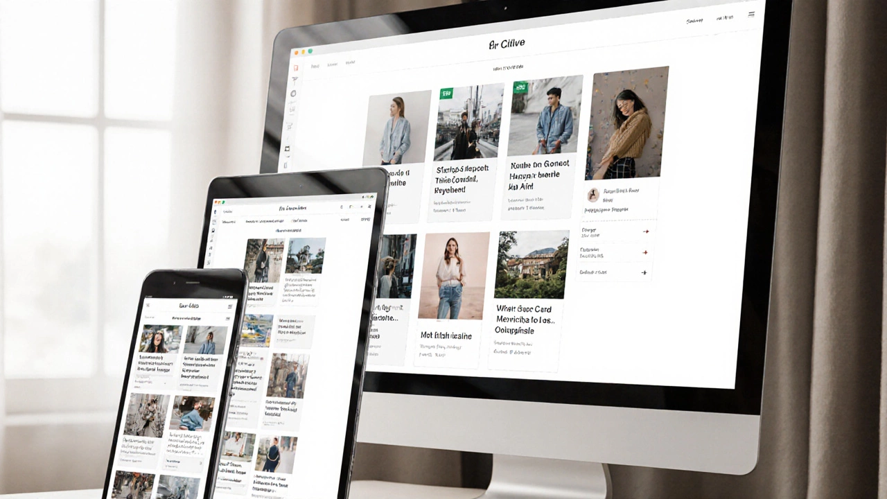
Mobile-Friendly Website: Why It Matters and How to Do It Right
Anyone who visits your site on a phone should get the same smooth experience as a desktop user. If your pages load slowly, text is hard to read, or buttons are too tiny, visitors will leave instantly. The good news is you don’t need a huge redesign to fix that. A few changes to layout, images, and code can turn a clunky site into a mobile-friendly one that ranks better and keeps users happy.
Start with a Fluid Layout
The first thing to check is how your layout behaves when the screen shrinks. Swap fixed widths (like width: 1200px;) for relative units such as percentages or flex. A simple CSS rule like max-width: 100%; on the main container stops content from spilling off the side. Use display: flex; or grid to let columns stack naturally on smaller screens. This way, text lines stay readable and images stay within view without horizontal scrolling.
Don’t forget the viewport meta tag. Adding <meta name="viewport" content="width=device-width, initial-scale=1"> tells browsers to match the page width to the device. Without it, even a fluid CSS layout appears zoomed out on phones, making everything look tiny.
Optimize Images and Resources
Large images are the biggest cause of slow loading on mobile networks. Serve sized‑appropriate pictures with the srcset attribute or use modern formats like WebP. A rule of thumb: keep most images under 150 KB and use lazy loading for below‑the‑fold content. That cuts bandwidth use and speeds up the first paint.
Combine CSS and JavaScript files where possible, and minify them to reduce file size. Turn on gzip or Brotli compression on your server – it can shrink text files by up to 70 %. Faster load times not only keep users engaged but also improve your SEO score, because Google uses page speed as a ranking factor.
Finally, test your site on real devices or use Chrome’s device emulator. Look for touch‑friendly buttons (at least 44 px tall) and make sure tap targets aren’t too close together. If something feels cramped on a phone, adjust the padding or margin until it feels comfortable to tap.
By applying these straightforward steps—fluid layouts, proper viewport settings, and image optimization—you’ll turn any site into a mobile-friendly experience. Your visitors will stay longer, search engines will notice the speed boost, and you’ll avoid the headache of redesigning everything from scratch.


