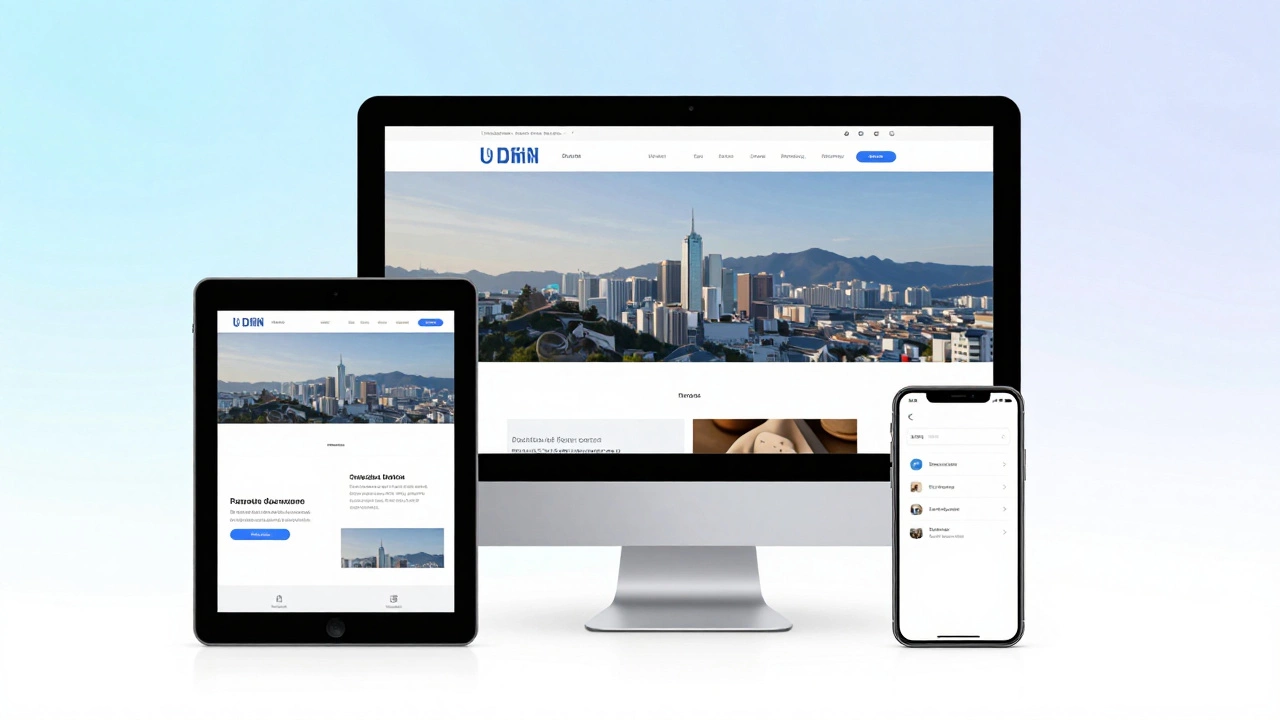
Understanding Responsive Web Design: Real-World Examples and Guide
13 Apr 2026Discover what a responsive website is through real-world examples like Amazon. Learn about fluid grids, media queries, and mobile-first design strategies.
If you’ve ever wondered why some sites look great on phones and terrible on laptops, the answer is almost always media queries. They let you tell the browser, “Hey, when the screen is this wide, apply these styles.” No fancy plugins, just plain CSS.
The good news? You don’t need years of experience to get them right. A few basic rules can make your layout adapt smoothly from a tiny phone screen to a giant 4K monitor.
A media query is a conditional statement that checks the device’s characteristics—most commonly its width. The syntax looks like this:
@media (max-width: 768px) {
    /* Styles for tablets and phones */
    .sidebar { display: none; }
}
The max-width part says, “Apply the rules inside only if the viewport is 768 pixels wide or less.” You can also use min-width, orientation, resolution, and more, but width is the workhorse for most projects.
Why not just use percentages? Percentages help with fluid layouts, but they don’t let you change the whole design at a certain size. Media queries let you swap layouts, hide or show elements, and even load different images without JavaScript.
Choosing breakpoints is more art than science, but start with the devices your audience uses most. A common set looks like this:
Instead of hard‑coding these numbers, look at your design. If a component starts to break at 850px, set a breakpoint right there. That way you’re solving real problems, not guessing.
Here’s a quick, real‑world example. Say you have a two‑column layout that looks cramped on phones:
.container {
    display: flex;
    gap: 2rem;
}

@media (max-width: 600px) {
    .container { flex-direction: column; }
}
When the screen drops below 600px, the columns stack vertically, keeping the content readable without zooming.
Don’t forget to combine min-width and max-width for a range:
@media (min-width: 601px) and (max-width: 1024px) {
    /* Tablet‑specific styles */
}
This prevents overlap between breakpoints and makes maintenance easier.
Another tip: avoid “mobile‑first” vs. “desktop‑first” debates. Pick whichever feels natural to you, but stay consistent. Mobile‑first usually means you write the base styles for small screens, then add min-width queries for larger devices.
Lastly, test on real devices. Browser dev tools are great, but they can’t mimic touch performance or hardware quirks. A quick check on a phone and a laptop will reveal most issues.
With these basics, you can start building layouts that feel native on any screen. Media queries aren’t a magic bullet, but they’re the simplest tool to make your site truly responsive.
Ready to try? Open your CSS file, add a @media block, and watch the page adjust as you resize the window. If it doesn’t look right, tweak the breakpoint value or the styles inside. Keep iterating until the layout feels solid at every size you care about.
Remember, the goal isn’t to chase every possible device width—just the ones that matter to your users. Focus on clear breakpoints, test often, and your site will look great everywhere.
Discover what a responsive website is through real-world examples like Amazon. Learn about fluid grids, media queries, and mobile-first design strategies.
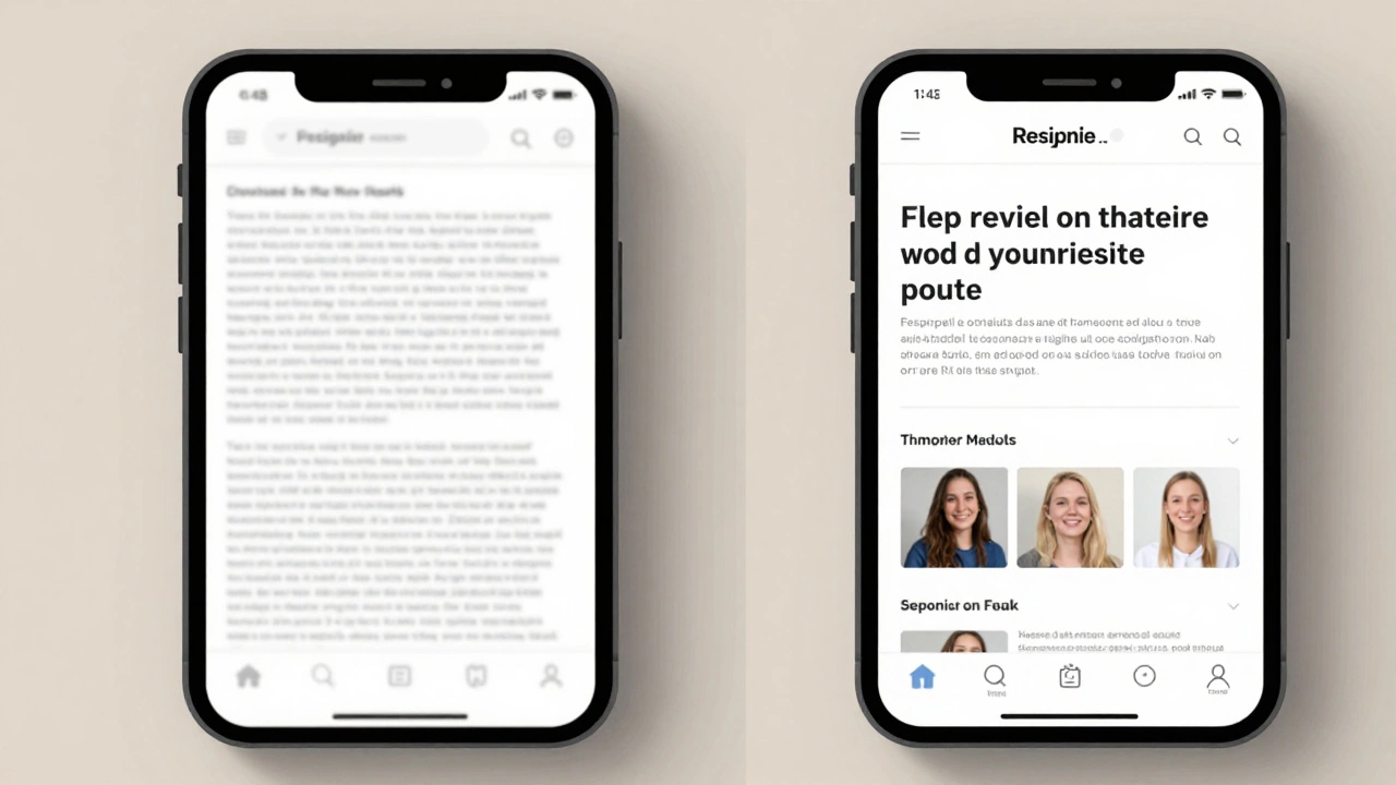
Fix your old website for mobile users quickly. Learn how to update layouts, handle images, and test responsiveness without rewriting everything from scratch.
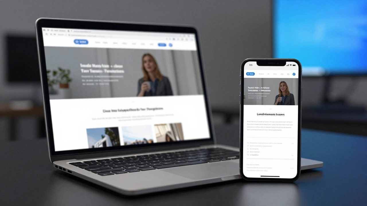
Learn how to build a responsive UI design that works on phones, tablets, and desktops. Start with the viewport tag, use fluid layouts, test on real devices, and avoid common mistakes that break mobile experiences.

Responsive design isn't about fitting your site to screens-it's about adapting the experience to the user. Learn the three core principles that make responsive design actually work across devices and networks.

Learn the optimal responsive design breakpoints, why fewer well‑chosen sizes beat many, and get a ready‑to‑use breakpoint set with testing tips.

Responsive web design is crucial in today's digital landscape, enabling websites to be viewed on a variety of devices. While Bootstrap offers an array of conveniences, many designers opt to build responsive sites without it, using custom CSS techniques. This article explores how to create responsive websites using CSS Grid, Flexbox, and media queries, offering valuable tips and innovative methods along the way. Discover the benefits of having more control over design and dive into real-world examples illustrating responsive design without Bootstrap.