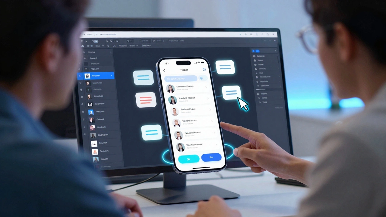
UI Design: Practical Tips and Current Trends
If you’ve ever clicked a button that felt clunky or stared at a screen that just didn’t make sense, you know how important good UI is. A solid UI makes a site easy to use, looks clean, and keeps visitors coming back. Below you’ll find a short cheat‑sheet that covers the basics you need right now, plus a peek at what’s shaping UI in 2025.
Core Principles of Effective UI
First off, keep it simple. Every element on the page should have a reason to exist. Too many colors, fonts, or icons can overwhelm users and slow down decisions. Stick to a limited palette—usually two main colors and one accent—and use one or two typefaces at most.
Next, think about hierarchy. Size, contrast, and spacing tell users where to look first. Larger buttons draw attention, while subtle text can sit lower in the visual stack. Use whitespace intentionally; it separates sections and makes the layout breathe.
Consistency is another must. Buttons, forms, and navigation should behave the same across all pages. That means using the same hover states, padding, and error messages everywhere. When users know what to expect, they move through your site faster.
2025 UI Trends to Watch
One trend gaining traction is “micro‑interactions.” Small animations—like a subtle bounce when a form field is filled—provide feedback without being distracting. They give a sense of polish and make the experience feel alive.
Another hot topic is “dark mode friendly” design. Instead of just inverting colors, design with true dark backgrounds in mind: use lighter text, adjust contrast, and avoid pure black. This keeps readability high and saves battery on OLED screens.
Neumorphism, the blend of flat and skeuomorphic styles, is still around but is now used sparingly. Over‑using soft shadows can hurt accessibility, so stick to it for decorative elements only.
Lastly, accessibility is non‑negotiable. Make sure contrast ratios meet WCAG AA standards, label every form field, and ensure keyboard navigation works. Good UI should work for everyone, not just a tech‑savvy crowd.
Putting these ideas together doesn’t require a massive redesign. Start by auditing a single page: check color contrast, simplify the navigation, and add a micro‑interaction where it makes sense. Test with real users or friends—if they can complete a task without confusion, you’re on the right track.
At Arachnid Web Solutions, we help businesses turn these principles into real sites that convert. Whether you need a quick UI polish or a full redesign, the same core ideas apply: keep it simple, guide the eye, stay consistent, and respect every user’s needs. Ready to make your interface work harder for you? Let’s talk.