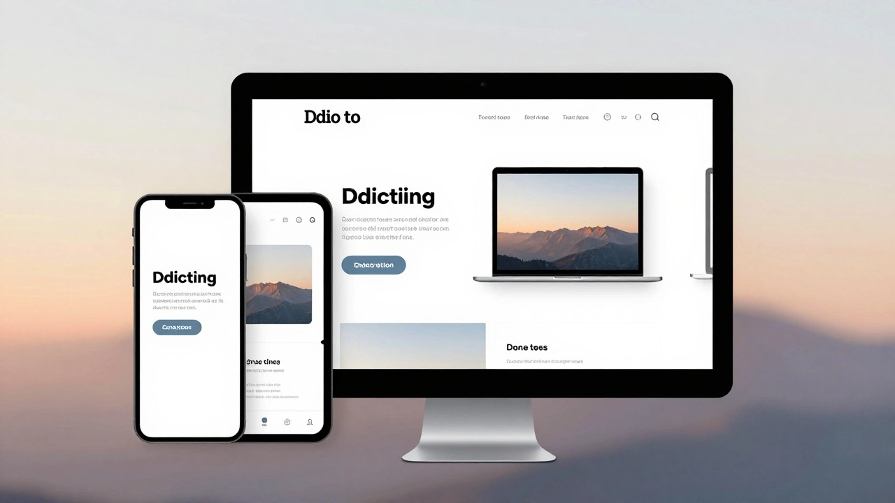
Responsive Web Design Made Simple – Your 2025 Guide
If your site still looks stretched on a phone or squeezed on a desktop, you’re missing out on real traffic. Responsive web design isn’t just a buzzword; it’s the backbone of every successful online experience in 2025. Below you’ll find straight‑to‑the‑point advice you can apply right now, no fluff.
Common Challenges and Quick Fixes
First off, performance. Slow load times on mobile kill conversions faster than any design flaw. Start by serving appropriately sized images. Use srcset and sizes attributes, or let a modern build tool generate WebP versions automatically. Next, remember that CSS breakpoints should reflect actual device widths, not arbitrary numbers. Test on a phone, a tablet and a laptop, then set breakpoints where the layout actually breaks.
Navigation menus are another pain point. A horizontal list that overflows on small screens frustrates users. Switch to a burger icon or a collapsible accordion when the viewport dips below your smallest breakpoint. Keep the tap target at least 48 px tall – that’s the recommended minimum for finger navigation.
Accessibility often gets left out of the responsive checklist. Make sure your contrast ratios stay strong even when text scales. Use relative units like rem for font sizes so the browser can honor user settings. And don’t forget to test keyboard navigation on every breakpoint; a layout that looks fine with a mouse can trap focus when shrunk.
Best Practices for Scaling Your Site
Flexible layouts are the core of responsiveness. Instead of fixed widths, use percentages or CSS Grid's fr unit. A two‑column grid that becomes a single column on smaller screens can be achieved with a single media query:
@media (max-width: 768px) {
  .grid { grid-template-columns: 1fr; }
}
This keeps your CSS tidy and your design consistent. When it comes to typography, set the base size with html { font-size: 100%; } and then scale headings using clamp(). That way text grows and shrinks smoothly without media queries for each heading level.
Lastly, audit your code regularly. Tools like Lighthouse or Web.dev give you a clear score for performance, accessibility and best practices. Aim for a score above 90; anything lower means you have hidden bugs that could hurt your SEO.
Putting these steps together creates a site that feels native on any device, loads fast, and stays accessible. You’ll see lower bounce rates, higher engagement, and better rankings because Google rewards truly responsive experiences.
Ready to upgrade your site? Start with one element – maybe image optimization – and iterate. Small, consistent improvements add up fast, and before you know it, your site will be the kind of place users love to visit on any screen.