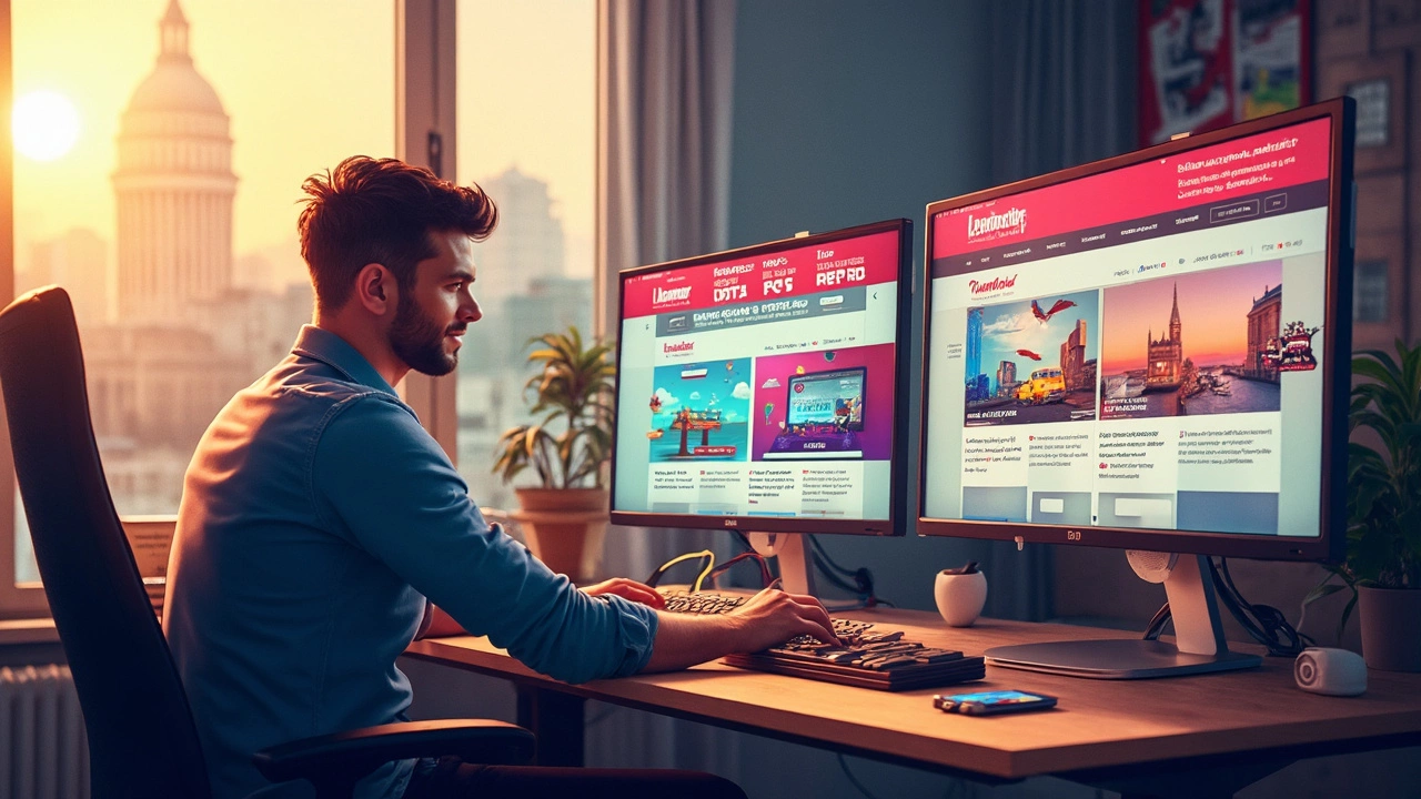
Web Design Tips You Can Use Right Now
If you’re building a site and want it to look good, load fast, and rank well, you need clear, simple guidance. Below are real‑world tips you can apply today, no matter if you’re a beginner or have built a few sites already.
Make Your Layout Flexible
Start with a mobile‑first mindset. Use max‑width on containers instead of fixed pixel values. That way the page shrinks and grows with the screen. Combine flexbox or grid with media queries to shift columns at common breakpoints: 600px, 900px, and 1200px. Test with Chrome’s device toolbar – if elements spill over, adjust the breakpoints.
Images often break layouts. Serve them in srcset so the browser picks the right size. Also compress with tools like TinyPNG before uploading. A fast‑loading site keeps visitors and search engines happy.
SEO Starts with Clean Code
Search engines love clear markup. Use semantic tags – <header>, <nav>, <section>, <footer> – instead of generic <div>s. Add a concise <title> and a unique <meta name="description"> for each page. Include your primary keyword near the top of your content, but avoid stuffing.
Don’t forget alt text for every image. Describe what the picture shows in a few words; this helps screen readers and gives search bots context. Structured data isn’t required, but adding simple schema for articles or products can boost visibility.
Lastly, keep the page speed high. Minify CSS and JavaScript, defer non‑critical scripts, and enable browser caching. Google’s PageSpeed Insights will point out easy wins.
Beyond layout and SEO, think about the user experience. Use a clear visual hierarchy – bigger headings for main ideas, smaller subheadings for details. Choose a readable font size (at least 16px) and enough line height (1.5). Make clickable areas large enough to tap on mobile; 44px by 44px is a safe target.
Contrast matters. Ensure text stands out from the background; a 4.5:1 ratio meets accessibility standards. You can check contrast with free online tools – just drop in your color codes.
Finally, test your site with real users. A short feedback loop – ask friends or post on a forum – can reveal hidden hurdles. Fixing a single confusing button can boost conversions dramatically.
These web design tips are quick to implement and deliver measurable results. Start with a flexible layout, clean up your code for SEO, and polish the user experience. Your site will look sharper, load faster, and rank better without extra fancy tricks.