Best Breakpoint Sizes for Responsive Web Design
8 Oct 2025Learn the optimal responsive design breakpoints, why fewer well‑chosen sizes beat many, and get a ready‑to‑use breakpoint set with testing tips.
When working with Viewport Width, the width of the visible area of a web page on a device. Also known as screen width, it determines how content scales from a phone to a 4K monitor. In plain terms, if you change the viewport width, the browser redraws the page to fit that space. That's why designers talk about Responsive Design, a design approach that adapts layouts to different screen sizes and rely on Media Queries, CSS techniques that apply styles based on viewport conditions to serve the right layout at the right size.
Viewport width drives every breakpoint you set in a stylesheet. A breakpoint is just a rule that says, "When the viewport width reaches X pixels, switch to this layout." This simple relationship creates a chain: viewport width → media query → breakpoint → layout change. Without a clear width reference, your CSS would have no trigger point, and the page would look broken on anything but the device you designed for.
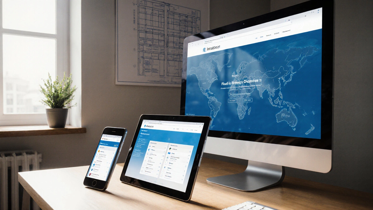
Most developers choose breakpoints that match common device classes—mobile (< 600 px), tablet (600‑900 px), laptop (900‑1200 px), and desktop (> 1200 px). Those numbers aren't magic; they map directly to the physical viewport width of the devices people use. By testing against real viewport widths, you avoid the "one‑size‑fits‑all" trap and keep the experience smooth across phones, tablets, and large monitors.
CSS offers several that tie directly to the viewport. The vw unit means "1% of the viewport width," so an element set to 50vw always occupies half the screen, no matter how wide the window gets. Similarly, vh works with height, and vmin/vmax pick the smaller or larger of the two. These units let you build fluid typography, images, and containers without constantly recalculating pixel values.
Mobile‑first design flips the script: you start with the smallest viewport width and add styles as the width grows. This approach forces you to prioritize essential content first and only layer in extra features when there's enough space. It also aligns with Google’s recommendation to serve the lightest possible page to mobile users, which improves load speed and SEO.
Performance is another side of the viewport width story. Large images that match a desktop viewport can cripple a mobile connection if you don't serve appropriately sized assets. By using the srcset attribute and picture elements, you let the browser pick the best image based on the current viewport width. This saves bandwidth and keeps page speed high—a crucial factor for both user satisfaction and search rankings.
Common pitfalls include mixing pixel‑based breakpoints with fluid vw layouts, which can cause sudden jumps in size, and relying on fixed heights that ignore the viewport’s vertical space. A quick audit checklist helps: verify that every major layout change is tied to a media query, confirm that text scales with rem or vw, and test on at least three different viewport widths (mobile, tablet, desktop).
Below you’ll find a curated set of articles that dive deeper into each of these topics. From practical fixes for responsive design challenges to step‑by‑step guides on using CSS units effectively, the collection gives you concrete tools to master viewport width and build sites that look great on any screen.
Learn the optimal responsive design breakpoints, why fewer well‑chosen sizes beat many, and get a ready‑to‑use breakpoint set with testing tips.