Mobile Responsive Design: What It Is and Why It Matters
When we talk about mobile responsive, a design approach that lets websites adapt automatically to different screen sizes and devices. Also known as responsive web design, it’s not just a nice-to-have anymore—it’s the baseline for every website that wants to be seen, used, and trusted. If your site looks broken on a phone, people leave. Fast. Google knows this. So do your customers. There’s no such thing as a "desktop-first" site anymore. The majority of web traffic comes from phones, tablets, and small screens. If your site doesn’t adjust, you’re losing traffic, sales, and credibility before someone even clicks.
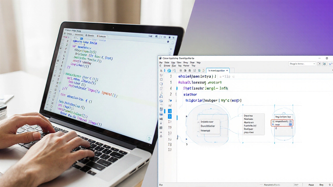
Building a mobile responsive site means using CSS media queries, rules that change how your site looks based on screen width, orientation, or resolution. It’s not about making buttons bigger—it’s about rethinking layout, navigation, content flow, and load speed. Tools like Flexbox, a CSS layout model that lets elements resize and rearrange fluidly and CSS Grid, a two-dimensional system for controlling rows and columns make this easier than ever. But the real trick isn’t the code—it’s testing. Real devices. Real networks. Real users. A site that looks perfect on your 6.7-inch iPhone 15 might crash on a 5-year-old Android with slow Wi-Fi. That’s why responsive design isn’t just a technical task. It’s a mindset.
Every post in this collection tackles a piece of this puzzle. You’ll find guides on how to build dynamic, responsive websites from scratch, what languages actually matter for layout, how to avoid common mistakes with CSS and JavaScript, and why even designers need to understand how their designs behave on small screens. Some posts break down the real cost of ignoring mobile responsiveness. Others show you exactly how to test your site on devices you don’t own. You’ll see how companies that nailed mobile responsiveness doubled their conversions—and how others lost customers because their menu disappeared on tablets. This isn’t theory. It’s what’s working right now.
Whether you’re a beginner trying to learn your first media query or a developer optimizing a client’s site for the 10th time, the goal is the same: make every visitor feel like the site was built just for them—no matter what device they’re holding. That’s what mobile responsive means. And if you’re not doing it, you’re already behind.