How to Make an Existing Website Responsive: Complete 2026 Guide
29 Mar 2026Fix your old website for mobile users quickly. Learn how to update layouts, handle images, and test responsiveness without rewriting everything from scratch.
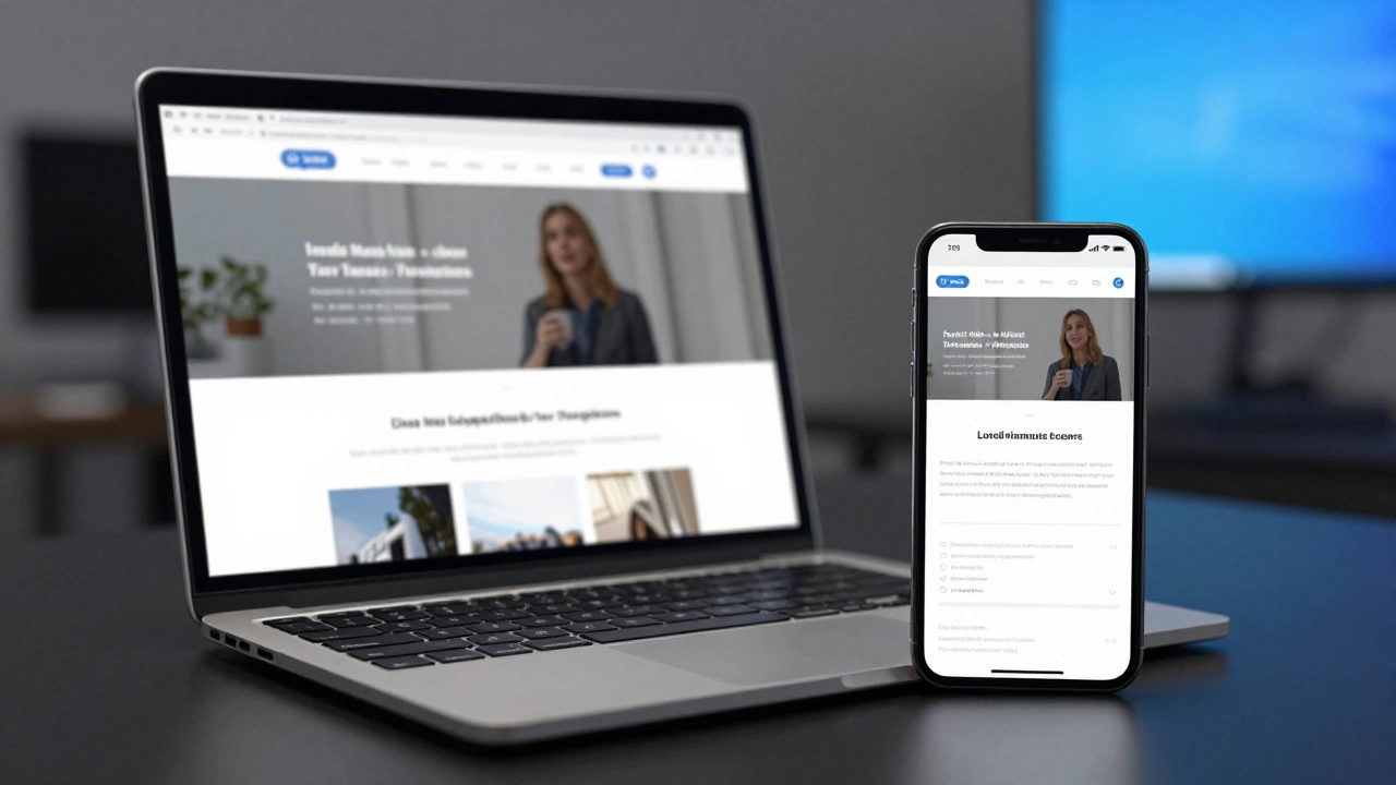
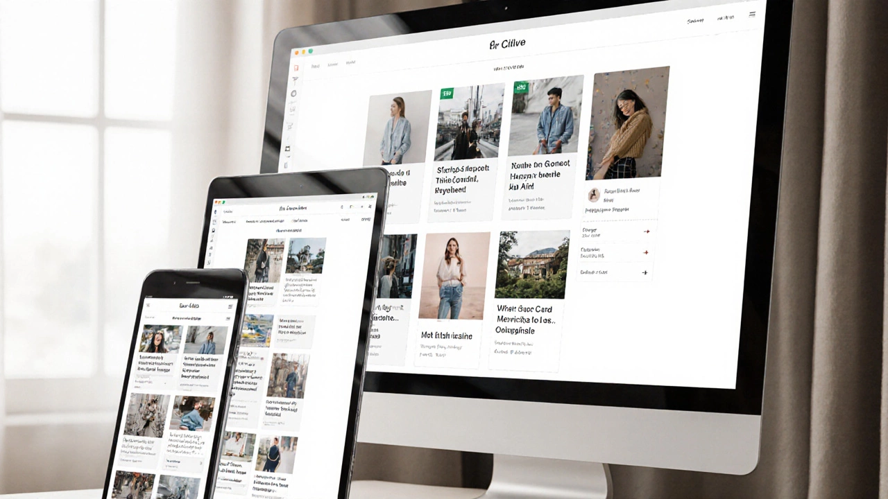
When you visit a website on your phone, tablet, or desktop and everything just fits—no scrolling sideways, no tiny buttons—that’s thanks to a fluid layout, a design approach where elements resize proportionally based on the screen width. Also known as liquid layout, it’s the foundation of every modern website that works across devices. Unlike fixed layouts that lock elements to pixels, fluid layouts use percentages, viewport units, and flexible grids to adapt in real time. This isn’t just a nice-to-have anymore—it’s the standard.
Fluid layout doesn’t work alone. It relies on tools like CSS Grid, a two-dimensional system for arranging content in rows and columns and Flexbox, a one-dimensional tool for aligning and spacing items in a row or column. These aren’t optional extras; they’re the engine behind fluid design. You’ll see them in nearly every post here—from guides on building dynamic websites to comparisons of WordPress vs hand-coded sites. Even if you’re using a CMS like WordPress, understanding how fluid layout works helps you pick themes that actually perform, not just look pretty.
Why does this matter? Because over half of all web traffic comes from mobile devices. If your site doesn’t adjust, people leave. Fast. Companies don’t hire developers who can only build for desktop. They need people who know how to make sites that feel native on any screen. That’s why you’ll find posts here about learning CSS and JavaScript together, how UI/UX designers benefit from knowing front-end basics, and why even WordPress developers need to understand responsive design. This isn’t theory—it’s daily work for every web pro.
Fluid layout also ties into performance. A site that shrinks gracefully loads faster on mobile networks. It reduces the need for separate mobile URLs or complex redirects. And when paired with media queries and modern CSS, it cuts down on code bloat. You’ll see this connection in posts about HTML5, JavaScript fetch, and even self-taught developers building portfolios without degrees. The best web developers don’t just code—they solve real problems with smart, flexible systems.
What you’ll find below are real-world examples of how fluid layout shows up in practice. From salary guides for freelance developers who charge more because they build responsive sites, to step-by-step breakdowns of building dynamic websites, every post here connects back to this core idea: if your site doesn’t adapt, it doesn’t succeed. No fluff. No buzzwords. Just what works.
Fix your old website for mobile users quickly. Learn how to update layouts, handle images, and test responsiveness without rewriting everything from scratch.
There's no one-click fix for responsive websites, but using modern CSS tools like Flexbox, Grid, and relative units lets you build sites that adapt automatically. Learn how to make your site truly mobile-friendly without plugins or guesswork.
Responsive web design and Bootstrap are not the same. Responsive design is a strategy for adapting layouts to any screen. Bootstrap is a CSS framework that helps you build responsive sites - but you don’t need it.