CSS3: Modern Styles, Responsive Layouts & Animations
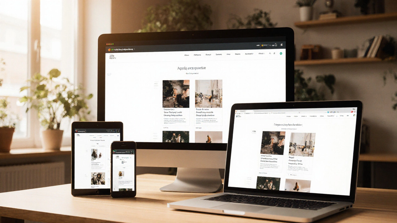
When working with CSS3, the third major version of Cascading Style Sheets that adds powerful layout modules, transitions, and flexible selectors. Also known as Cascading Style Sheets Level 3, it enables developers to create fluid, interactive websites without heavy JavaScript. Media Queries a feature of CSS3 that lets you apply styles based on screen size, orientation, and resolution are a core part of this toolkit. Together, CSS3 and media queries let a page adapt instantly, which is why responsive design depends on them. This opening paragraph sets the stage for the collection below, where you’ll find articles on breakpoints, performance tricks, and real‑world CSS3 use cases.
Why CSS3 Drives Responsive Design and Front‑End Work
Responsive Design an approach that makes web layouts work across phones, tablets, and desktops would be impossible without CSS3’s flexible box model, grid system, and CSS Animations declarative rules that animate elements without JavaScript. The relationship is clear: CSS3 includes flexbox and grid, which enable responsive grids; CSS3 provides transitions, which enhance user experience on small screens. Front‑end developers rely on these features to keep code clean and page load fast. In our posts you’ll see practical breakpoints, media‑query patterns, and animation tips that translate theory into ready‑to‑use snippets.
Beyond layout, CSS3 affects performance, accessibility, and SEO. When you use hardware‑accelerated transforms, browsers paint smoother and consume less CPU, which improves Core Web Vitals – a key SEO metric. Combining CSS3 with modern HTML5 markup also boosts semantic meaning, helping search engines understand page structure. Our collection covers real‑world challenges like managing multiple breakpoints, avoiding layout jank, and testing across browsers. You’ll learn when to prefer CSS Grid over Flexbox, how to write mobile‑first media queries, and which animation properties are safe on older browsers. All of this ties back to the central idea: mastering CSS3 gives you a versatile foundation for any front‑end project.
Ready to dig into hands‑on examples? Below you’ll find guides that walk through responsive breakpoints, CSS3 animation tricks, and performance‑focused styling. Whether you’re polishing a personal blog or building a complex e‑commerce interface, these resources show how CSS3 can solve everyday design problems. Browse the list and start applying modern styles today.