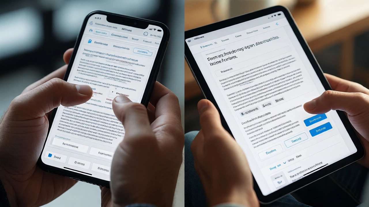
Responsive vs. Unresponsive Website Simulator
Select a device size and website type to see how layout adapts (or fails to adapt).
This section contains the primary article or product information. In a responsive site, this stretches to fill available space. In an unresponsive site, it remains fixed width.
Note: The "Unresponsive" mode simulates a desktop-fixed layout being viewed on smaller screens. Notice the horizontal scroll requirement or zooming issues if you were viewing the actual raw HTML without viewport scaling adjustments.
You know that feeling when you try to buy something on your phone, but the buttons are too small, the text is microscopic, and you end up zooming in and out like a maniac? That’s an unresponsive website at work. It’s frustrating, it loses sales, and honestly, it looks outdated. On the flip side, a responsive website adapts seamlessly, whether you’re on a massive desktop monitor or a tiny smartwatch. But what actually makes them different under the hood? And why does Google care so much about which one you have?
If you’re building a site or managing one for a client, understanding this distinction isn’t just technical trivia-it’s critical for survival in today’s digital landscape. Let’s break down exactly how these two approaches differ, why responsiveness became the standard, and what happens if you ignore it.
The Core Difference: Fixed vs Fluid Layouts
At its heart, the difference comes down to how the website handles screen size. An unresponsive website uses fixed dimensions. If the designer set the main content area to 960 pixels wide, that’s what it stays, regardless of whether you’re viewing it on a 1920-pixel widescreen monitor or a 375-pixel iPhone screen. The browser doesn’t adjust the layout; it just scales everything down, making text unreadable and images blurry unless you pinch-to-zoom.
A responsive website, however, uses fluid grids. Instead of hard-coded pixel values, developers use percentages. So, instead of saying "the sidebar is 200px wide," they say "the sidebar is 20% of the container." This allows elements to stretch and shrink relative to the viewport. When combined with flexible images and media queries, the site can completely reorganize itself. A three-column layout on desktop might stack into a single column on mobile, ensuring every element remains accessible without horizontal scrolling.
Why Unresponsive Sites Are Dying Out
You might think, "My old site worked fine ten years ago, why change it now?" Because the way people browse has fundamentally shifted. In 2026, over 60% of global web traffic comes from mobile devices. If your site requires pinching and zooming, you’re actively pushing away more than half your potential audience.
Beyond user annoyance, there’s a financial cost. Studies consistently show that users abandon sites that take longer than three seconds to load or render poorly. An unresponsive site often loads heavy desktop assets on mobile, slowing down performance. Plus, bounce rates skyrocket. If a user can’t find the 'Contact Us' button because it’s off-screen, they don’t scroll-they leave.
How Responsive Design Works Under the Hood
It’s not magic; it’s CSS. Three key technologies make responsiveness possible:
- Fluid Grids: As mentioned, using relative units like percentages and `rem` instead of absolute pixels allows layouts to scale proportionally.
- Flexible Images: Setting `max-width: 100%` ensures images never overflow their containers. They shrink to fit smaller screens but won’t stretch beyond their original resolution on larger ones.
- Media Queries: These are conditional statements in CSS that apply styles only when certain conditions are met, such as "if the screen width is less than 768px, hide the sidebar." This is where the real adaptation happens, allowing different layouts for phones, tablets, laptops, and large monitors.
Without media queries, you’d just have a squished version of the desktop site. With them, you get a tailored experience for each device class.

Google’s Mobile-First Indexing Impact
Here’s where it gets serious for business owners. Since 2018, Google has primarily used the mobile version of content for indexing and ranking. This means if your site is unresponsive and renders poorly on mobile, Google sees a low-quality page. Even if your desktop version is beautiful, your search rankings suffer.
Google’s algorithms prioritize pages that offer a good user experience (UX). Metrics like Core Web Vitals-specifically Largest Contentful Paint (LCP) and Cumulative Layout Shift (CLS)-are directly influenced by responsiveness. An unresponsive site often suffers from high CLS because elements jump around as the browser tries to scale fixed-size assets. Fixing responsiveness often fixes these SEO issues automatically.
Cost and Maintenance: One Site vs Many
In the early days of mobile, some companies built separate mobile sites (e.g., m.example.com). This meant maintaining two codebases. If you updated a product description on the desktop site, you had to remember to update it on the mobile site too. Missed updates led to inconsistent information, confusing users and hurting trust.
Responsive design solves this by having one URL and one HTML structure. You write the code once, and it serves all devices. This simplifies maintenance significantly. You don’t need to worry about redirecting mobile users incorrectly or dealing with duplicate content penalties. For most businesses, the long-term savings in maintenance time outweigh the initial development effort.
When Might Unresponsive Still Make Sense?
Are there exceptions? Rarely, but yes. Some highly specialized applications, like certain data-heavy dashboards designed strictly for large desktop monitors, might opt for a fixed layout to maximize density. However, even these are increasingly adopting responsive principles for tablet compatibility. Another exception might be legacy internal tools where no mobile access is required. But for public-facing websites, blogs, e-commerce stores, and portfolios, responsiveness is non-negotiable.
How to Test Your Website’s Responsiveness
Don’t just guess. Check your site yourself. Open Chrome, press F12 to open Developer Tools, and click the device toolbar icon. Toggle between different device presets (iPhone SE, iPad Pro, Desktop HD). Watch how your layout behaves. Do columns stack neatly? Do buttons remain tappable? Is text legible without zooming?
Also, test on actual devices. Emulators are great, but nothing beats holding a physical phone. Notice if hover effects work on touchscreens (they shouldn’t rely on hover alone) and if forms are easy to fill out with thumbs. If you find yourself struggling, your site likely needs a responsive overhaul.
| Feature | Responsive Website | Unresponsive Website |
|---|---|---|
| Layout Behavior | Adapts to screen size | Fixed width, requires scrolling/zooming |
| User Experience | Seamless across devices | Frustrating on mobile/tablet |
| SEO Ranking | Favored by Google (Mobile-First) | Potentially penalized |
| Maintenance | Single codebase | Complex if multiple versions exist |
| Load Speed | Optimized for device | Often slower due to unnecessary assets |
Common Misconceptions About Responsiveness
One big myth is that "responsive" means the site looks identical on every device. It doesn’t. It means it looks *appropriate* for every device. The layout changes intentionally. Another misconception is that responsive design is slow. While complex animations can hurt performance, a well-coded responsive site is often faster than a separate mobile site because it avoids redirects and leverages caching more effectively.
Also, remember that responsiveness isn’t just about width. It includes handling orientation changes (portrait vs landscape), varying pixel densities (Retina displays), and input methods (mouse vs touch). True responsiveness accounts for all these variables.
Taking Action: What Should You Do Next?
If your site is unresponsive, you have two paths. First, you can attempt to retrofit existing CSS with media queries. This works for simpler sites but can become messy if the original structure wasn’t built with flexibility in mind. Second, you can rebuild using a modern framework like Bootstrap, Tailwind CSS, or Foundation. These frameworks come with pre-built responsive grids and components, speeding up development and ensuring cross-browser compatibility.
For WordPress users, switching to a modern, responsive theme is usually the easiest fix. Most premium themes released after 2015 are fully responsive by default. Just ensure your plugins aren’t breaking the layout on mobile views.
Does responsive design affect page speed?
Yes, it can. Poorly implemented responsive design might load desktop-sized images on mobile devices, slowing down load times. However, techniques like srcset and lazy loading help mitigate this. Generally, a single responsive site is faster than maintaining separate desktop and mobile sites due to reduced HTTP requests and better caching efficiency.
Is my website responsive if it scrolls horizontally on mobile?
No. Horizontal scrolling on mobile is a classic sign of an unresponsive or broken responsive layout. Elements should fit within the vertical viewport width. If you have to swipe left or right to see content, the layout is not adapting correctly to the screen size.
Can I convert an unresponsive site to responsive without rebuilding?
Sometimes. If the underlying HTML structure is semantic and clean, you can add media queries and switch fixed widths to percentages. However, if the site relies heavily on tables for layout or absolute positioning, a rebuild is often more efficient and maintainable in the long run.
Do all browsers support responsive design?
Modern browsers do. Media queries were introduced in CSS3 and are supported by all major browsers including Chrome, Firefox, Safari, and Edge. Older browsers like Internet Explorer 8 require polyfills or fallback strategies, but given IE’s discontinuation, this is rarely a concern for new projects in 2026.
Is responsive design the same as adaptive design?
No. Responsive design uses fluid grids and continuous scaling to adapt to any screen size. Adaptive design detects the device type and serves a pre-designed static layout optimized for that specific device category (e.g., mobile, tablet, desktop). Responsive is generally preferred for its flexibility and easier maintenance.