Responsive Design Simulator & Quiz
Layout Visualizer
Drag the slider to see how a typical webpage layout adapts from desktop to mobile using fluid grids.
(Flex: 1)
Knowledge Check
Question 1 of 3
According to the article, why is "Mobile-First" no longer optional?
Quiz Complete!
You've reviewed key concepts about Responsive Design in 2026.
You might have heard the rumor that responsive design is dead. Maybe a colleague told you it’s outdated because everyone uses apps now, or perhaps you saw a new framework that claims to handle layout magic automatically. But here’s the reality check: if your website breaks on a foldable phone or looks cramped on a tablet in portrait mode, you don’t have a modern site-you have a liability.
As of September 2026, Responsive Web Design is not just relevant; it is the non-negotiable baseline for any serious digital presence. The conversation has shifted from "should we do it?" to "how do we make it smarter?" We aren't just stacking columns anymore. We are dealing with variable refresh rates, diverse aspect ratios, and users who expect sites to feel native regardless of the device they pick up.
| Factor | Impact on User Experience | Business Consequence |
|---|---|---|
| Device Fragmentation | Users access content on screens ranging from smartwatches to 4K monitors. | High bounce rates if layouts break on common devices. |
| Google Mobile-First Indexing | Search engines prioritize the mobile version of your content for ranking. | Poor SEO visibility if desktop and mobile versions differ significantly. |
| Accessibility Standards | Fluid layouts support zooming and text resizing better than fixed widths. | Legal risks and exclusion of users with visual impairments. |
The Evolution From Media Queries to Container Queries
For years, Media Queries were the backbone of responsive work. You’d write code like @media (max-width: 768px) and hope the viewport matched the component’s needs. It worked, but it was rigid. If you dropped a card component into a sidebar instead of the main content area, it didn’t know how to adapt because it only listened to the window size, not its own container.
This changed when Container Queries gained widespread browser support. Now, components can react to their immediate parent element rather than the entire screen. This is a game-changer for design systems. Imagine building a product card that automatically switches from a horizontal layout to a vertical one based on whether it’s sitting in a narrow sidebar or a wide grid. You stop writing redundant media queries for every possible breakpoint combination. Your code becomes cleaner, more reusable, and genuinely modular.
If you’re still relying solely on breakpoints tied to specific iPhone models, you’re fighting yesterday’s battle. Modern browsers understand context. Leverage it.
Mobile-First Is No Longer Optional
Some developers treat mobile-first as a checkbox. They design for desktop, then shrink things down until they fit. That approach usually results in bloated CSS and poor performance on slower networks. In 2026, Mobile-First Design means starting with the constraints of a small screen and progressively enhancing the experience for larger displays.
Why does this matter? Because mobile traffic consistently accounts for over 60% of global web visits. More importantly, mobile users often have less patience and higher data costs. By prioritizing core content and functionality on mobile, you force yourself to cut the fluff. When you scale up to desktop, you add enhancements-like complex animations or multi-column layouts-that require more bandwidth and processing power. This strategy naturally leads to faster load times and better Core Web Vitals scores.
Think about your last project. Did you start with the smallest screen? If not, try flipping your workflow next time. You’ll likely find fewer bugs and a leaner codebase.
CSS Grid and Flexbox Have Matured
The early days of responsive design involved floating divs and clearing hacks. Today, CSS Grid and Flexbox give you precise control without the headache. These tools allow you to create layouts that flow naturally across different screen sizes without needing dozens of custom rules.
Consider using minmax() functions in CSS Grid. Instead of defining fixed column widths, you tell the browser: "Make this column at least 200 pixels wide, but let it grow if there’s space." The browser handles the rest. This intrinsic responsiveness reduces the need for explicit media queries. You’re letting the content dictate the layout, which is far more robust than forcing content into predefined boxes.
- Use Flexbox for one-dimensional layouts (rows or columns).
- Use CSS Grid for two-dimensional layouts (complex page structures).
- Avoid absolute positioning for major layout elements unless necessary for overlays.
Mastery of these tools separates hobbyists from professionals. If you’re still struggling with alignment issues, it’s worth revisiting the documentation for these properties. They solve problems that JavaScript used to handle inefficiently.

Performance Is Part of Responsiveness
A responsive site that loads slowly isn’t really responsive-it’s frustrating. Users on mobile devices often face slower network conditions. If your high-resolution hero image takes ten seconds to load on a 4G connection, the user will leave before they even see your layout adapt.
Implement Lazy Loading for images and videos below the fold. Use modern image formats like WebP or AVIF, which offer better compression than JPEG or PNG. Serve different image sizes based on the user’s device pixel ratio. A retina display doesn’t need the same file size as a standard laptop screen, but it does need higher resolution. The srcset attribute helps browsers choose the right asset automatically.
Don’t forget about font loading. Custom fonts look great, but they block rendering if not handled correctly. Use font-display: swap to ensure text remains visible while the font downloads. Small optimizations like this compound quickly, leading to a smoother experience on all devices.
Designing for Foldables and Tablets
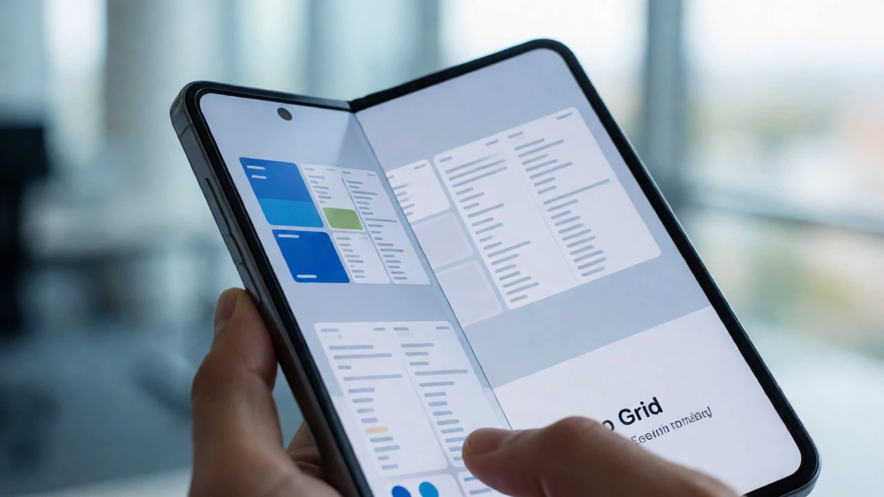
The market isn’t just phones and laptops anymore. Foldable phones and large tablets occupy a middle ground that requires thoughtful design. A simple two-column layout might look awkward on a half-folded device. You need to consider intermediate states.
Test your designs on actual hardware whenever possible. Emulators are useful, but they don’t capture the tactile feel of interacting with a large touch target on a tablet. Ensure buttons are spaced adequately for thumb reach. On foldables, leverage the extra screen real estate by showing additional context or secondary information alongside primary content. This adds value rather than just stretching the layout.
Remember, responsiveness isn’t just about fitting content; it’s about optimizing interaction. A layout that fits but forces awkward scrolling or tiny tap targets fails the usability test.
Common Pitfalls to Avoid
Even experienced developers fall into traps. One common mistake is assuming all mobile users have fast connections. Don’t assume Wi-Fi. Test on throttled 3G or slow 4G profiles. Another pitfall is ignoring accessibility. Color contrast must remain sufficient across all themes, especially if you support dark mode. Ensure focus states are visible on keyboard navigation, which some users rely on even on touch devices via external keyboards.
Also, beware of "responsive bloat." Adding too many JavaScript-based layout adjustments can hurt performance. Let CSS handle the heavy lifting. JavaScript should enhance interactivity, not manage basic structural changes. If your JS bundle is huge because you’re trying to replicate CSS features, refactor your approach.
Frequently Asked Questions
Is responsive design harder than adaptive design?
Not necessarily. Adaptive design creates separate layouts for specific breakpoints, which can be easier to manage initially but harder to maintain long-term. Responsive design uses fluid grids and flexible images to adapt continuously. While setting up the initial fluid system requires careful planning, it generally results in less code duplication and easier updates in 2026.
Do I still need media queries if I use CSS Grid?
Yes, but fewer of them. CSS Grid’s auto-fit and minmax functions handle many layout shifts automatically. However, you may still need media queries for significant changes in typography scale, navigation structure, or hiding/showing complex UI elements that don’t fit well on smaller screens.
How does responsive design affect SEO?
It positively impacts SEO by improving user experience metrics like bounce rate and time on site. Google’s mobile-first indexing means your mobile version determines your rankings. A responsive site ensures consistent content delivery across devices, avoiding penalties associated with hidden content or different URLs for mobile and desktop.
What is the role of fluid typography in responsive design?
Fluid typography scales text smoothly between minimum and maximum sizes based on the viewport width, typically using the clamp() function. This prevents jarring jumps in text size at breakpoints and ensures readability on all devices without requiring multiple font-size declarations.
Can I ignore tablet-specific designs?
You shouldn’t ignore them entirely. While responsive principles cover most cases, tablets often have unique usage patterns, such as landscape orientation for media consumption. Testing on tablet-sized viewports ensures your layout leverages the extra space effectively rather than just looking like an enlarged phone interface.